Comments: +
April 20 2012
")
The creative community loses a multi-talented inspiration.
Designer, author, and filmmaker Hillman Curtis sadly passed away on April 18th after a three year battle with cancer. At only 51, Curtis leaves behind an impressive body of work which includes numerous award-winning short films and the feature-length film Ride, Rise, Road about David Byrne and Brian Eno.
Curtis is perhaps best known for his popular Artist Series, which was ongoing from 2005 and featured designers like Milton Glaser, Paula Scher, and David Carson.
His latest project, The Happy Film, is a feature-length film loosely based on designer Stefan Sagmeister’s book Things I Have Learned in My Life So Far. It was in production at the time of his death.
Filed under: design
Comments: +
February 10 2012

Are unpaid internships evil, or is education payment enough? Thomas Wilder reflects on his past experience as an unpaid intern at a New York design firm.
Editor’s note: idsgn spans different points of view, and what follows is an opinion not neccesarily shared among our editorial team. However, we feel the debate is a valid one to explore and the topic is worthy of further discussion.
During my years in design school, I worked on countless projects with professors and never expected anything in return other than their vast knowledge. I understood it would help me in my future profession.
Following my junior year, I obtained an unpaid internship at a design firm in New York City. There, I was taught by an extremely talented creative director who mentored and educated me about the professional side of design. My professors were extremely talented and unusually nurturing, but I came to understand the knowledge gained during an internship can be invaluable, and the experience can shape the way one approaches, visualizes, conceptualizes and executes a design project.
Filed under: design
Comments: +
January 27 2012
Wrapping up our Fresh & Hungry series, Chris Rubino speaks with London-based Sean Freeman.
CHRIS RUBINO: I think your work is probably the most developed of the winners this year, it’s quite impressive that you are still under 30. How early on did you realize such a strong vision for your work? How did typography become the voice for that vision?
SEAN FREEMAN: Thanks! I don't think a strong vision for my work came consciously, more that over the years of experimentation it’s become tighter and I feel I know more now about where I want my work to be and at what level.
I've always been very into illustrated type and have a particular love for words so I enjoyed combining that love for words with being naturally curious.
Filed under: design
Comments: +
January 26 2012
Chris Rubino speaks with Brooklyn-based photographer Elizabeth Weinberg, our next Fresh & Hungry subject.
CHRIS RUBINO: Recently I'm finding it difficult to select photography I really respond to. Maybe its just being overwhelmed, I don't know, but I really like that you have such a cohesive body of work. Do you think about your voice as a photographer? What do you look for when creating an image?
ELIZABETH WEINBERG: I don't really put too much thought into it, honestly. It's just what I do. I've found that if I start over-thinking photography I get really burnt out on it and lose the pure love for it that I always want to have. I let my instinct guide me and if I want to take a picture, I take it. Simple as that, and I don't think it has to be any more complicated.
Filed under: design
Comments: +
January 25 2012
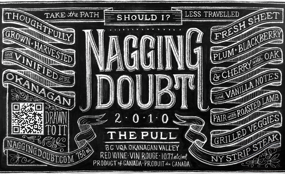
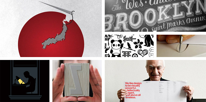
In this Fresh & Hungry, Chris Rubino talks with Dana Tanamachi, a graphic designer and custom chalk letterer living in Brooklyn.
CHRIS RUBINO: Your work is so striking, I love that you’ve chosen such a unique and tangible medium. I’m sure you’ve been asked this a lot but how did the chalkboard drawings begin? That decision has truly created a voice that you can call your own.
DANA TANAMACHI: Thank you! I never tire of telling this story because it's an occasion to boast about my incredible community of friends here in Brooklyn. A couple years back, there was a Great Gatsby-themed housewarming party in Boerum Hill—and of course everyone came all gussied up. My friends' new place had a huge chalk wall in their living room, and a much smaller one to the side. She suggested that I pick up a piece of chalk and doodle something ("You're artsy, aren't you?"). So I did. My other friend and I wrote the word Brooklyn on the wall—it was relatively small; not amazing. But people started coming over to it and commenting how great it was. Soon it became the "photo wall" for the party and all the photos were uploaded to Facebook after that night. I guess we were on to something.
Filed under: design
Comments: +
January 24 2012
Continuing our Fresh & Hungry series, Chris Rubino chats with Brooklyn design trio GrandArmy—Larry Pipitone, Joey Ellis, and Eric Collins.
CHRIS RUBINO: I'm very interested in the group dynamic GrandArmy has. I think it really brings an eclectic quality to your work. How important is this collaborative process to your work? And how did this become the way each of you decided to work?
GRANDARMY: The collective nature of GrandArmy has been indispensable in creating our body of work. Before working together we had all developed similar tastes as creative people, and this was one of the reasons we initially decided to join forces. Looking back over the GrandArmy portfolio in its entirety, it is hard to find a single piece that wasn't at some point impacted by each member's distinct fingerprint.
Filed under: design
Comments: +
January 23 2012
Kicking off our Fresh & Hungry series, Chris Rubino speaks with ADC Young Gun recipient Kyle Bean.
CHRIS RUBINO: I’m going to assume you have the most exciting studio of any of this year’s Young Guns. I’m very impressed with your appropriation of materials and impeccable craftsmanship. Can you talk a bit about your various approaches to each individual project and how materials are chosen? Do you have a pile of materials on reserve for the future?
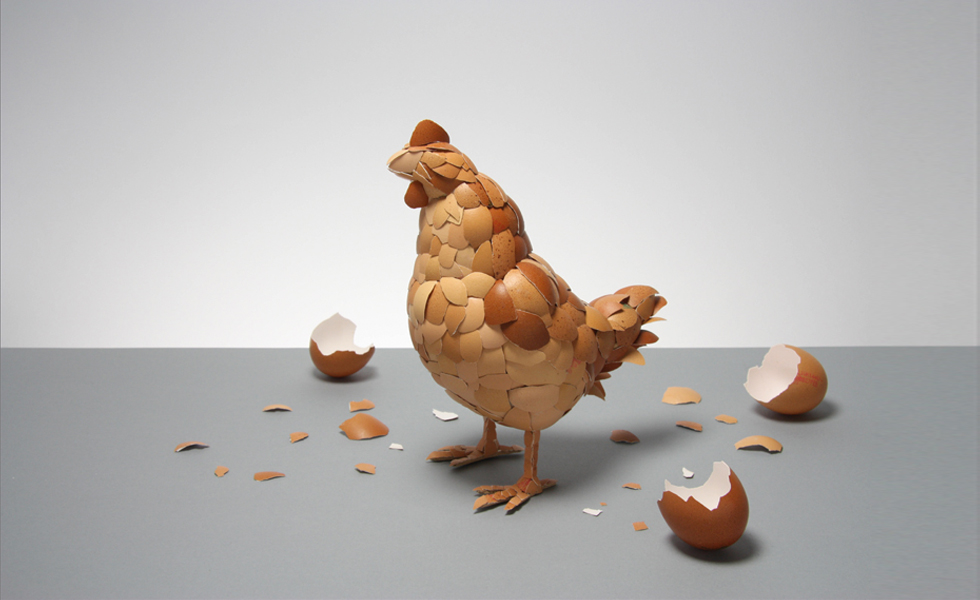
KYLE BEAN: It may come as a surprise but my studio is actually pretty small, and as such I have to try and keep it fairly clutter free! I have a cutting desk, a plan chest to store all of my sheet material, a book case and a few storage boxes full of other materials. I go through phases of hoarding materials, and I have often kept things for years thinking that one day they might be useful, but eventually I have to let them go! I like using everyday materials the most, as they are obviously easily accessible but also have an immediacy or familiarity to them - So that when people look at the images/objects that I create I hope that they can understand what the material is that I have used to create them. I get a lot of pleasure from constructing objects and images from humdrum things. There is something very satisfying about reforming a cardboard box, or even pencil shavings (as in my Pencil Shaving Portraits for Wallpaper* magazine) into something new and unexpected.
Filed under: design
Comments: +
January 23 2012
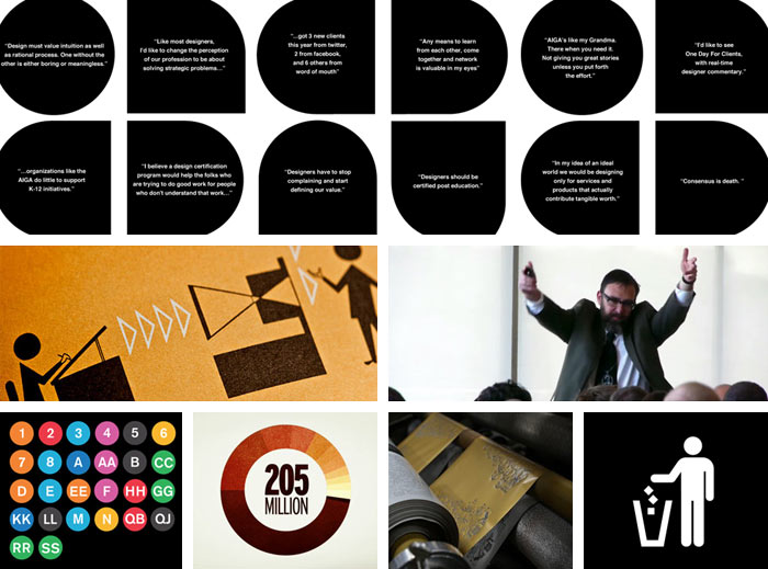
The world of design is expanding so quickly. I truly believe in the past 10 years it has grown in size and talent like never in the past.
The ADC Young Guns continue to be on the forefront of this evolution. Just take a look at the latest winners, such a diverse collection of talent. Designers using traditional skills in new ways, designers with very unique voices, many working at levels well beyond their years. As always it is difficult to select just a few from this very talented class but I’ve chosen 5 of my favorites to find out a bit more about where they are coming from and where they are going.
Filed under: design
Comments: +
January 6 2012
With 2012 upon us, we look back over our most memorable articles of last year.

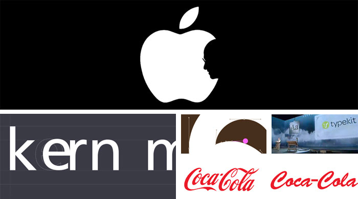
Steve Jobs, 1955-2011
We wrote about Steve Jobs’ impact on design and his collaboration with design legend Paul Rand on the NeXT brand. Little did we know he would pass away a few short days later at the age of 56.
9/11 ten years later
2011 marked the ten year anniversary of the September 11 attacks. On this day, we took at look at one design firm’s approach to commemorate the events of 9/11.
Filed under: design
Comments: +
December 11 2011
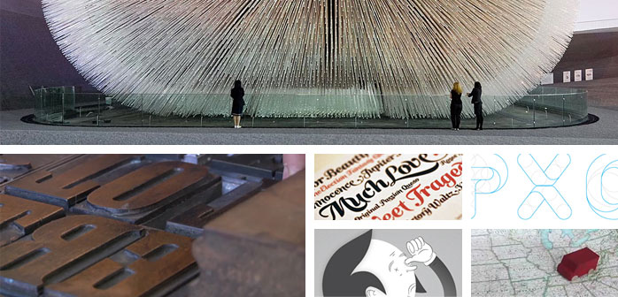
It’s that time of the year again, and we’re back with twelve must-have design gifts for the holidays.
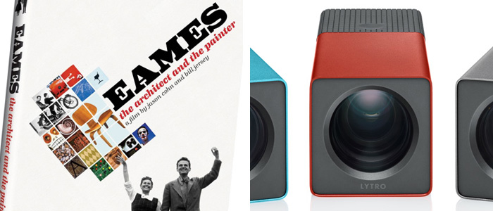
12 inspiring moments
You’re bound to find at least a dozen inspiring moments in this documentary on modern design legends Charles and Ray Eames. Snag the DVD when it hits stores December 13th, just in time for the holidays.
11 million light rays
The first of its kind, the Lytro Light Field camera lets you play with light and capture “living pictures.” Thanks to its light field sensor that captures 11 million light rays, you can shoot now and focus later.
$399 - 499 from Lytro
Filed under: design
Comments: +
May 9 2011

Does it make sense to walk into a restaurant, ask the chef to make you three entrees, eat from all three plates and then skip out on the bill if you didn’t like any of the options? The answer is no.
Sometimes it feels like we, as designers, put up with this treatment. We may even invite it by not questioning this attitude or acting against it. But today, I want to focus on something even more ineffective and misguided that is threatening our industry: crowdsourcing.
Imagine our dinner analogy now extends to crowdsourcing. In the chef’s kitchen, you’re again in search of the perfect meal. But now you have a great idea! Fire the chef and invite random people from the streets (and wherever you can find them). Tell them they will not be paid a chef’s salary, but they can play with all the fancy equipment and be a chef-for-a-day (oh, and they can now put this on their résumé!).
Filed under: design
Comments: +
March 14 2011

Our industry can seem pretty negative.
There are many reasons for this. There is subjectivity in our work. Big egos and temperamental personalities flourish in the arts. Criticism comes with the job, too. It helps us to evaluate honestly, progress and move forward. But, from the outside looking in, one might think that we are a pretty catty group that doesn't get along.
Filed under: design
Comments: +
March 9 2011

Design studios are like restaurants in New York City, every day one opens while another one closes its doors.
To succeed in our industry a studio’s work must be fresh, relevant and important. Alexander Gelman’s Design Machine was one of those studios. Started in 1996 and closed in 2005, Design Machine was able to make an enormous impact on the New York design scene in an incredibly brief timespan.
Filed under: design
Comments: +
February 14 2011

Everyone loves Marian Bantjes.
Not only because she defies trends and creates fantastically complex, awe-inspiring work, but because she stood up for art and won.
February 14th is a day for love. Last year, idsgn looked at how love affects working relationships with our Design Love series. This year, Marian Bantjes reveals how following love over money can make all the difference. She also gave us a sneak peek at the 2011 installment of her annual Valentine’s project.
Filed under: design
Comments: +
January 17 2011

Anyone hear that sound? It’s a giant turd being dropped into your mailbox.
Actually, it’s the February issue of Print magazine.
I know what you’re saying: Does anyone still subscribe to that?
Well, what can I say? I still read it. Maybe I’m an extreme hoarder, or I don’t like to let go. Maybe I just really like 1/4 inch printed thumbnails of websites?
If you are a subscriber, you’ll notice that this month’s Print looks different. There is even a new tagline: Redefining Design (does that really mean anything?). If this issue is an indication of design’s new redefinition, we are in for some boring, inept design.
Filed under: design
Comments: +
January 12 2011
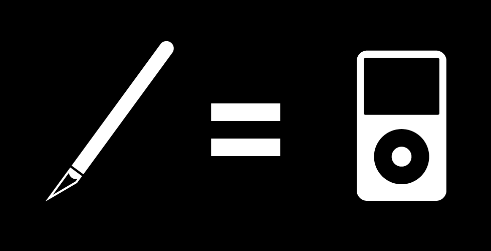
The professional fields of design and music have crossed paths for years. Each constantly fueling the other through visual, audible and emotional expression.
Design weaves itself into music through a number of different mediums: packaging, websites, posters, typography, logos, videos, fashion, and more. Entire visual brands are built around musicians in order for the artist to appeal to the correct demographic. Some musicians even require designers to elevate their aesthetic taste level, as designer Stefan Sagmeister notes
Filed under: design
Comments: +
January 5 2011
As we enter a new year, we have taken a moment to look back over our most memorable features of 2010.
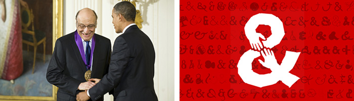
Glaser makes history
Milton Glaser made history as the first graphic designer to win the National Medal of Arts. The renowned designer received the award from president Obama, alongside singer Bob Dylan and actor Clint Eastwood.
Design for the people
Following a devastating earthquake in Haiti, type designers join forces to raise money for relief efforts. With the notion that design for the people is not dead, we asked can design help a struggling city?
Filed under: design
Comments: +
December 14 2010
Need some last minute holiday gift ideas? The contributors at idsgn came together again to share what’s on our radar this year. Don’t forget the wrapping paper!
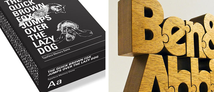
12 fox a-leaping
Get to know your Helvetica from your Akizdenz with The Quick Brown Fox Jumps Over the Lazy Dog, a typographic memory game from BIS Publlishers.
$17 from Amazon
11 letters wooden
Lovingly handcrafted by designer John Christenson in Chicago, Nuzzles are custom designed wooden typographic puzzles. Cut from a single block of wood, letters fit together like a jigsaw puzzle.
$24 (per character) from Nuzzles
Filed under: design
Comments: +
November 29 2010

We complete our Fresh & Hungry series with Always With Honor, a Portland, Oregon collective consisting of Elsa and Tyler Lang, and a dog named Zoe.
CHRIS RUBINO: Your work makes me smile, I wish I had a room in my house that felt like your work, I’d go sit there in the morning and delete emails. I’m wondering if this is a result of working as partners rather than the lonely designer sitting in a room for days on end, how has the collaboration developed your work?
ALWAYS WITH HONOR: We’re glad our work makes you smile, that makes us smile. Smile party. We’re both pretty easy going and light-hearted, so we’re thrilled when it’s reflected in our work. We try not to take ourselves or our work too seriously—if you can get away with it, it’s way more fun that way. This is also where Zoe really earns her kibble, you’d be surprised how a sassy wiener dog can brighten your day, affecting the work at hand.
Filed under: design
Comments: +
November 29 2010

Continuing our Fresh & Hungry series, Chris Rubino speaks with New York-based art director Christine Gignac.
CHRIS RUBINO: The variation in your work is what immediately attracted me to it, I’ve enjoyed your long-running needsforsale.com and wantsforsale.com sites for quite some time. You partner with your husband (artist Justin Gignac) and work at Mother with a team, is collaboration an absolute in your process?
CHRISTINE GIGNAC: Collaboration is very important to me. It’s so easy to get stuck when you’re working alone because you get lost in your own head and start to forget what makes sense and what doesn’t. My best ideas seem to come out when I have someone else as a sounding board. When I’m having a conversation there’s less pressure and the ideas flow naturally. You never know when one of you will say something that sparks an entirely new idea for the other. Working as a team just inspires me more and pushes me harder than I could on my own. And it’s more fun.
Filed under: design
Comments: +
November 26 2010

Chris Rubino speaks with Brooklyn-based designer and illustrator Jennifer Daniel, our next Fresh & Hungry subject.
CHRIS RUBINO: It’s about time. I feel like I’ve been enjoying your work for 10 years, which means we met when you were maybe 16 and I was was 25? Apologies for attending parties I shouldn’t have been at. Anyway, your work (as you know) is great, and it’s very much based in a modern iconographic language, often a comical one. Why do you think designers are so serious about design? That bothers me so much. Is your work a reaction to this attitude?
JENNIFER DANIEL: Oh Chris, you have underestimated me. Sure, I’m ‘fun and silly’ and a ‘bad girl’ but occasionally I too have an expensive limited edition ornament stuck up my ass like any other designer. When I am allowed to remove it I am afforded with the comfort to enjoy and love my job.
You could say my sense of humor is a reaction to my surroundings and you’d probably be right. I’ve come to associate laughter with approval. I’m too insecure to simply draw something and share it and you look at it in silence. Though, that happens a lot too.
Filed under: design
Comments: +
November 25 2010

HelloVon is a studio established by London-based illustrator Von, our next Fresh & Hungry subject.
CHRIS RUBINO: So I own a great number of pencils and none of them can do what yours do—should I complain, shop elsewhere, new brands? Your drawing skills are amazing. Was this something that you were aware of at a young age? Did you freak out your parents with that?
VON: [Laughs] Thanks! Drawing skills were not really something I was aware of until school as before then I was never in situation where the artwork was compared and marked against others. It was just the thing I always loved doing since I could hold a pencil which grew into a healthy-ish obsession and then, with a generous dose of luck, a career.
Filed under: design
Comments: +
November 24 2010

Continuing our Fresh & Hungry series, Chris Rubino speaks with Kansas City-based illustrator Micah Lidberg.
CHRIS RUBINO: I love how seldom you use black, it’s so refreshing to see line work in such a wide range of beautiful colors. Do you abide at all by the law of nature that expresses a non-belief in true black?
MICAH LIDBERG: Yes! I do prefer to use color whenever I can. Conveniently, it’s pretty easy to avoid pure black. However, I don’t hate black. Who could? It's black after all. As for any laws of nature, I’m not convinced nature has any specific feeling towards true black. There’s usually an exception. Actually, back in 2008 a research team at Rice University developed a material that absorbs more than 99.9 percent of light. That material and the vacuum of space might qualify as true black, both of which I think would be fantastic to see in person.
Filed under: design
Comments: +
November 23 2010

Next up in our Fresh & Hungry series, Chris Rubino speaks with ADC Young Gun winner Frank Chimero—a graphic designer, illustrator, teacher, and writer in Portland, Oregon.
CHRIS RUBINO: Frank, can you please start to teach classes in good taste? Maybe you could give seminars to clients?
FRANK CHIMERO: Taste is really important, and the scary thing is I have no idea if you can teach it. We can’t choose what resonates with us any more than we can choose who we fall in love with, you know? But, as a teacher, taste matters because a student (and even I) can't make things better than what we define as ‘the best.’ If your bar for success is low, then your final results will be worse than that. So, the question becomes ‘Can you teach taste?’
Filed under: design
Comments: +
November 22 2010

As part of our Fresh & Hungry series, past ADC Young Gun recipient Chris Rubino speaks with new winner Jessica Walsh, a multidisciplinary designer living in New York City.
CHRIS RUBINO: I immediately gravitated to your work when looking through this years winners, many times thinking, ‘shit, why didn’t I think of that.’ Also you’ve found multiple reasons to either wear body suits or paint yourself (or maybe that’s not you?). The work definitely is coming from the same creative mind but I’d like to talk a bit about the process from inception, do you have a growing list of techniques you want to explore?
JESSICA WALSH: Yes that would be me, didn't think anyone would notice! I love painting a person or object, and seeing how it transforms into a sculpture. I have a personal project that I'm working on now involving painted people, but this time not myself. As for techniques, I’d love to work with 3D printing. I am completely in love with laser/die-cutting so it seems like the next step.
Filed under: design
Comments: +
November 22 2010
I’m always excited to take a good look at the winners of the ADC Young Guns awards and, of course, scope out the competition.
I honestly think each year keeps getting better, more diverse, and maybe even younger. I enjoy seeing more and more young design with a basis in ideas and not just style, design that communicates in provocative ways, emotional ways and, of course, funny ways. It is extremely difficult to select just a few from this amazing class but I managed to choose eight of my personal favorites to talk with. I’ve asked questions that hopefully give some insight into the minds of these designers and maybe even reveal a few secrets for us to learn from.
Filed under: design
Comments: +
November 8 2010

Olimpia Zagnoli is an Italian illustrator whose distinctive, character-driven work is marked by an iconic simplicity following in the tradition of Paul Rand, Bruno Munari and Charley Harper—resulting in images that are uniquely simple, fun, captivating and sometimes sad.
Zagnoli’s work has been exhibited in magazines, newspapers, book covers, posters and galleries around Europe and the US. Her clients include The New York Times, The New Yorker, The Guardian, Adidas Originals, The Rolling Stone, Il Corriere della Sera and many others. Born in a small town in northern Italy, Olimpia now lives in Milan and drives a yellow Fiat. When she gets old she wants to be a rockstar. She is giving her first United States lecture on November 10th in New York for AIGA/NY.
Filed under: design
Comments: +
September 21 2010
As a recent graduate, I’ve taken the summer to think about my four years of design school. I decided to go to an art school with very little classical art training in high school, but had a love for design nonetheless.
That lack of traditional training made my first year equally exciting and confusing. Although I’d like to think I can wield an X-acto blade like no other now, there was a time when I didn’t even know what a #11 was. That first year was an awakening, and it was thanks not only to my classes, but to a drive to push myself into accepting my ignorance and discovering things on my own. A few trips through the art supply store became an awakening, as did every interview in the first design book I read, Adrian Shaughnessy’s How to be a Graphic Designer Without Losing Your Soul.
Looking back now, there are many small things that can tremendously shape you as a designer. That book, for instance, most definitely changed my outlook in some ways, I’m sure. But it helped in that it became a spider web for me, the somewhat ignorant, to seek out other bits of information. Every interview contained a website for me to jump to and learn from. For those of you in school now, I’d say that personal drive absolutely makes those years of education.
Filed under: design