Comments: +
May 18 2011
")
In the most unlikeliest location lies a typographer’s oasis.
Far from the intellectual boomtowns, surrounded by desert, in a dusty industrial lot, hides an oasis of ascenders, ampersands, and slab serifs.
Any type-nerds or inclined designers should first be prepared to pass through an army of Ed Hardy-shirted, barbed-wire-biceped, faux-hawk-wearing-infantry that serve as a sturdy wall of defence to this sanctuary of letters. The unruly guard preserves the secret of a place called the Neon Boneyard.
Filed under: typography
Comments: +
April 4 2011
On April 1st, we posted an article titled Sonoran: The next Helvetica. Yes, this was an April Fool’s Day joke—and yes, the actual typeface we showed was Arial. But it wasn’t all lies.
Here are some hidden truths that you may or may not have spotted:
- Arial was originally named Sonoran Sans Serif (we did not make this up), created by Monotype to compete with Helvetica.
- The typeface was, as we said, designed by Robin Nicholas and Patricia Saunders.
- It was designed in the 1980s (originally released in 1982 as Sonoran, renamed Arial in 1992).
- Helvetica was designed by Max Miedinger in 1957, of course—everything about Helvetica was true.
- Massimo Vignelli did say “Helvetica is our ultimate typeface: objective, powerful, and delicate according to weight” (the rest we made up).
- FontFont did take down their website on April 1st, but it was to launch a brand new website (which is up now, and looking great).
- Arial does have robust multilingual character support, with Narrow, Light, Black, Rounded, and Monospaced varieties.
- Gary Hustwit is releasing a special director’s cut of Helvetica, titled Helvetica Neue—although you missed your chance to buy a copy if you didn’t support his Kickstarter fund last month.
- Microsoft introduced Arial as the default font with Windows 3.1 (in 1992), not Windows 7.1.
- The typeface is available for purchase from Fonts.com (as Arial), and has been for years.
Filed under: typography
Comments: +
April 1 2011
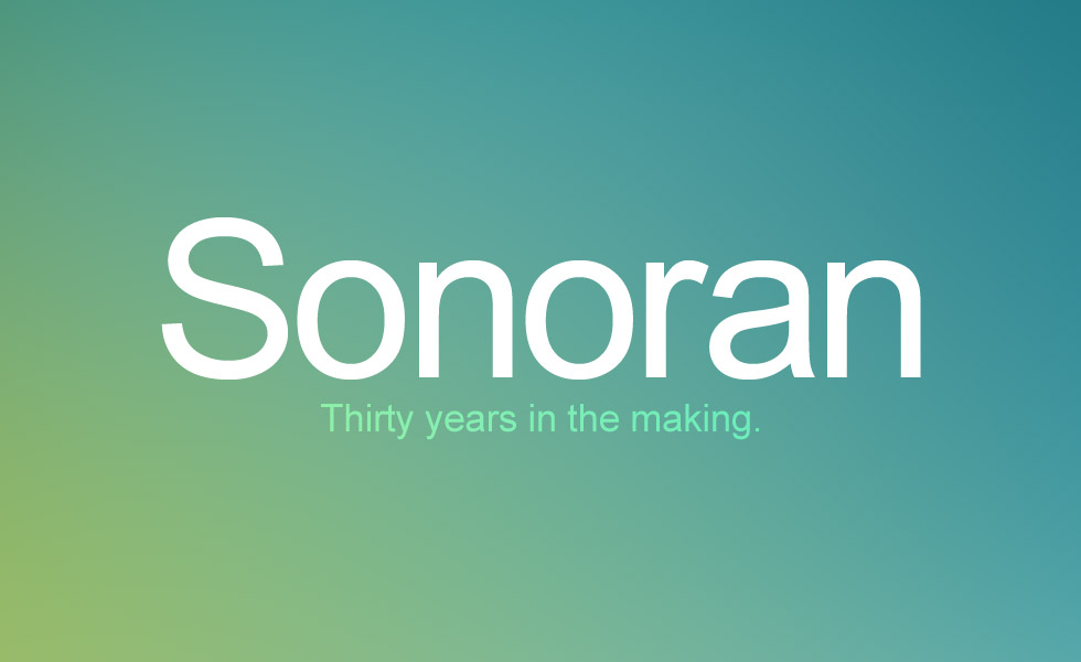
Introducing Sonoran, 2011’s most anticipated typeface release.
Nearly thirty years in the making, the highly anticipated Sonoran is finally here.
Typeface designers Robin Nicholas and Patricia Saunders first began work on Sonoran in the early 1980s, drawing inspiration from the classic Swiss typeface Helvetica. “Helvetica is a great font, people really love it. But it does have its flaws,” says Nicholas. “With Sonoran, our main goal was to fix Helvetica’s mistakes.”
Filed under: typography
Comments: +
March 2 2011
“Decide who you are, decide what you want to do, and then do it, because it is surely possible.”
Wise words from an incredible individual who left the design community all too soon. Doyald Young, a designer, writer, teacher and mentor, regrettably passed away February 28th from complications during heart surgery. Although this extremely talented and passionate designer is no longer with us, his lifetime of work will carry on and be celebrated by all who encounter it.
Filed under: typography
Comments: +
February 25 2011
.")
Flat. Generic. Invisible. Myriad is the ninth installment in our ‘Know your type’ series.
In the early nineties, when typeface designers Robert Slimbach and Carol Twombly set out to design a new sans-serif for Adobe, the goal was to create something generic—jokingly calling the typeface ‘Generica’ during its design. “We wanted to make almost a totally invisible type of letter, just very generic… something that really didn’t show anyone’s personality too much,” explains Slimbach in Adobe Magazine.
Filed under: typography
Comments: +
November 9 2010
")
8 Faces is a magazine about typography, created by British designer Elliot Jay Stocks.
I had the pleasure of meeting Elliot Jay Stocks at the Brooklyn Beta conference in October, where he gave a presentation on the story behind 8 Faces magazine. He had a clear passion to fill what he saw as a gap in our industry and to create something unique that was worth printing.
His mission fits in with an ongoing discussion I've been having with some typographer friends of mine. We've been talking about the inaccessibility that designers can feel when it comes to typography. It can sometimes seem like a ‘black art’ within our industry that only the initiated few will ever truly understand. Although we often work closely with text every day, the process of making it and the overwhelming choice when selecting it can create barriers to good results.
Filed under: typography
Comments: +
October 26 2010
")
Designed by a perfectionist and self-taught printer, Baskerville is the eighth font to be explored in our ‘Know your type’ series.
Baskerville, designed in 1754, is most known for its crisp edges, high contrast and generous proportions. The typeface was heavily influenced by the processes of the Birmingham-bred John Baskerville, a master type-founder and printer, who owed much of his career to his beginnings. As a servant in a clergyman’s house, it was his employer that discovered his penmanship talents and sent him to learn writing. Baskerville was illiterate but became very interested in calligraphy, and practised handwriting and inscription that was later echoed in strokes and embellishments in his printed typeface.
Filed under: typography
Comments: +
August 17 2010
")
As a graphic designer, typography is the backbone of my practice. Fascinated with the construction of letterforms, my interest lead me to the work of chemical engineer and Holocaust survivor, Charles K. Bliss, who devoted his life to developing a system of bringing people closer together.
This is the story of an international auxiliary language that brought many people a voice they otherwise would not have.
Born in Austria, Bliss grew up among many nationalities that were constantly in conflict. As World War II broke out in Europe, he left his factory in Vienna and fled to Shanghai in 1940, where there was an international settlement that allowed him to stay and work as a photographer and filmmaker. In the six years that Bliss stayed in China, he became drawn to Chinese ideograms and paid scholars to teach him about the history of the characters.
Filed under: typography
Comments: +
June 30 2010
")
While Western letterpress printing has made a recent revival, what was once considered one of the Four Great Inventions of Ancient China is no longer a sustainable practice in its country of origin.
Wai Che Printing Company, preserved by its 81-year-old owner Lee Chak Yu, has operated on Wing Lee Street with its bilingual lead type collection and original Heidelberg Cylinder machine for over 50 years. Curious to learn more, I visited Wai Che—one of the last remaining letterpress shops in Hong Kong—to understand how Chinese movable type differed and why this trade has become obsolete.
Filed under: typography
Comments: +
June 11 2010
Unless your name is Massimo, chances are you have more than three or four typefaces in your collection.
Personally, I have always struggled to keep my font library organized. Over the years I have tried a number of software applications, but never felt completely comfortable with what I've used. It’s a huge investment to try out a new solution, so that typically means putting up with the bloated or sluggish software in exchange for some ‘time-saving’ features like auto-activation and font previews.
Filed under: typography
Comments: +
February 12 2010

Type designers lend an ampersand to help Haiti.
The Society of Typographic Aficionados (SOTA) have recently announced their latest Font Aid benefit project. Working under the theme ‘Coming Together,’ hundreds of type designers have contributed an ampersand for a special benefit font, currently under development. All proceeds from the collaborative font will help Doctors Without Borders in their relief efforts following the recent disaster in Haiti.
Filed under: typography
Comments: +
February 3 2010
")
Designed by an architect, and known today as the face of The New York Times, Cheltenham is the seventh installment in our ‘Know your type’ series.
American architect Bertram Grosvenor Goodhue was known for his involvement in the gothic revival at the turn of the 20th century, designing countless churches and buildings, including the Nebraska State Capitol and the Los Angeles Public Library.
But before that, he designed a typeface.
Filed under: typography
Comments: +
December 22 2009

Scientists say no two snowflakes are alike. Apparently, designers have their own opinion.
From holiday storefronts to ski chalet logos, it seems this six-sided shape can be seen everywhere this time of year. Even spotted on the back of my cancelled airline ticket (thanks the weekend snowstorm in New York), this flake sure gets around. But why? If Wilson Alwyn Bentley was able to capture over 5,000 unique “tiny miracles of beauty” at the turn of the 20th century—is there any reason designers favor this particular snowflake?
Filed under: typography
Comments: +
December 8 2009
")
From Brazilian graphic designer Andre Felipe, Typo/graphic Posters is an online art gallery for the typography-obsessed.
Bursting with typographic goodness, the Typo/graphic Posters project has just been relaunched. The site features posters from over 300 designers and agencies around the world, curated for their strong “typographical and graphical content.”
Filed under: typography
Comments: +
November 11 2009

Typography on the web
The future of web typography is coming… but not quick enough.
Nearly fifteen years ago Netscape 1.0 was introduced. With it came the (now retired) <font> tag, giving web designers the ability to adjust text sizes in HTML for the first time.
Since then, the Internet has progressed enormously in many ways—you can watch your favorite TV show in high-definition or chat in real-time with friends across the world—but little has changed in the world of typography since the introduction of CSS a few years later.
Filed under: typography
Comments: +
October 1 2009
")
Called the “Helvetica of England,” the sixth installment in our ‘Know your type’ series is the humanist sans-serif Gill Sans.
Influenced by the ‘Underground’
The history of Gill Sans stems from Edward Johnston’s iconic typeface, Johnston Sans, designed for the London Underground in 1913. Eric Gill, who had studied under Johnston at London’s Central School of Arts and Crafts, later became a friend and apprentice—and even had a small role assisting in creation of the proprietary typeface.
Filed under: typography
Comments: +
September 18 2009
, tonystl on Flickr (right)")
Cambozola or Baldessare? Molbo or Arsis? How well can you tell your fonts from cheese?
Fun for a slow Friday, Cheese or Font is an online quiz created by Tony Gambone that tests your knowledge of font/cheese names (it's harder than it sounds!). The site also puts together some interesting stats: with almost 2 million questions asked, Helvetica was easiest item (obvious, yet 11% think Helvetica is a cheese?). Give it a try and let us know how you do.
Filed under: typography
Comments: +
September 16 2009
When IKEA switched to Verdana for their 2010 catalogs, the move was highly criticized. But it looks like IKEA may have the last laugh as Verdana, along with web-safe pal Georgia, are getting a makeover fit for print in 2010.
An early sample of the new Verdana & Georgia
Designed by Matthew Carter and hand-hinted by Tom Rickner, the Georgia and Verdana typefaces were originally commissioned by Microsoft in the early days of the web to address the challenges of on-screen display. The fonts were initially released in 1996 with Microsoft’s ‘Core fonts for the Web’ and later shipped with Windows and Max OS, becoming two of the most widely used typefaces on the Internet.
Filed under: typography
Comments: +
September 3 2009
It's no secret that we love fonts. So, of course, every month we look forward to reading the latest Creative Characters.
Creative Characters, which debuted July 2007 from font distributor MyFonts, is a monthly newsletter interview series with some of today’s most respected type designers. The series provides a rare opportunity to learn more about the people who create the typefaces we love. Here are a few gems from the collection:
Alejandro ‘Ale’ Paul

Alejandro Paul is a co-founder of the first Argentinean type collective, Sudtipos. Known for his many script fonts, he recently received his second Type Directors Club award for his typeface Adios Script. Starting out as a graphic designer, he explains how he transitioned naturally into a type designer
Filed under: typography
Comments: +
August 26 2009
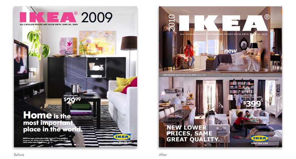
After 50 years of the iconic Futura typeface, IKEA has made a switch to… Verdana?
The 2010 IKEA catalog, now arriving at doorsteps around the world, reveals the company’s choice to change all typography to the Microsoft font that every web designer has grown to hate (you can already hear the cries). Verdana, specifically designed for on-screen readability, first shipped with Internet Explorer 3 in 1996. Being one of the better looking ‘Core fonts for the web’—a limited selection which also includes Arial, Comic Sans, and Times New Roman—Verdana has become one of the most widely used fonts on the web (but rarely ever used in print).
Filed under: typography
Comments: +
August 25 2009
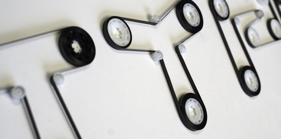
What do type lovers do with a box full of old mix tapes?
Following HandMadeFont, who make custom “typefaces” out of everything from grass to sticky notes, Turkish designer Ersinhan Ersin has found a good use for old cassette tapes. In a new project appropriately dubbed Tapeography, Ersin recycles the innards of old tapes to create his typographic works of art.
Filed under: typography
Comments: +
August 21 2009

For the fifth installment in our ‘Know your type’ series we look to Clarendon—an influential typeface that helped tame the Wild West, and the first to ever be patented.
A significant change
Named after Oxford’s Clarendon Press, the popular slab-serif was created in 1845 by Robert Besley for the Fann Street Foundry. Notable as one of the last new developments in nineteenth century typography, the letterforms represented a significant change from the slab-serif Antiques and Egyptians that were so popular in that time.
Filed under: typography
Comments: +
July 29 2009

Last week FontShop asked Twitter users to name their favorite underused typeface.
There will always be a place for classic type in contemporary design, and it’s safe and easy to rely on the same old standards, but using type that is underused is often the best way to stand out in an increasingly crowded and homogeneous design landscape.
Filed under: typography
Comments: +
July 23 2009
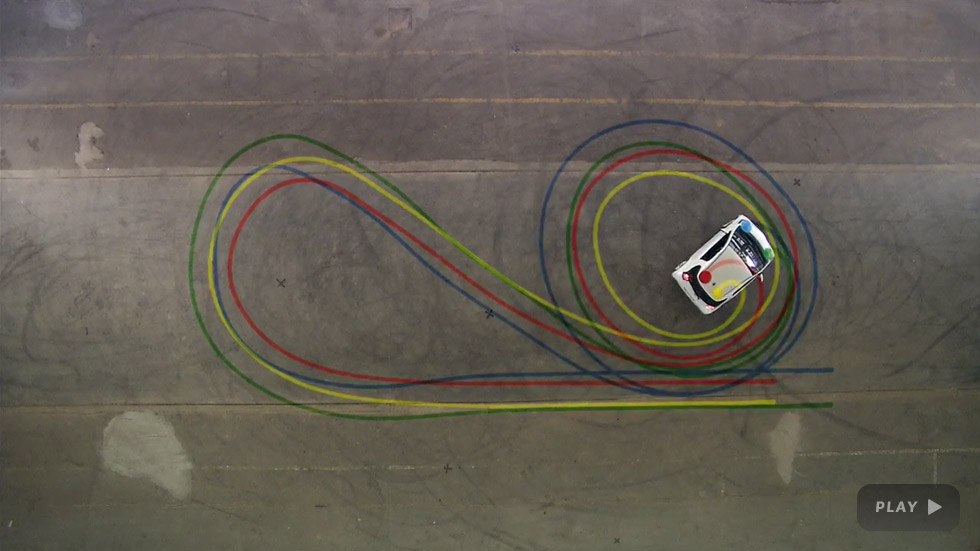
When two type designers, an interactive artist, and a professional race car driver got together… a font was born.
In a project sponsored by Toyota, Belgium-based design duo Pierre Smeets and Damien Aresta (of pleaseletmedesign) teamed up with race car driver Stefan van Campenhoudt to create a typeface using a car and some sophisticated software.
Filed under: typography
Comments: +
July 22 2009

Perhaps most well known from the successful Obama ’08 presidential campaign, Hoefler & Frere-Jones’ Gotham has been referred to as the typeface of the decade—and it’s the subject of the fourth installment in our ‘Know your type’ series.
Masculine, new, and fresh
Gotham was born in 2000, when men’s fashion magazine GQ commissioned New York-based Hoefler & Frere-Jones to create a new typeface for use in their publication. Provided with a brief to create something “masculine, new, and fresh,” type designer Tobias Frere-Jones drew influences from post-war building signage and hand-painted letters seen around New York City. Using the seemingly plain, geometric lettering from New York’s Port Authority Bus Terminal as the project’s touchstone, an American “working class” typeface was born.
Filed under: typography
Comments: +
July 14 2009
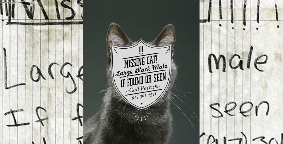
In neighborhoods around the globe, illegible handwritten flyers are pasted everywhere from bulletin boards to telephone poles. With Cardon Copy, recent SVA graduate Cardon Webb has taken it upon himself to clean up the ’hood—one missing cat at a time.
Following his mother's advice: “Leave it better than the way you found it,” Cardon took to the streets of New York City finding uninspired eyesores and treating them to an extreme makeover. Replacing the handwritten (or at best, Micosoft Word-created) posters with typographic works of art.
Filed under: typography
Comments: +
July 9 2009
Helveticons is a new set of royalty-free icons, glyphs and symbols based on the Helvetica Bold typeface.
Should you need icons for wire-framing, presentations, Web applications, buttons, promotional material, or something to put above your desk - Helveticons got you covered. Bundled with your download comes a .psd you can get inspiration from. Examples ranging from a basic Web button to a strong logotype should get you going in no time.
Filed under: typography
Comments: +
June 23 2009
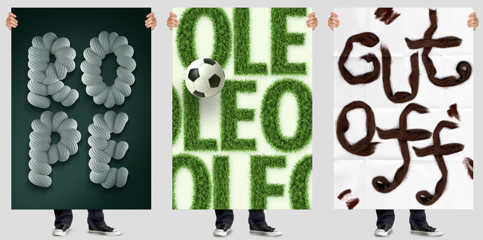
HandMadeFont creates unique, untraditional fonts out of some crazy materials—dirt, grass, toast, yarn... you name it.
Estonia-based HandMadeFont was founded in 2008 by Vladimir Loginov and Maksim Loginov. With an amazing 168 alphabets now available in their collection, you can find pretty much anything to make unique, striking headlines. Most sets are limited to single-case A-Z characters with numbers and limited punctuation, available as high-resolution Photoshop/Illustrator files.
A 10 font pack goes for 250 € (about $350) and or 780 € (around $1,050) for the entire collection.
Filed under: typography
Comments: +
June 17 2009
")
This is the third installment in the ‘Know your type’ series, where we take a look into the origins of some of the most interesting and commonly used typefaces in design today. This month, we look at the classic, geometric sans-serif, Futura.
Inspired by the Bauhaus
Following the Bauhaus design philosophy, German type designer Paul Renner first created Futura between 1924 and 1926. Although Renner was not a member of the Bauhaus, he shared many of its views, believing that a modern typeface should express modern models rather than be a rivial of a previous design. Futura was commercially released in 1927, commissioned by the Bauer type foundry.
Filed under: typography
Comments: +
June 12 2009
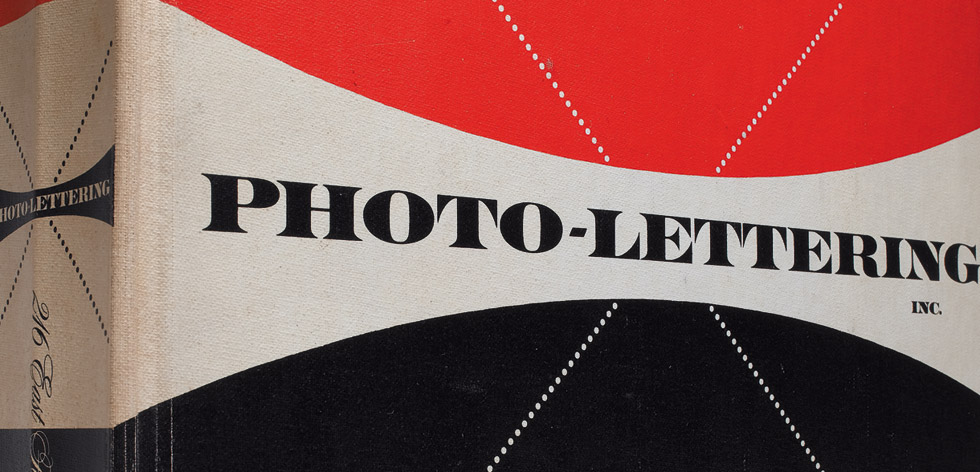
Once a mainstay of the pre-digital design & advertising industry, Photo-Lettering is making a comeback thanks to independent type foundry House Industries.
The Photo-Lettering library, a collection of film-based display type, was widely used by art directors and designers from 1936 until the rise of desktop publishing. Pioneering type house Photo-Lettering, Inc. (or PLINC, as it was affectionately known) utilized photo technology in the production of commercial typography and lettering, offering the largest library from a single foundry (before or since). Featuring type hand-drawn by the likes of Herb Lubalin, Milton Glaser and Seymour Chwast, New York City-based PLINC employed such influential designers as Ed Benguiat. Since going out of business in the late 1980s, graphic designers today best know Photo-Lettering from its highly collected type catalogs.
Filed under: typography
Comments: +
May 18 2009
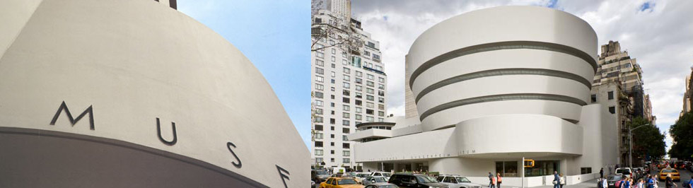
This is the second entry in the ‘Know your type’ series, where we take a look into the origins of some of the most interesting and commonly used typefaces in design today. This month, we look at the history of Hoefler & Frere-Jones’ Verlag.
Inspired by the Guggenheim's Art Deco lettering
This year the Solomon R. Guggenheim Museum celebrates its 50th anniversary in New York. Designed by American architect Frank Lloyd Wright in the 1950's, The Guggenheim is one of 20th century's most important architectural landmarks. The museum is the permanent home to a renowned collection of modern and contemporary art—but it's the lettering on the outside that we came to see.
Filed under: typography
Comments: +
April 30 2009
It's no secret most designers hate Comic Sans. But now, thanks to type designer Hannes von Döhren, we have a new (free) alternative called "HVD Comic Serif". Originally released in 2007, it now comes in a OpenType "Pro" version with an eastern, central and Western European language support.
Filed under: typography
Comments: +
April 29 2009
A fun look into letterpress printing with Mikey Burton.
Filed under: typography
Comments: +
April 8 2009
")
This is the first post in the ‘Know your type’ series, where we will take a look into the origins of some of the most commonly used typefaces in design today. The first typeface to get the treatment is DIN.
Born from the German railway system
 The history of the realist sans-serif known today as DIN goes back to 1905. At the time, the Prussian railway created a set of lettering with the purpose of unifying the descriptions on their freight cars. Following a merger of all German state railways in 1920, the master drawings of the Prussian railway became the reference for most railway lettering. Based on the master drawings, the D. Stempel AG foundry released the earliest version of a DIN face in 1923.
Filed under: typography
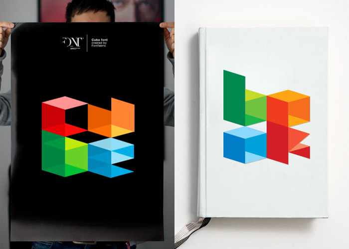
Independant type foundry Fontfabric has released a three-dimensional, cubic-style typeface called Cube font. The colorful font is available via Fontfabric's website (for free) in EPS format.
Filed under: typography