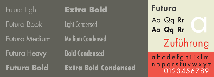
Know your type: Futura
Comments: +
June 17 2009
")
This is the third installment in the ‘Know your type’ series, where we take a look into the origins of some of the most interesting and commonly used typefaces in design today. This month, we look at the classic, geometric sans-serif, Futura.
Inspired by the Bauhaus
Following the Bauhaus design philosophy, German type designer Paul Renner first created Futura between 1924 and 1926. Although Renner was not a member of the Bauhaus, he shared many of its views, believing that a modern typeface should express modern models rather than be a rivial of a previous design. Futura was commercially released in 1927, commissioned by the Bauer type foundry.
While designing Futura, Renner avoided creating any non-essential elements, making use of basic geometric proportions with no serifs or frills. Futura's crisp, clean forms reflect the appearance of efficiency and forwardness even today.
Renner's initial design experimented with several geometrically constructed character alternatives and old-style figures, which can be found in the typeface Architype Renner: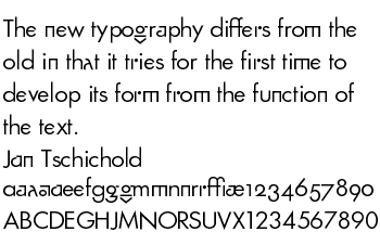
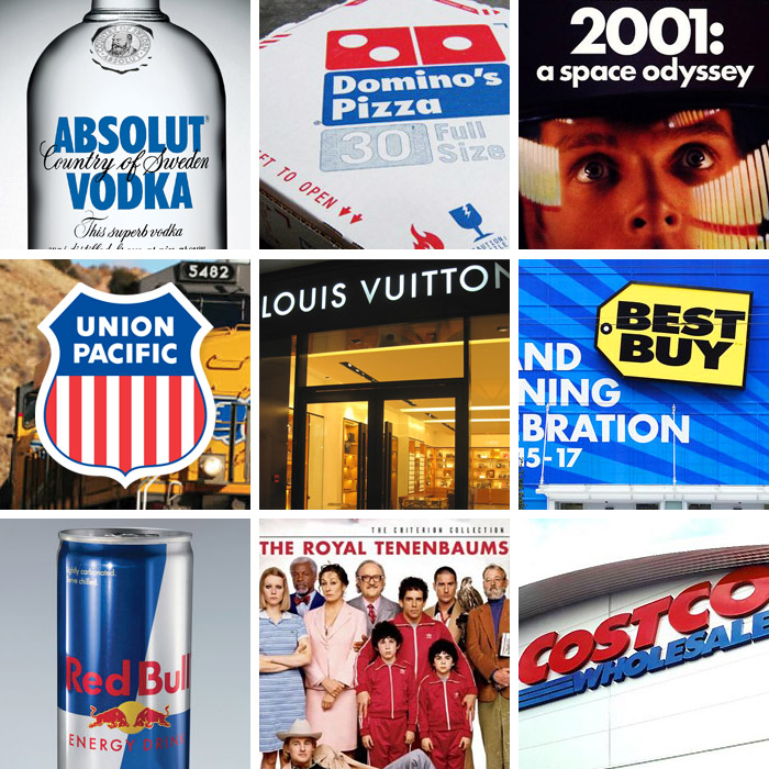
The success of Futura spawned a range of new geometric sans-serif typefaces, such as Kabel and Century Gothic, among others. Now over 80 years since its creation, many foundries have released variations of Futura in the digital form, Adobe being the one of the most commonly used. Several international companies also use their own customized version of Futura, including Volkswagen (visible in their renowned advertising) and IKEA.
From the moon to the big screen
Futura had the honor of being the first typeface on the moon, chosen for a commemorative plaque left by the astronauts of Apollo 11 in 1969.
")
Iconic filmmaker Stanley Kubrick used Futura religiously in many of his films, notably 2001: A Space Odyssey and Eyes Wide Shut.
It was Stanley's favourite typeface. It's sans serif. He liked Helvetica and Univers, too. Clean and elegant... I was always trying to persuade him to turn away from them. But he was wedded to his sans serifs.
- Tony Frewin, on working with Stanley Kubrick
More recently, Wes Anderson has done the same with his films (The Royal Tenenbaums, The Life Aquatic, etc), using Futura (specifically Futura Bold) almost exclusively in the artwork, credits, and even within the films.
Popularity today
Futura (and its variants) have become an extremely popular typeface for countless corporate logos, commercial products, films and advertisements for years. In fact, so popular that certain art directors had began boycotting its use in with Art Directors Against Futura Extra Bold Condensed, published in 1992's TDC Typography 13.
Regardless, Futura remains one of the most used (and loved) sans-serif fonts today with no signs of slowing down.
Usage
Also see:
Filed under: typography
Comments