Comments: +
October 11 2011

Brand Thinking and Other Noble Pursuits is the latest book from Debbie Millman. In this ‘Design discussions,’ we speak with the author about the book, her time as president of the AIGA, and her thoughts on the most important aspects of creating a brand.
The name Debbie Millman should be familiar to most idsgn readers. Former president of the AIGA, Millman hosts a weekly online talk show called Design Matters and is the author of several design books, including How to Think Like a Great Graphic Designer. She is also a contributing editor at Print Magazine, chair of the Masters in Branding program at the School of Visual Arts in New York, and president of the design division at Sterling Brands. And I could go on and on.
Filed under: branding
Comments: +
September 26 2011

Steve Jobs’ recent departure from Apple was met with sadness and nostalgia within the design community. And rightly so. Jobs had a unique appreciation for the value of design and allowed designers to flourish in a way that is rarely seen in business.
This mutual respect led to some of the most beautiful industrial design and revolutionary products in human history. Talented designers like Jonathan Ive and others, serendipitously met one of the most visionary CEOs in history. This allowed designers to create products, experiences, and interactions based on what was important to the people using them. It doesn’t seem revolutionary, but the trust and freedom offered by Apple stands apart in a world where designers are often forced to base their designs on what is important to a committee and to the fearful levels of corporate structure.
Filed under: branding
Comments: +
September 11 2011
A decade later‚ COLLINS asks: how should we commemorate 9/11?
From commemorative pins to stars-and-stripes-clad paraphernalia, there have been many attempts to commemorate the events of September 11‚ 2001 over the past ten years.
Stepping away from overt imagery and attempting to create a symbol that can resonate on a more global scale, New York-based firm COLLINS has taken upon itself to create a new symbol to honor 9/11.
Filed under: branding
Comments: +
March 29 2011
 and American Kraft Macaroni and Cheese (right)")
It’s cheesy, neon orange, and makes a meal for four in 9 minutes. In this Parallels, we look at Kraft (Macaroni and Cheese) Dinner.
Kraft Dinner (that’s right, Kraft Dinner) could very well be America’s first convenience food. Preceding the TV dinner by nearly two decades, Kraft’s eponymous Dinner was first introduced to American test markets in 1936.
By 1937, the product was launched nationally across Canada and the United States, selling 9 million boxes in its first year.
Filed under: branding
Comments: +
January 6 2011
![]()
The world’s largest coffee chain reveals an updated logo, removing its ‘Starbucks Coffee’ wordmark.
The new logo, which was introduced January 5th on the company’s website, retains the memorable “siren” that has served as Starbucks’ icon since the company’s formation in 1971. Dropping the ‘Starbucks Coffee’ wordmark, the company attempts to position itself to market other (read: non-coffee) products—over the past few years Starbucks has dabbled in music, ice cream, and even booze.
Filed under: branding
Comments: +
October 11 2010

MySpace has an identity crisis. Can a new logo revive the dying social network?
Attendees at Friday’s Warm Gun design conference in San Francisco had a sneak peak at MySpace’s upcoming brand relaunch. Presented by Mike Macadaa, MySpace vice president of user experience and design, the new logo marks the biggest visual change in the MySpace brand since its launch in 2003.
Filed under: branding
Comments: +
October 7 2010
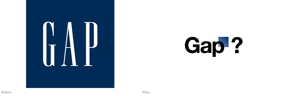
One of America’s most recognizable clothing brands launches a new logo—or not.
After quietly posting a new logo on Gap.com earlier this week, the online community was to quick to respond with overwhelmingly negative feedback. After all, Gap has built a solid brand since its humble beginnings in 1969 as a Levi’s and record store. So why trade that for Helvetica (and an awkwardly placed square)?
Filed under: branding
Comments: +
September 30 2010
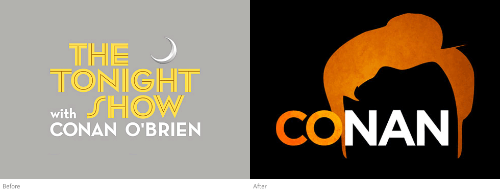
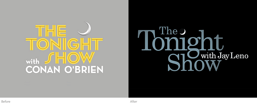
Conan O’Brien unveils the logo for his upcoming show on TBS.
Back in February we reported on the new Tonight Show logo, following Jay Leno’s controversial takeover of the show (briefly) hosted by Conan O’Brien. This November, Conan O’Brien will make his return to television with a new show on TBS called, simply, Conan.
The logo for this new series puts the spotlight on O’Brien’s trademark red hair. A defining feature since his start on television in the nineties (as highlighted on the cover of Rolling Stone in 1996), it has become even more iconic in recent months. Throughout NBC’s highly-publicized Tonight Show controversy, O’Brien won mass public support as he was pushed away from his show. Fans embraced ‘Team Coco’ with t-shirts, artwork, and sold-out tours that seemed to have one visual theme in common: the famous red hair.
Filed under: branding
Comments: +
August 23 2010
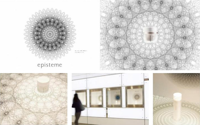
In a follow-up to our previous post on award-winning print design at the 57th annual Cannes Lions festival, we have selected some of the notable identity projects in the design category.
Episteme Skincare, Bronze
Filed under: branding
Comments: +
May 25 2010
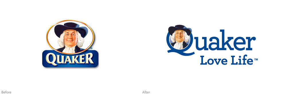
Quaker Oats quietly introduces a new logo as the company focuses on “wholesome” products.
The Quaker Oats Company has a rich history dating back over 130 years in the United States. Founding mill owners Henry Seymour and William Heston originally chose the name after reading about The Religious Society of Friends (better known as Quakers) who were known for quality and honest value. Although they had no ties to the religious group themselves, the name stuck. In 1877, the iconic Quaker Man (a fictitious character dressed in traditional Quaker garments) became America’s first registered breakfast cereal trademark. Parents have been grossing kids out with steaming bowls of mushy oats ever since.
Filed under: branding
Comments: +
April 14 2010
![]()
After months of hinting and speculation, Adobe has unveiled the latest version of its popular design toolbox, Creative Suite 5. Beneath a mountain of new features, the suite also received a comprehensive brand refresh. We talked with Adobe’s brand design team to find out more.
Since its humble, grayscale beginnings on the Macintosh Plus, Adobe Photoshop—and more recently, the Adobe Creative Suite—has become a vital component in nearly every designer’s toolbox, forever changing the way we work.
Filed under: branding
Comments: +
April 1 2010
Following IKEA’s lead, Apple Inc. has changed its corporate typeface to Verdana.
The California-based computer and electronics company, best known for its Macintosh computers and iPods, announced today the company will be adopting Verdana as its corporate typeface. The typographic change, Apple’s first since 2001, was spotted on several of the company’s international websites Thursday morning, and will soon be visible on all new packaging and marketing materials.
Filed under: branding
Comments: +
March 30 2010
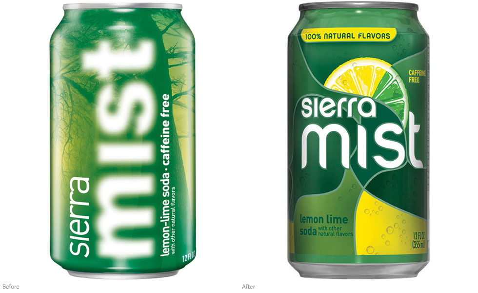
Pepsi has recently unveiled the new logo and packaging for their Sierra Mist brand—the lesser known ‘uncola.’
The lemon-lime-flavored soft drink has sure seen its fair share of brand makeovers during its relatively short ten year existence. Interestingly, the latest comes less than a year and a half after the previous attempt—which was launched alongside Pepsi’s infamous refresh and Tropicana flop (all designed by New York’s Arnell).
Filed under: branding
Comments: +
February 18 2010
The dust has finally settled following the heavily publicized ‘Late-Night Wars.’ On March 1st, Jay Leno will return as the host of The Tonight Show, but his logo will not.
For more than a decade, comedian Jay Leno was the host of NBC’s The Tonight Show. Taking over from the legendary Johnny Carson in the early ’90s, Tonight has become the longest running entertainment program currently on air in the United States. The network came under fire in the past year, however, following their decision to move Leno to a new prime time program after his supposed retirement. The Tonight Show franchise was left in the hands of Conan O’Brien, but only long enough for both shows to suffer a ratings slide and cause NBC execs to quickly hit ‘undo.’
Filed under: branding
Comments: +
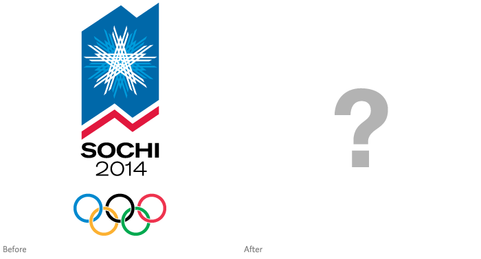
December 1 2009
![]()
We’ve waited—and we’ve even seen some early concepts—but today the official Sochi 2014 logo was unveiled in Russia.
Developed by Interbrand in conjunction with Sochi’s own brand council, the new logo is simpler than anything we’ve seen in recent history. Stepping away from the traditional practice of incorporating an abstract cultural image (London 2012 excluded), Russia opted for an all typrographic treatment for the Winter Olympic Games in 2014.
Filed under: branding
Comments: +
November 23 2009
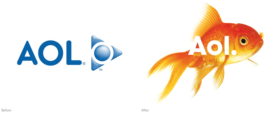
The company that bombarded us with billions of unsolicited America Online disks moves on, sans-triangle.
Suffering from significant drops in subscriptions (seriously, does anyone still use AOL?), the company announced yesterday in a press release it will adopt a new brand identity. Created by Wolff Olins, the full makeover will be unveiled on December 10th when AOL is spun off from parent company Time Warner.
Filed under: branding
Comments: +
November 23 2009
![]()
Could this be the new identity for the 2014 Winter Olympic Games in Sochi, Russia?
After reports of a closed press conference Friday in Moscow, images have begun to surface of what might be the new Olympic Games logo. Saying goodbye to the snowflake design from the bid, the unconfirmed logo features five torch flames (or leaves? feathers?) formed into a ring formation and set in the Olympic colors.
Filed under: branding
Comments: +
November 19 2009
")
To hawk a centuries-old spirit, vodka manufacturers concoct innovative flavors and get creative with the bottle. Bacon-flavored shot, anyone?
Vodka. It’s the most basic of spirits—colorless, odorless, and nearly tasteless. The drink of the czars, produced in Russia and Poland since the end of the 9th century, presents modern distillers with a thorny dilemma: how best to sell an essentially neutral product to a restless generation that demands a wide range of choice in everything they buy, from triple soy half-caff lattes to sneakers? Two front running approaches are to offer as many different flavors as Vitamin Water, and to package the product in a memorable bottle.
Filed under: branding
Comments: +
November 5 2009
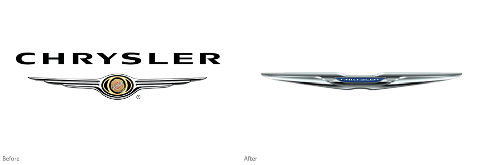
Following a Chapter 11 bankruptcy, all-time low sales, and a new partnership with Italian automaker Fiat, it comes as no surprise that Chrysler wants to reinvent itself.
Yesterday the new Fiat-directed Chrysler Group unveiled its long-awaited 5-year business plan, announcing a plan to sell smaller Fiat-designed vehicles and pay back billions in U.S. bailout loans by 2014. The 7-hour marathon press conference also featured a presentation (PDF) on the Chrysler brand by marketing chief Oliver Francois, which introduced a new logo for the struggling car manufacturer.
Filed under: branding
Comments: +
October 30 2009

It’s almost Halloween and no trick-or-treat bag is complete without a twisty, colorful roll of (depending where you call home) Smarties, Fizzers, or Rockets.
Admittedly not one of my most favorites, the chalky pastel-colored candy could usually be found near the bottom of my treat bag. Weeks after Halloween they would remain next to the yellow lollipops, little boxes of raisins, and—the worst offender—the rock-hard, black-and-orange wrapped molasses candies (an oddity of growing up in Canada).
Filed under: branding
Comments: +
October 22 2009
![]()
Cats, deer, monkeys, bats, birds… a variety of species can be found on many of the world’s most recognizable logos. Save Your Logo is a global initiative aimed at these brands as a way to give back to their beloved creatures.
Backed by the Global Environmental Facility (GEF), the World Bank, and the International Union for Conservation of Nature (IUCN), the French-based Save Your Logo was founded to support the biodiversity of the plants and animals represented on logos across the world. The initiative also focuses on education and community engagement in efforts to help preserve a healthy planet.
Filed under: branding
Comments: +
October 15 2009
")
When Kraft launched a spin-off of their uniquely Australian Vegemite spread, they turned to consumers for a name… and it was dropped four days later. Last week another name was announced, can Kraft make it right this time?
The year was 1923 when chemist Cyril Callister took out a newspaper ad announcing his new food invention, a salty yeast extract spread made from the by-products of beer manufacturing, and a £50 award for the best name. Similar to the British Marmite, the sticky brown paste has become a staple in the country, selling more than 22 million jars per year. Over 85 years later, Kraft Foods followed Callister’s plan to name a new milder variation—a Vegemite and cream cheese blend—with much less fanfare.
Filed under: branding
Comments: +
September 23 2009
")
Non-profit Conservation International convinces two of the world’s biggest brands to ‘go green.’
Continuing with our Advertising Week coverage, we caught a surprisingly engaging discussion with Howard Schultz (CEO of Starbucks), Rob Walton (Chairman of Wal-Mart), and Peter Seligman (Co-Founder and CEO of Conservation International).
Filed under: branding
Comments: +
September 4 2009

The popular travel site has launched a new logo and promises more to come.
Launched in 2004, Kayak.com is a travel search-engine that compares other travel sites in an attempt to find the best possible deal. Making money from advertising and click-throughs, rather than making deals with airlines or travel providers, Kayak aims to become the ‘Google’ of travel.
Filed under: branding
Comments: +
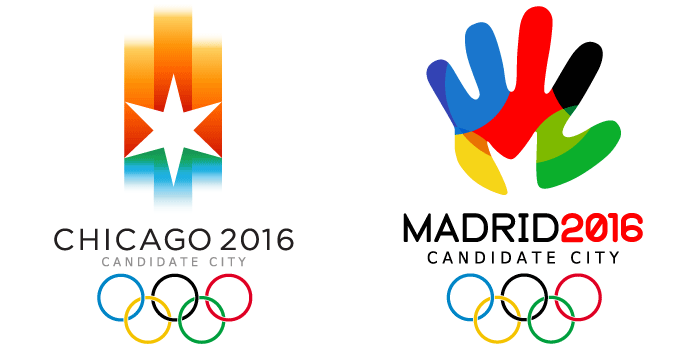
August 14 2009
Last week we asked readers to vote on their favorite candidate logo for the 2016 Summer Olympics. We have the results—and we also take a look at how the winning logo might evolve.
Our readers have spoken, with Madrid coming out on top (receiving 48% of the votes) and Chicago coming in second (with 27%). We'll have to wait until October to find out what the Olympic Committee decides, and (as a couple commenters pointed out) the final logo may change drastically.
Today we take a look at the identities of the Games over the past decade to see how they have evolved from the bid process into the official mark seen around the world.
Filed under: branding
Comments: +
August 4 2009
Two months from now the International Olympic Committee will name the host city of the 2016 Summer Olympics. If the decision were based solely on design, which candidate would win?
Filed under: branding
Comments: +
August 2 2009

Nickelodeon wipes away the slime as the popular kids’ network celebrates its 30th anniversary.
The MTV-owned cable channel has announced a new identity which will debut this fall. Representing its biggest change in 25 years, the new logo marks a departure from the familiar ‘splat’ in favor of a more standardized look. While the new logo has not officially aired, it can already be seen on material for the upcoming Nickelodeon Animation Festival and new merchandise like DVD box sets.
Filed under: branding
Comments: +
July 31 2009
 and Australia (right)")
Eating a bowl of Kellogg’s Rice Krispies—and listening to it “snap, crackle, and pop”—is pretty much a requirement, growing up in North America. So when we first discovered Rice Bubbles (as they are known in Australia and New Zealand), we were intrigued enough to start a new blog series: Parallels.
Little more than puffed rice and sugar, the breakfast cereal was first launched in the United States in the late twenties. Perhaps most loved for its use in ‘Rice Krispie Squares,’ the brand's long advertising history has made Rice Krispies a household name for generations.
Filed under: branding
Comments: +
July 24 2009
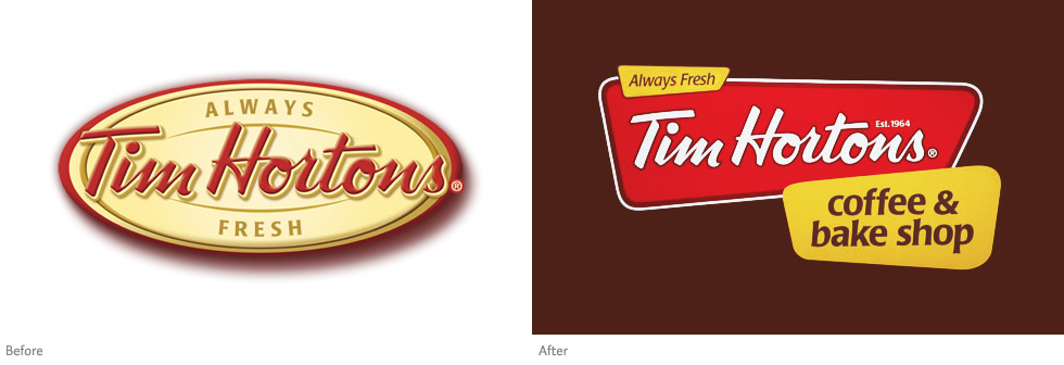
Last week Canadian coffee and doughnut giant Tim Hortons invaded New York City, rebranding and opening 12 locations nearly overnight.
As someone who grew up in Canada, it is hard to explain the significance of the Tim Hortons brand. Founded and named after a famous hockey player in 1964, Tim Hortons’ trademark Timbits and Ice Capps are ingrained in the country’s culture. With around 3,000 locations, Tim Hortons is the largest food service operator in Canada, even larger than McDonald’s and Starbucks, selling about two billion cups of coffee per year. But to most Americans, Tim Hortons means nothing. “The biggest challenge will be to get New Yorkers to know what Tim Hortons is,” the Riese Organization (the local franchisee) told the New York Times.
Filed under: branding
Comments: +
July 7 2009
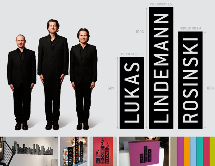
The 56th annual Cannes Lions International Advertising Festival recently took place in France, its second year to include awards for design. Among the many winners in the wide-ranging design category, we have selected some of the notable identity projects.
Lukas Lindemann Rosinski, Bronze
Filed under: branding
Comments: +
July 6 2009
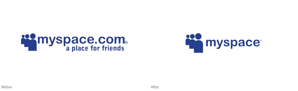
With mass employee layoffs, declining marketing dollars, and millions of annoyed users, social networking site MySpace has appropriately downsized their logo. While hardly worth mentioning (design-wise), the change marks the beginning of the end for a site which was once the most popular of its kind.
The change comes after what Fast Company calls “the largest de-friending in its history” with MySpace laying off 30% of its U.S. workforce mid-June, and two-thirds of its international employees a week later.
Notably, the slogan “a place for friends” is dropped, which has been a part of the logo since its launch in 2003. An appropriate move, as ‘friends’ leave the site and flock to Facebook by the millions.
Filed under: branding
Comments: +
July 2 2009
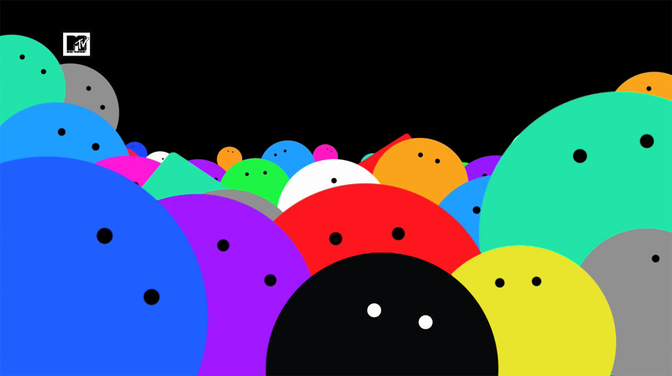
MTV International is launching a new look this week across all 64 of its worldwide channels, led by UK studio Universal Everything.
The new look, referred to by the design team as “pop x 1000%”, retains the old logo but strips it of the colors and textures that often adorned the iconic symbol since its launch in 1981. “Now the logo is sacred,” says Roberto Bagatti, Vice President of Creative for MTV Networks.
Filed under: branding
Comments: +
June 24 2009
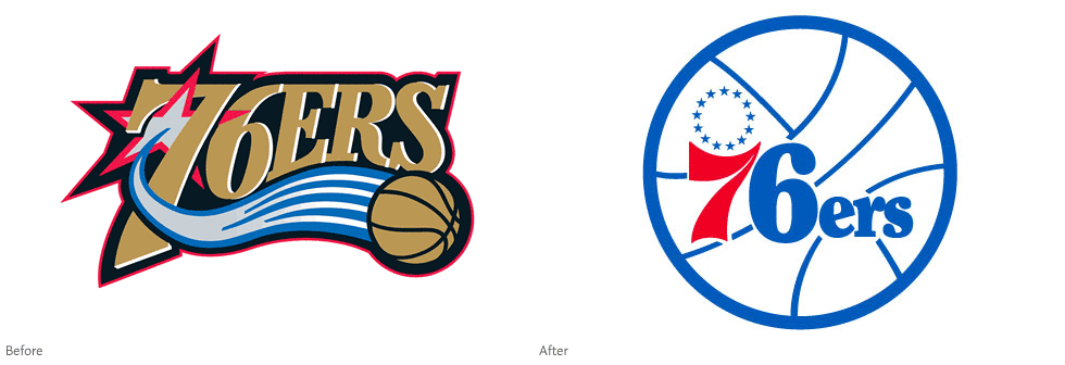
NBA basketball team The Philadelphia 76ers are officially making a switch back to their classic 1977 logo. Making fans happy and adding to the growing list of brands going ‘retro’ in 2009.
Introduced in 1977, the vintage blue and red logo was used famously during the Sixers' heyday, including their 1982-83 championship run. In 1997 it was replaced with the ‘modernized’ gold and silver logo, which has been in use ever since.
I'm no sports fanatic but I'm happy to see the classic logo come back. We've already seen leading soft drink and snack companies do it, so why not professional sports teams? The '77 logo still looks clean and refreshing next to the mess of swooshes and stars that reek of bad 90's design. I'm only amazed it took them this long to make the switch.
Filed under: branding
Comments: +
June 22 2009
![]()
Although many people will never realize the change, Mozilla has just announced a new logo for the upcoming Firefox 3.5.
The (slightly) refreshed identity was designed by Anthony Piraino from the Iconfactory, directed by the logo's original designer along with the team at Mozilla. As described in the extensive creative brief, the goal was to modernize the overall look of the logo. Did it really look out of date?
You have to look close (grab your magnifying glass), but the most notable differences include finer hair detail and depth shading on the fox, flames that wrap around the globe, and a few heavy coats of gloss on the globe itself. I don't know if it really looks more modern, but it is definitely more detailed. Which is not necessarily a good thing for an identity—a lot of the charm of the original logo was in its iconic stylization. But truth be told, it looks pretty much the same.
Filed under: branding
Comments: +
June 18 2009
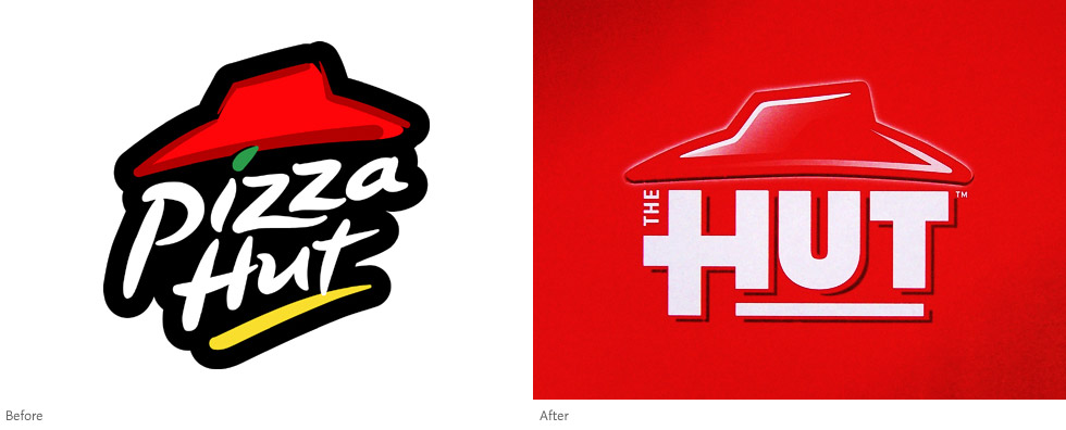
With a significant decline in sales, Pizza Hut is responding to the tough economic times by launching a new branding strategy. Will ‘The Hut’ make you want to eat out again?
It's no secret, more consumers are choosing to dine at home and avoid 'junk' foods to save money. The largest player in the pizza industry is trying to win back pizza fans with a new image and menu items like all-natural multigrain pizza, lasagna, and wings.
Filed under: branding
Comments: +
June 5 2009
, After photo by carianoff on Flickr")
2009 is turning out to be the year of retro food packaging. We've already seen Pepsi and General Mills try it out, now Nabisco is following suit with vintage renditions of Ritz crackers and Oreo cookies.
The vintage-inspired packaging, from Kraft-owned Nabisco, focuses on a clean minimal aesthetic—gone are the countless gradients, glows, and warped type. While simple, it is a breath of fresh air on supermarket shelves typically stuffed with over-designed products. A nice way to reinvent a couple of otherwise boring products.
Filed under: branding
Comments: +
June 3 2009
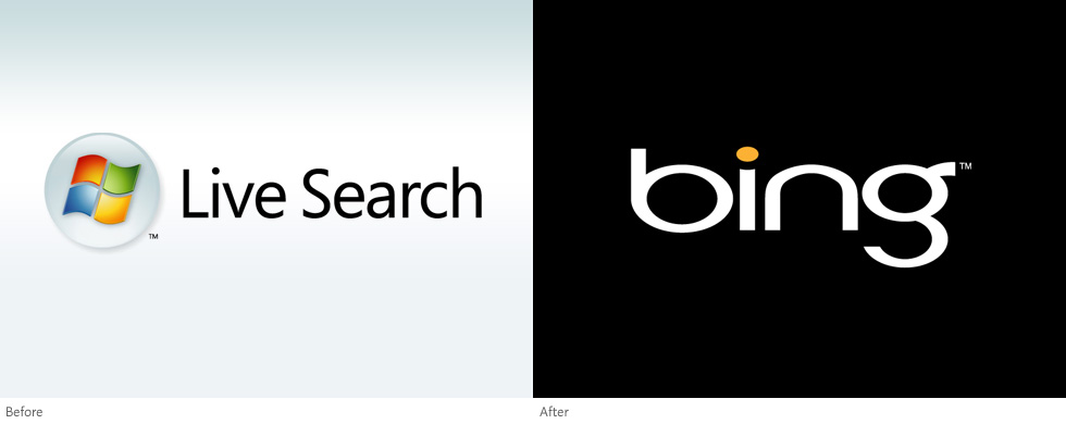
Microsoft officially launched Bing worldwide today, a rebranding of their Live Search engine. With a new identity and features that promise to make searching easier, will you say goodbye to Google and ‘Bing it’?
Bing, dubbed as a "decision engine", is Microsoft's attempt at winning some of the search market from Google and Yahoo in a fight for advertising dollars. The name was conceived with help from branding company Interbrand, chosen for its simplistic spelling (and the fact it can be used as a verb). To launch the service, Microsoft has hired JWT for a nearly $100 million marketing campaign, beginning with a 60 second TV ad.
Filed under: branding
Comments: +
May 29 2009
Just when you thought the Disney brand couldn't be stretched any further, here comes Disney-branded produce. The most recent addition to the family of products: Disney "Farm Fresh" eggs. Now available at your local grocery store alongside High School Musical avocados and Finding Nemo oranges.
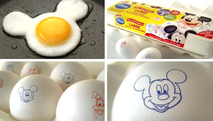
What makes an egg Disney? A small one-color stamp of "your pals" on the shells... and a higher price tag. It is obviously aimed at kids, but what kids even see the egg shells? The TV commercial shows eggs prepared in a "fun" Mickey Mouse shape, but good luck creating that at home. Still, these eggs are flying off the shelves.
Filed under: branding
Comments: +
May 11 2009
Ije Nwokorie, Senior Strategist at Wolff Olins in the UK discusses the importance of brands in recession.
Filed under: branding
Comments: +
May 8 2009
Not long after releasing their (controversial) new logo, Pepsi announces 'Pepsi Throwback'. Throwback features a retro look and is sweetened with natural sugar, as opposed to high-fructose corn syrup.
It looks like a similar product to Pepsi Retro, released last year in the Mexican market with a similar package.
Filed under: branding
Comments: +
May 4 2009
Located in Kansas City, chefBURGER is a new burger joint with some great branding by Tad Carpenter at Design Ranch.
![]()
At chefBURGER, you'll find some unique burgers with unusual toppings like fried green tomatoes, cranberry chutney, and sriracha coleslaw—which you can enjoy alongside a spiked milkshake. The logo, which features an "ever-changing burger head", was inspired by the restaurant's seemingly endless burger options.
Filed under: branding
Comments: +
April 29 2009
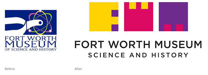
The Fort Worth Museum of Science and History in Texas has a fresh new logo created by DJ Stout of Pentagram. The identity gets its inspiration from the architecture of the museum's new building, with its recurring use of geometric shapes and rich colors, designed by architect Ricardo Legorreta. The new logo is a welcoming improvement over the existing logo, which was nicknamed the 'Nuclear Spur.'
Filed under: branding
Sunny D (formerly Sunny Delight) has been rebranded in the UK by global brand consultancy Elmwood.
![]()
The new Sunny D is an entirely new drink, which now contains 70% fruit juice with no artificial ingredients, preservatives, or added sugar. The new product (including the packaging) has taken three years to develop. The redesign focuses on the natural ingredients and evokes images of Californian surf culture, aiming to capture a healthy, outdoorsy feel.
Filed under: branding
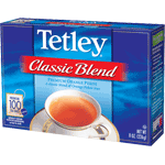
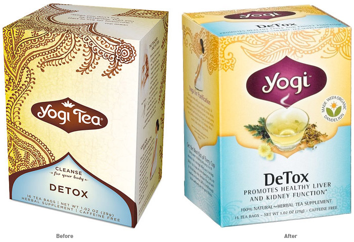
I drink a lot of tea. At any given time, my cupboard is overflowing with nearly a dozen kinds of herbal teas. One of my favorite brands by far is Yogi Tea, I enjoy their unique blends almost as much as I (used to) enjoy the unique packaging. The packaging had a clean and simple (yet, exotic) look featuring henna designs by Anita Bohrer, it definitely stood out from the typical "Tetley" varieties.
Yogi Tea's roots began in 1969 when Yogi Bhajan, an Indian spiritual teacher, began teaching yoga in America. After each yoga class, he served a special spice tea to his students, which they affectionately named “Yogi Tea.” Yogi Tea is part of Golden Temple of Oregon, LLC, which also manufactures Peace Cereal, Sweet Home Farm, and Golden Temple bulk granola.
Filed under: branding