Award-winning identities from Cannes Lions 2010
Comments: +
August 23 2010
In a follow-up to our previous post on award-winning print design at the 57th annual Cannes Lions festival, we have selected some of the notable identity projects in the design category.
Episteme Skincare, Bronze
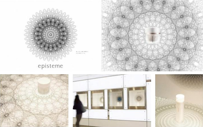
Dentsu Kansai of Osaka, Japan created an identity for Rohto Pharmaceutical’s Episteme line of luxury skincare products.
Our goal was to launch the luxury skincare brand for department stores from this pharmaceutical company. We needed to create the unique/distinct brand in the very crowded anti-aging market. Our target was Female 30's & 40's of affluent lifestyle being intellectually curious about many things.
Nook, Bronze
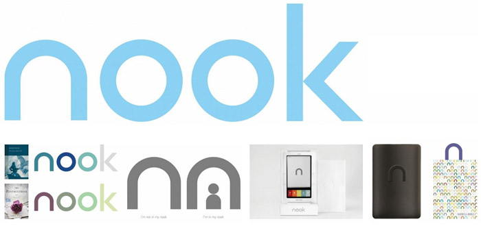
R/GA in New York came up with the name and designed the identity for Nook, Barnes & Noble’s first e-reader.
The biggest challenge was to launch a product that successfully challenged the dominance of the Amazon Kindle. Before launch, there were no viable Kindle competitors. Part of our brand development strategy was to tap into what makes Barnes & Noble unique, namely, the physical store, a destination where you can lose yourself in a world of books, which informed the name and subsequent identity. The key objective was to create an identity that was at once appropriate for the Barnes & Noble brand and that distinguished itself in the marketplace. Ultimately, it had to appeal to all readers and seem easy-to-use.
AOL, Bronze
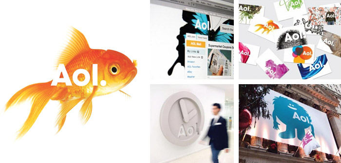
New York’s Wolff Olins created a memorable rebrand for AOL, distancing the brand from its former American Online days.
The new identity separates AOL from other media businesses and embraces the fragmented, non-linear online world. It's creatively fluid and flexible, and the name ‘AOL' is revealed through ever-changing image and video experiences. Some of the world's best creative artists, including Universal Everything, GHAVA and Dylan Griffin, created art and animations for the brand. The new brand identity raises the bar for AOL to present new innovations and new content experiences to the world.
House of Cards, Gold
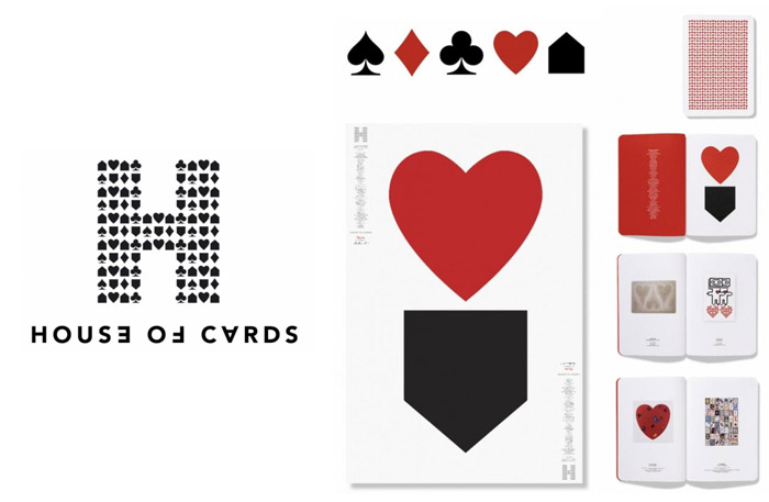
Leo Burnett along with Pentagram in the UK designed the identity for House of Cards, a campaign for UK’s housing and homeless charity Shelter.
The mark was borne from the simple idea of creating a 5th playing card symbol—a House. These symbols were combined to form an H representing the ‘House’. The symbols were used right side up and upside down to support the cascading image of houses collapsing. A logotype was developed to work independently and with the mark. Having certain characters twisted/set upside down reflected the cascading idea as well as playing into the ambigram nature of cards and Avenir was used for it’s simplicity, directness and modernity. The black and red palette was a reference to both playing cards and the Shelter brand.
La Biennale di Venezia, Gold
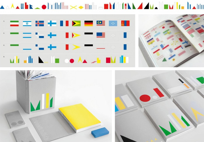
With the theme ‘Making Worlds,’ Stockholm Design Lab created this identity system for La Biennale di Venezia International Art Exhibition.
The design concept for ‘Making Worlds’ is a graphic language with a visible connection to the world, that communicates its message clearly. Stockholm Design Lab combined elements from something truly universal—all the flags of the world—and created something new by deconstructing the flags in neverending combinations. The making of worlds with abstract forms.
9/11 Memorial, Shortlist
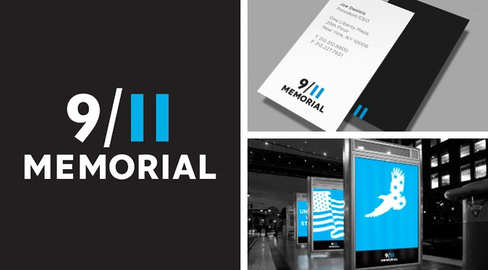
Landor Associates in New York created an identity for the National September 11 Memorial & Museum at the World Trade Center (Note: this project made the shortlist, but did not take home an award).
We created a new 9/11 Memorial identity that is effective in its simplicity. This idea was the guiding principle of or work and informed the type style, weight, colour, and arrangement. Finding a balance between a compelling visual style and the proper tone and mood for the memorial was important. The bespoke typography is modern yet timeless, and the eleven is crafted from two austere blue rectangles that reference the shapes missing from the New York City skyline. Combining the date with the building silhouettes creates an essential connection in people’s minds. We believe our solution is also elegant: a characteristic required by a historical institution whose role is remembrance, education and progression.
You can see the full list of award-winners at the Cannes Lions website.
Also see:
- Award-winning print design from Cannes Lions 2010
- Award-winning print design from Cannes Lions 2009
- Award-winning identities from Cannes Lions 2009
- Award-winning package design from The Dieline
Filed under: branding
Comments