Award-winning identities from Cannes Lions 2009
Comments: +
July 7 2009
The 56th annual Cannes Lions International Advertising Festival recently took place in France, its second year to include awards for design. Among the many winners in the wide-ranging design category, we have selected some of the notable identity projects.
Lukas Lindemann Rosinski, Bronze
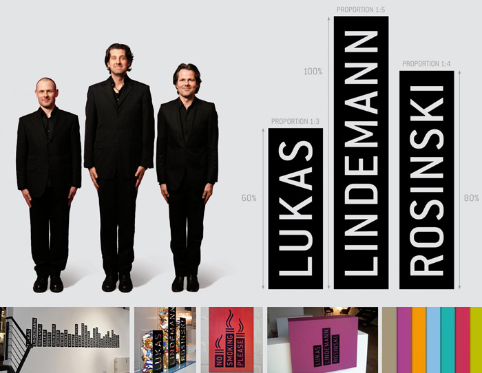
Corporate identity for German ad agency, Lukas Lindemann Rosinski.
When Bernhard Lukas, Arno Lindemann and Bent Rosinski started their own ad-agency, they were looking for a logo that contained something personal from each founder. They discovered a particular point: The length of their names were proportional to their actual heights and were proportional to each other (60%, 100%, 80%). And thus, the concept for their corporate identity was born: Size Matters.
For more, check out the short video.
Global Handwashing Day, Bronze
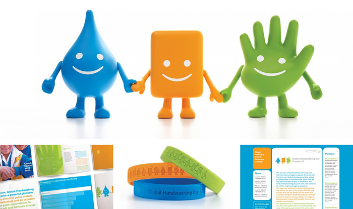
Identity for Global Handwashing Day (Proctor & Gamble) by Landor.
The act of washing one's hands with soap can dramatically reduce the incidence of diarrheal diseases and pneumonia, which together account for the majority of children's deaths around the world. The goal of Global Handwashing Day is to make people aware that effective prevention is simple and inexpensive...
The characters holding hands communicate that when water and hands are brought together with soap, health is the result—and health is worth smiling about.
Nearly 80 countries participated in the launch of the first Global Handwashing Day.
Aswaaq Supermarkets, Bronze
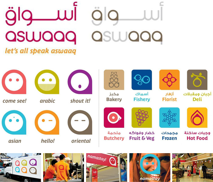
Branding for Dubai-based Aswaaq Supermarkets by Landor.
Dubai has a broad ethnic mix, with each nationality bringing its own background and flavor to the country... Aswaaq aims to become a daily destination, community centric hub and a celebration of diversity. In Muslim culture its almost unheard of to promote emotional expression through human faces. Our client felt the identity strategy of engaging the community through cultural diversity and emotional exchange was compelling enough to challenge convention, creating a breakaway brand that was so daring for the Middle East region.
No Homophobia Campaign, Bronze
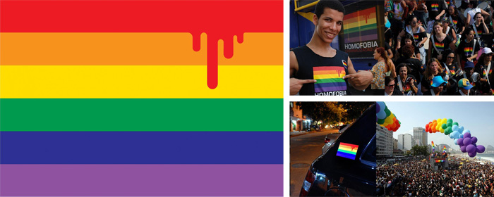
A symbol for Brazil's No Homophobia campaign by Indústria Nacional & Dialogo Design.
According to Brazilian researchers, 70% of its gay population suffers some sort of discrimination. Every second day a homosexual is killed because of homophobia... The worldwide known rainbow flag was used to reveal boldy and instantly the violence against homosexuals.
We Campaign, Silver
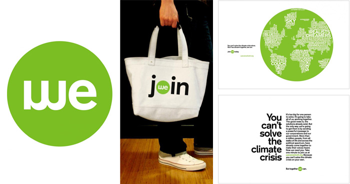
Identity for The Alliance for Climate Protection's “We” campaign by Collins.
Our approach was to make an idea as complex and potentially intimidating as stopping global climate change feel personal and achievable. Since the audience is everyone, we flipped the “m” in the word ME to make a bigger, more inclusive idea: WE.
Hudson Gavin Martin, Silver
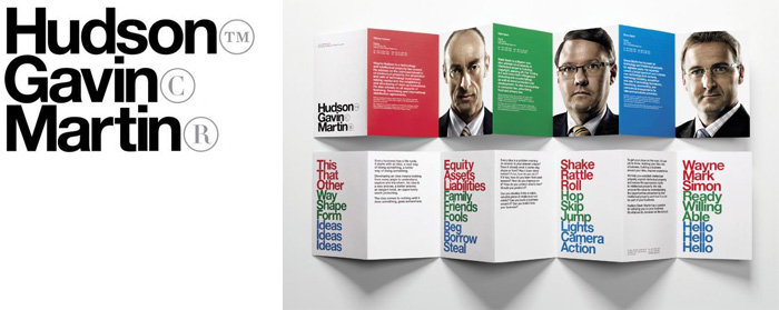
Corporate Identity for Hudson Gavin Martin, a New Zealand-based law firm specializing in intellectual property, by Alt Group.
Colloquial wisdom has it that all good things come in threes. Three is more than a partnership – it’s a team. Culture and customs offer up all sorts of threesomes, humorous and otherwise. The identity uses the copyright, trademark, and registered symbols to directly reference the firm's core business.
Claro Telecommunications, Silver
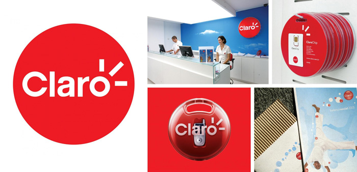
Logo for Brazilian mobile phone network Claro, by Gad.
Attributes such as strength, shine and light guided all creative processes of the brand, whose personality also needs to transmit happiness and Brazilian aspects. The new brand represents the shape of the sun, which also combined the transparency as a playful effect. The sun rays reinforce the concept.
Recipease, Gold
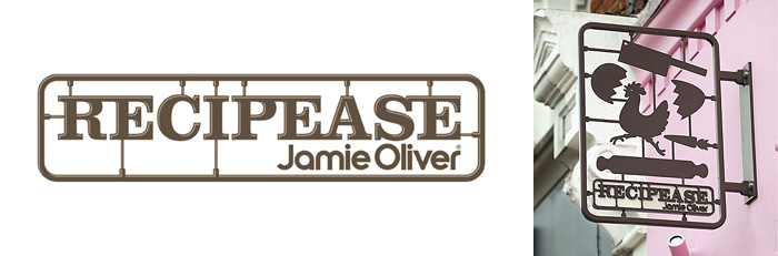
Identity for the Jamie Oliver's Recipease retail stores by Williams Murray Hamm. An interesting concept for a store:
These Recipease shops will be places where you can assemble a brilliant meal in around 20 minutes in our kitchens, using ingredients we’ve prepped for you ahead of time; pick up a delicious freshly-made meal to go; or attend classes where you’ll learn how to make every part of a dish from scratch, no matter what level of cooking you’re at.
Office Games, Gold
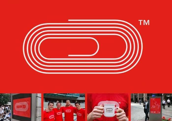
Logo for Office Games, a spoof athletics fundraiser benefiting Richard House Children's Hospice, by The Partners in London.
They didn't want it to appear too 'charity' and pressure people into taking part, instead the focus was on the fun and enjoyment of the event.
Also check out the print design winners from Cannes Lions 2009.
Filed under: branding
Comments