No longer a place for friends
Comments: +
July 6 2009
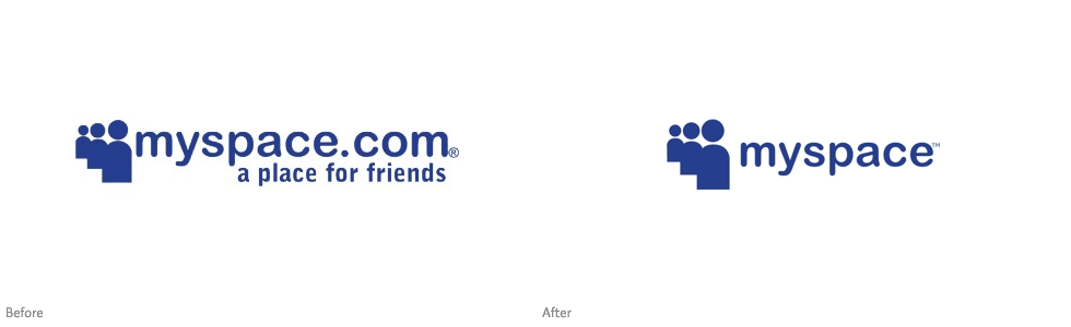
With mass employee layoffs, declining marketing dollars, and millions of annoyed users, social networking site MySpace has appropriately downsized their logo. While hardly worth mentioning (design-wise), the change marks the beginning of the end for a site which was once the most popular of its kind.
The change comes after what Fast Company calls “the largest de-friending in its history” with MySpace laying off 30% of its U.S. workforce mid-June, and two-thirds of its international employees a week later.
Notably, the slogan “a place for friends” is dropped, which has been a part of the logo since its launch in 2003. An appropriate move, as ‘friends’ leave the site and flock to Facebook by the millions.
Just one year ago MySpace was dominating Facebook in the U.S., pulling in 73.7 million users per month in May 2008 to Facebook's 36 million. While Facebook had surpassed MySpace in global unique visitors the previous month, MySpace's vast advantage in the U.S. still gave the site clout with advertisers.
What a difference a year makes. Last month, Facebook edged ahead of MySpace with 70.28 million unique U.S. visitors to MySpace's 70.26 million. Globally, MySpace is looking no better, with 127 million users to Facebook's 307 million. Facebook's breakneck growth has drawn some marketing dollars away from MySpace, but its stagnancy has hurt the company equally if not worse...-Clay Dillow, Fast Company


If MySpace really wants to survive the battle against Facebook, the company needs to do a lot more than re-arrange their logo.
via TechCrunch
Filed under: branding
Comments