Award-winning package design from The Dieline
Comments: +
April 23 2010
Our friends at The Dieline recently held their first worldwide package design competition, The Dieline Awards. Winners were revealed at last week’s FUSE conference in Chicago.
Judged by a panel of industry leaders, headed by AIGA President Debbie Millman, winners were chosen in 10 categories from over 800 entries around the world. Here are some of our personal favorites…
Waitrose Breadsticks, Third Place (Food B)
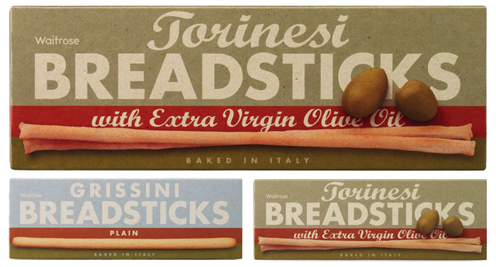
Attempting to boost sales and visibility, branding agency Turner Duckworth designed a new packaging system for breadsticks sold at UK supermarket chain Waitrose. Even with names like Grissini and Torinesi, the packaging could not be any clearer.
The range had been under-performing, due to lack of visibility within store. Our solution was to focus on the Italian heritage of the range and educate consumers about the difference between Grissini (everyday and kids love them) to Torinesi (pre-dinner party nibble plus additional ingredients). This was achieved by the use of actual size photography of the product against a distinctly rustic graphic background, and of course, actually telling consumers what the product is in large type!
Tube belt, Third Place (Books, Office & Art Supplies, Toys, Clothes/Accessories)
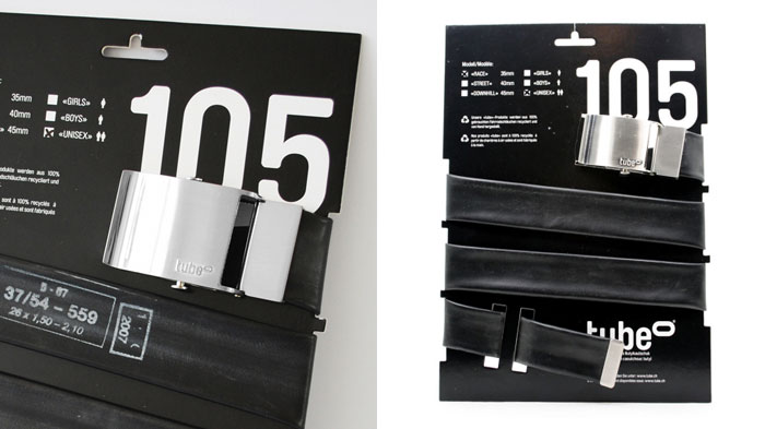
cubegrafik in Switzerland designed this postal-friendly package for Tube, a belt handmade from recycled bicycle tubes.
This one packaging was conceived for 3 different kind of belts, which lowers the cost of its fabrication. The products are mostly sold online, therefore the packaging is optimized so that it can be mailed in the format of a standard envelope, which lowers the shipping costs, fits in the mailbox and the client doesn't have to go and pick up the merchandise at the post office. Thanks to the hook at the top of the packaging, it can also be displayed in stores on hangers.
JAQK Cellars, Third Place (Wine, Beer, Tobacco)
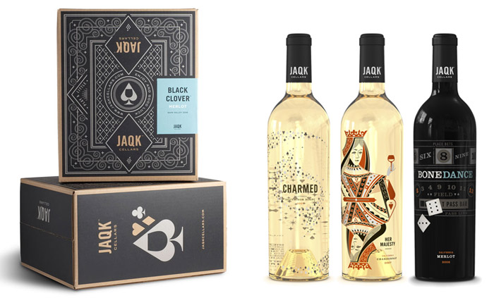
Inspired by the Jack, Ace, Queen, and King in the deck of cards, San Francisco’s Hatch Design injects a little fun into a new line of California wine.
The names of these wines tap in to the allure and sophistication of the world of gaming—High Roller, Soldiers of Fortune (the Jacks), Black Clover (clubs), Pearl Handle (the derringers that tamed the gambling saloons), 22 Black (roulette), Bone Dance (craps), Her Majesty, (the Queens) and Charmed (the luckier the better). They do so in a way that brings about a smile even before the first sip is enjoyed.
The Kraken Rum, Third Place (Spirits)
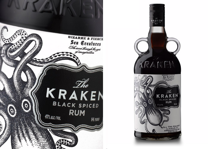
Designed by Stranger & Stranger, The Kraken Black Spiced Rum is presented in a custom designed bottle made standout on the shelf. Definitely not your average Captain Morgan.
The spiced rum market is dominated by a few old brands so The Kraken was developed to add a bit more spice and attitude. The objective was to maximize the shelf standout.
Amazon Kindle DX, Third Place (Electronics, Technology, Movies, CDs)
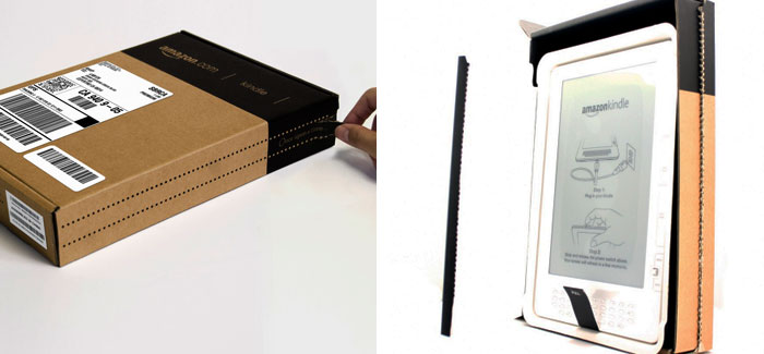
For the Kindle DX, Amazon’s own Lab 126 designed what could be called the ‘anti-package.’ Fitting with the company’s Frustration-Free Packaging initiative, the product ships in its own container and is made out of more than 90% recycled materials.
Primarily, the design is meant to deliver an elegant out of box experience for the customer. Additional design criteria included using minimal packaging to reduce cost, emphasizing environmentally considerate materials, and fitting within Amazon.com’s guidelines for efficiency and durability.
Mr Singh’s Bangras, Second Place (Food A)
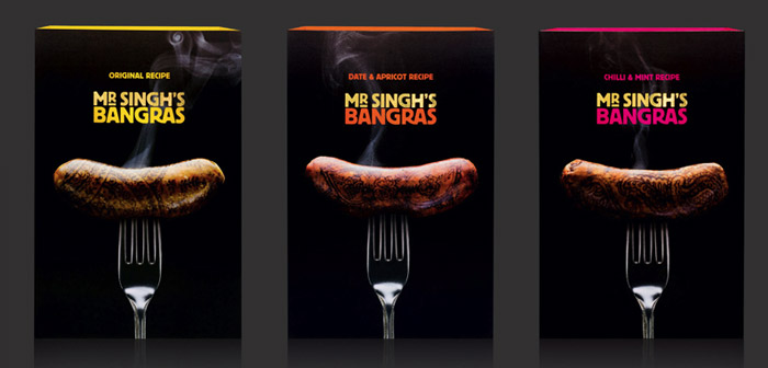
UK-based The Partners set out to create an unforgettable way of packaging Mr Singh’s gourmet Indian sausages. Proclaimed “the world’s first branded sausages,” each sausage is printed with a unique henna design in edible ink. It’s definitely unforgettable. Unfortunately for Mr Singh, it also looks rather revolting.
Instead of creating packaging, each sausage has a unique henna print in edible ink. Every Bangra is packaged in its own skin.
A simple protective sleeve and tray holds the sausages together and shows off the product. Whether the sausages are seen on a barbecue, deli counter or beneath the sleeve of the pack, Mr Singh’s Bangras will always stand out as the original Indian sausage.
NYC Spaghetti, Second Place (Food B)
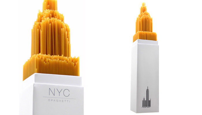
Receiving second place in the Food B category (breads, pasta, baking ingredients, etc), NYC Spaghetti is a class project designed by UK student Alex Creamer. Interesting to see a student beat out top package design agencies for this award.
The spaghetti sits on a 3d model of the chrysler building that was modelled on CAD by Ben Thorpe. And then modelled out of high density foam, creating a spaghetti model of the Chrysler building.
…designed to see what can be achieved with shape and form of food and packaging. Whether everyday food can be made to look attractive. Whilst keeping it fun and with a bit of humour along the way.
Coca-Cola packaging system, Second Place (Beverage)
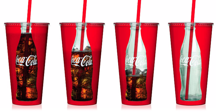
London and San Francisco-based packaging design firm Turner Duckworth redesigned Coca-Cola’s packaging system, returning simplicity and clarity to the brand.
Our design renews a spirit and aesthetic that celebrates Coke’s core elements – the Spencerian script, dynamic ribbon device, and contour bottle shape – and it emphasizes the positive and authentic qualities that make Coke a great brand. When Coke brought back its historical bottles for a special holiday promotion, we designed six-pack carriers that express Coke’s bygone imagery with a contemporary look.
Related: Turner Duckworth also took home first prize in the beverage category with their summer identity for Coca-Cola.
Copenhagen board game, Second Place (Books, Office & Art Supplies, Toys, Clothes/Accessories)
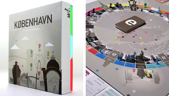
With offices in New York and Denmark, Hello Monday designed a Copenhagen board game drawing inspiration from classic games like Monopoly and Denmark’s Bezzerwizzer.
Authenticity is a key concept in the design and brings together historic and contemporary elements to give players a real Copenhagen experience. To execute this mission everything in the game has been custom designed to reflect the city's ontology: the pieces, the bills, the game board, the cards, and the packaging. Grab a bike and ride your way to a better and more sustainable Copenhagen.
Double Cross vodka, Second Place (Spirits)
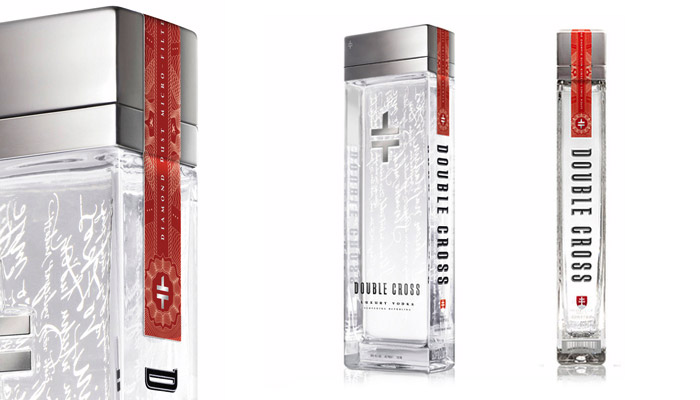
Designed by Minneapolis-based branding firm Capsule, Double Cross vodka is a modern take on the centuries-old spirit (previously discussed here).
Through research and strategy, it was determined that the package needed to delicately blend the rich heritage of the country from which the vodka came with a modern, simple and pure aesthetic reflecting the quality product it contained.
The strikingly simple form of the bottle provides a perfect canvas for small touches of rich detail, including hand lettered Slovakian poems, the Slovakian crest, and the logo for Double Cross which is a modern take on the Slovakian crest.
Ktima Gerovassiliou wine gift box, First Place (Wine, Beer, Tobacco)
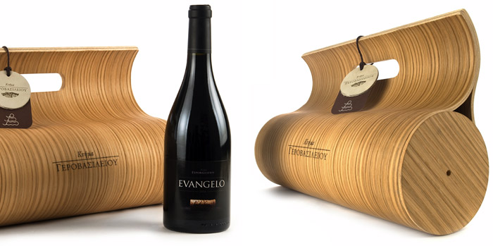
Athanasios Babalis of the Technological Educational Institute of Larisa designed this reusable gift box for Greek vinyard Ktima Gerovassiliou SA out of oak plywood.
The shape of the box was chosen because it is sympathetic to the shape of the bottle and it also looks like a grape from one side when stack. The box has a handle and can be carried like a bag without the need for additional packaging. The use of Oak plywood as the main material was chosen because it makes references to the Oak barrels the wine matures in. The client logo appears on the box and on a label on the handle which also explains the concept and the way to reuse the box.
Help Remedies, Best of Show
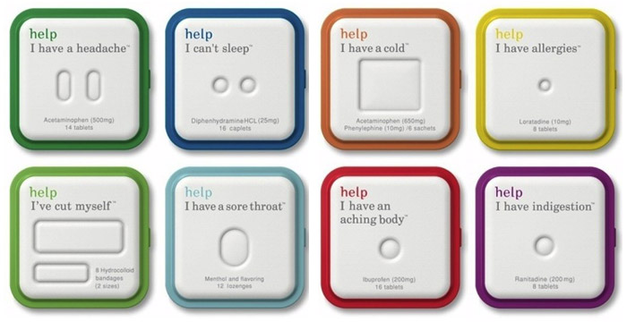
With packaging designed by ChappsMalina, Help Remedies is a New York City-based startup aiming to revolutionize over-the-counter medication.
The product approach was simple; keep it clean and minimal with enough coding to clearly articulate my needs in a moment of crisis as directly as possible. Instead of lab coats, ChappsMalina chose to communicate content through the soft topography of the packaging material, that is reminiscent of a soft white pillow.
For more packaging goodness, check out our interview with The Dieline’s Andrew Gibbs and the complete lineup of winners from The Dieline Awards 2010.
Also see:
Filed under: design
Comments