Designing a better subway map
Comments: +
September 2 2010
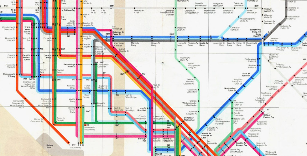
“A diagram is a diagram. Don’t cheat me,” says a heated Massimo Vignelli during an AIGA/NY event earlier this year. It’s been over 30 years since the Italian designer’s New York subway map was axed, but it’s still a passionate issue.
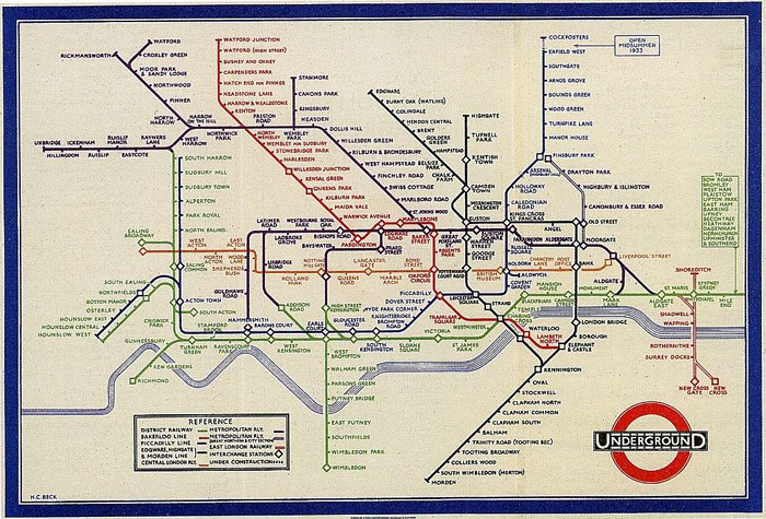
Vignelli’s now-classic New York City subway map was first introduced in 1972, following his work on the signage system in the late 1960s. Inspired by London’s Underground map designed by Harry Beck in 1933—which, in turn, was inspired by electrical circuit diagrams—Vignelli simplified New York’s complex subway system into a clean graphical system. “A different color for each line, a dot for every station. No dot, no station. Very simple. The whole map is designed on a 45/90 degrees grid with geographic distortions to accommodate the lines,” recalls Vignelli in From A to Z.
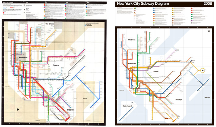
Today, the Vignelli map has a near-cult following—with vintage maps selling for upwards of $200 on eBay, a place in the collection of the Museum of Modern Art, even a designer dress. In 2008, an updated version was commissioned by Men’s Vogue magazine to raise funds for charity.
A striking piece of graphic design history, the map also had its shortcomings. As designer Michael Bierut points out:
The result was a design solution of extraordinary beauty. Yet it quickly ran into problems. To make the map work graphically meant that a few geographic liberties had to be taken. What about, for instance, the fact that the Vignelli map represented Central Park as a square, when in fact it is three times as long as it is wide? If you're underground, of course, it doesn't matter: there simply aren't as many stops along Central Park as there are in midtown, so it requires less map space. But what if, for whatever reason, you wanted to get out at 59th Street and take a walk on a crisp fall evening? Imagine your surprise when you found yourself hiking for hours on a route that looked like it would take minutes on Vignelli's map.
We spoke with Paul Shaw, author of Helvetica and the New York Subway System, back in February on the topic.
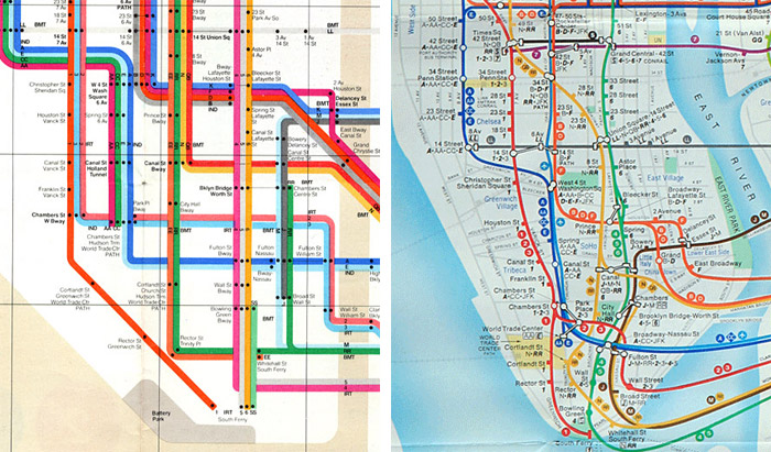
“Most designers—if blogs are to be believed—prefer the Vignelli map. But the Vignelli map is terrible if you actually want to use the subway. I know this from my first years in New York and I have heard similar comments from others who remember trying to use the map when it was introduced,” says Shaw. He points out a scene from The Warriors in which a gang trying to get from The Bronx to Coney Island on the subway look at Vignelli’s map and find themselves totally confused. “The problem is not that Central Park is a square rather than a rectangle. It is that the locations of some stations are geographically incorrect and that of others misleading in relation to their physical presence. The pair of stations that bothered me back in 1977 and still do with Vignelli’s 2008 revision of the map are South Ferry and Whitehall Street. They are much closer than the map indicates, so close in fact that in 2009 they became one station.”
In 1979, Vignelli’s linear map was replaced with a more traditional-style topographical map. Designed by Michael Hertz, the map evolved from subway-only to include inter-modal transportation like buses and ferries. “Since 1997 or so it has been The Map—the Hertz-style map with lots of pop-up boxes to indicate connections to other forms of transportation such as trains, buses and ferries. The back of the map which used to show each subway line in a Vignelli-like manner as route strips now has a commuter map of the New York metropolitan region. The emphasis now is on the entire MTA (which is much more than the subway),” explains Shaw.
So what does Mr. Vignelli think?
“I think the real reason is space. But not because Manhattan is too small, it’s because they want to put too much information that doesn’t belong in the diagram. That’s why. All of a sudden there is …and there is no reason. I mean, all you want to know is [how] to go from A to B,” explained Vignelli at Navigating the Labyrinth, an AIGA/NY event hosted in February.
While it has been criticized for being geographically inaccurate, this was by design. “On purpose we rejected any visual reference to nature or landmarks,” Vigenlli told Men’s Vogue in 2008. “People expected a map instead of a diagram. But diagrammatic representation is common practice around the world since the London Underground map of the thirties.”
Vignelli had actually envisioned the map as a four-part complimentary system: the stylized map providing the basic route information; a geographic map showing the surface and the relationship between the subway and the city; a neighborhood map providing information of the area around the station and surface connections; and a verbal map to provide instruction on how to reach a destination from a particular station.
All New York subway maps have tried to convey all the information on a single map, with the result of making semantic overlaps, and a very fragmented and visually unpleasant map. The only way to provide clear information is to have both an abstract system map and a geographical map as separate complementary maps. One on one side, the other on the opposite side. Easy.
Easy or not, the complimentary maps were not widely implemented. The verbal map, for example, was only implemented from one station while the neighborhood map was implemented in a few stations.
The perfect solution?
“I would love to see a subway map with the elegance of Vignelli’s and the practicality of Hertz’s. That is the Holy Grail,” says Paul Shaw. “But until then I prefer the messiness of the current map.”
This summer, New York City’s Metropolitan Transportation Authority unveiled its first major subway map redesign in over a decade. Is today’s new subway map the Holy Grail? Far from it, says Shaw in a follow-up discussion.
“The new map looks essentially like more of the same. The colors have been tweaked to be more harmonious overall. However, the green that has replaced the sand for the background reminds me of baby food. A more serious complaint is the unnecessary addition of shadows to the individual route lines. They serve no purpose and can be mistaken for an extra gray route running in tandem with other routes (which is what my wife initially thought was happening). This is dumb design.”
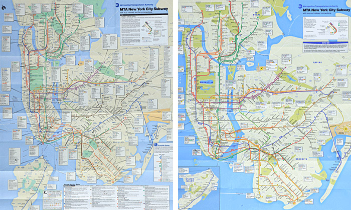
Searching for the Holy Grail
Is it possible to get everything on one map, and have it look good at the same time?
New York-based design duo David Heasty and Stefanie Weigler of Triboro Design make it work—and they do it all in one single color. Triboro’s one-color map builds upon the Vignelli-style map, retaining all of the content from today’s map including the service guide, the city streets, and the various bus and ferry connections.
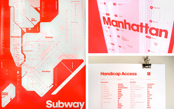
One goal was to try to make the landmasses and geography more true to life than the current MTA map and establish a stronger sense of typographic hierarchy… Initially we tried making the subway lines very strong—which is a typical feature of most subway maps—but this made the map extremely difficult to decipher. The solution to the problem was counter intuitive. We decided to deemphasize the subway lines, making them so light that they almost disappear. The stops then come to the foreground and viewers can connect the dots (so to speak) with their eyes, tracing and revealing individual subway lines. I wouldn't say that our one-color map is easy to use but we think it is surprisingly functional.
As beautiful (and functional) as this map is, it’s not likely to replace the official MTA map anytime soon. “The goal was not so much to try to create an alternative to the official map but instead to tackle an interesting design challenge and emerge with an object that we would be happy to hang on our wall. We chose florescent red as the color because…how could we not? We wanted it to look outrageous!” explains Triboro.
Perhaps a more viable solution is Eddie Jabbour’s Kick Map. The Kick Map aims to resolve the 50-year debate between diagrammatic and topographic mapping, with a design that combines the best of both worlds. Unlike the Vignelli map, where stations and lines are distorted for pure graphic harmony, the Kick Map attempts to be geographically accurate while still standardizing angles whenever possible.
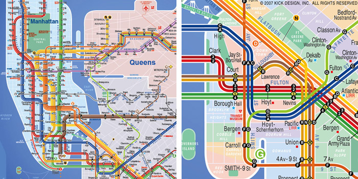
The Kick Map is designed to get more people to ride New York City's subway system… A well-designed map not only welcomes and empowers novices to use the subway but also encourages additional use for regular ‘home-to-work-only’ commuters to use the subway for recreational destinations where they might otherwise take a car. For this reason the design of the subway map can directly influence ridership numbers and can indirectly have an effect on New York's traffic congestion and pollution. In short, a better-designed subway map will make our subway system more open and accessible.
Jabbour’s map even caught the (brief) attention of the MTA in 2007, but was soon dismissed for being geographically inaccurate. “He’s a good designer and it’s an interesting map,” MTA executive director Christopher Boylan told the New York Times. “The design is important, but the thing we’re concerned with is the best directional guidance. We design a map for use, not solely to look good…”
So the debate continues, underlining a struggle designers continue to face. Does Mies van der Rohe's mantra ‘Less is more’ hold up or does the consumer, especially in the information age, need more? On the other hand, it’s 2010 and with technology like Google Maps and mobile apps (including some which even tells us which subway car to get on) perhaps the printed subway map is a thing of the past?
Filed under: design
Comments