MTV’s new look
Comments: +
July 2 2009
MTV International is launching a new look this week across all 64 of its worldwide channels, led by UK studio Universal Everything.
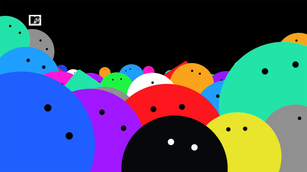
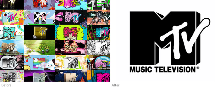
The new look, referred to by the design team as “pop x 1000%”, retains the old logo but strips it of the colors and textures that often adorned the iconic symbol since its launch in 1981. “Now the logo is sacred,” says Roberto Bagatti, Vice President of Creative for MTV Networks.
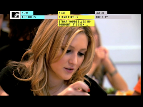
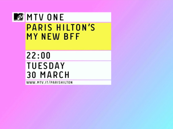
On-air, the ‘new’ logo serves a purpose. Remaining stationary at all times on the screen's upper left corner, the logo is treated as an anchor for a new navigation-like system. Reminiscent of interfaces on the web, program information and progress bars are oriented next to the logo, showing how far viewers are into the current program (ala YouTube) and which terrible reality shows are coming up next:
In addition, Universal Everything, has created a series of on-air identity animations to fit the new branding system:
For more on the new look see the in-depth write-up at Creative Review.
Filed under: branding
Comments