Fort Worth Museum gets square
Comments: +
April 29 2009
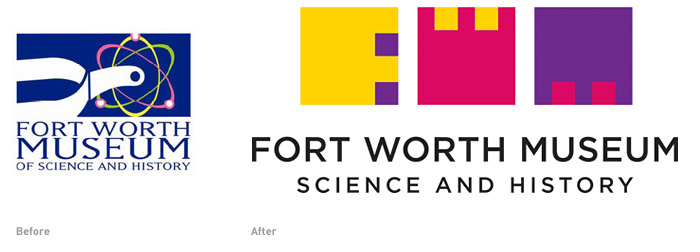
The Fort Worth Museum of Science and History in Texas has a fresh new logo created by DJ Stout of Pentagram. The identity gets its inspiration from the architecture of the museum's new building, with its recurring use of geometric shapes and rich colors, designed by architect Ricardo Legorreta. The new logo is a welcoming improvement over the existing logo, which was nicknamed the 'Nuclear Spur.'
Stout and his team in Austin developed a logo consisting of three squares representing the letters F, W, and M (Fort Worth Museum) and an entire alphabet of Legorreta-inspired letterforms. The square letterforms can be stacked and rearranged like a child’s set of alphabet blocks. These symbolic “building blocks of knowledge” are a metaphor for the museum’s early roots as a children’s museum and its commitment to families and learning. “This place is different from the other museums in the Cultural District,” says Stout. “It’s fun, fun, fun. I wanted the identity to reflect its playful, childlike sense of discovery.”
The designers developed a full Legorreta-inspired alphabet: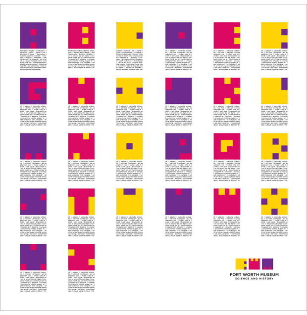
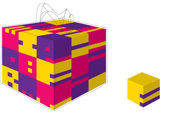
A few applications of the new logo: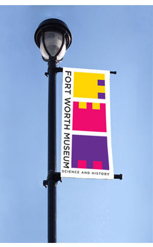

For more information, check out the post on Pentagram's blog.
Filed under: branding
Comments