The Permanent Mark: Honoring 9/11
Comments: +
September 11 2011
A decade later‚ COLLINS asks: how should we commemorate 9/11?
From commemorative pins to stars-and-stripes-clad paraphernalia, there have been many attempts to commemorate the events of September 11‚ 2001 over the past ten years.
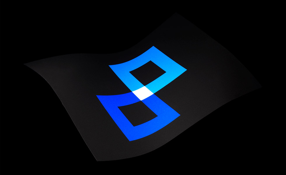
Stepping away from overt imagery and attempting to create a symbol that can resonate on a more global scale, New York-based firm COLLINS has taken upon itself to create a new symbol to honor 9/11.
“Our intent is to offer a symbol abstract enough to hold anyone’s interpretation of that morning but suggestive enough to relate to the event,” says Collins. The symbol consists of two interlocked squares derived from the birds-eye view of the twin towers’ foundations. The interlocked foundations form a symbol of infinity, an idea that this day has affected us forever, and we will always remember it.
The symbol uses three colors: dark blue to represent loss and despair; light blue to bright blue to represent hope and optimism; and white to represent peace where the skewed foundations meet.
Video: the team at COLLINS talk about the design of the Permanent Mark
For us‚ this mark conveys the challenging but eternal lesson of that morning: we are as one. Just as we fall together‚ we can only rise together. Living with such empathy for one another is a steep mountain to climb. But we believe it is both the path out of 9-11 and the path we must trudge throughout life. This lesson is the permanent mark that day has left on us one decade later.
COLLINS has developed a series of posters and flags of the Permanent Mark available at honoring911.com, with all proceeds going to the Fire Fighter Cancer Foundation.
Filed under: branding
Comments