Yogi Tea
Comments: +
April 13 2009
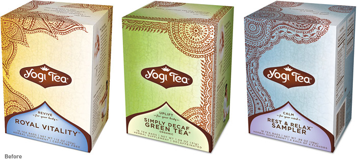
I drink a lot of tea. At any given time, my cupboard is overflowing with nearly a dozen kinds of herbal teas. One of my favorite brands by far is Yogi Tea, I enjoy their unique blends almost as much as I (used to) enjoy the unique packaging. The packaging had a clean and simple (yet, exotic) look featuring henna designs by Anita Bohrer, it definitely stood out from the typical "Tetley" varieties.
Yogi Tea's roots began in 1969 when Yogi Bhajan, an Indian spiritual teacher, began teaching yoga in America. After each yoga class, he served a special spice tea to his students, which they affectionately named “Yogi Tea.” Yogi Tea is part of Golden Temple of Oregon, LLC, which also manufactures Peace Cereal, Sweet Home Farm, and Golden Temple bulk granola.
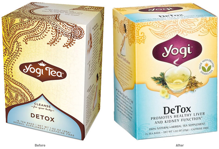
Recently, on a trip to stock up my cupboard, I was surprised to see a different Yogi Tea than what I was used to. At first, I assumed I was seeing an expired package from several years ago (common place for a corner store in Brooklyn), but after checking the date I knew I was looking at the new packaging for Yogi Tea.
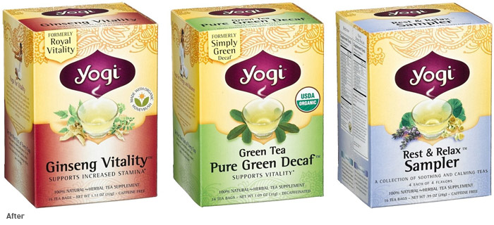
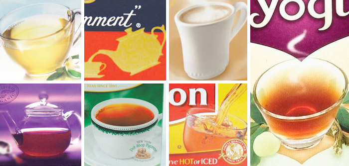
Overall, I can't say the new packaging (which was designed in-house) is badly designed, but it does lose the unique essence of the previous design. It still features the henna design (but faded) and similar colors to the original (but more saturated). It's just simply no longer recognizable as the "unique" package in the tea aisle. Besides the commercial-looking typography changes, the biggest difference is the presence of a cup of tea surrounded by herbs (dandelions in the above example). Which you can find on almost any box of tea:
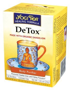
Something that Yogi Tea also used in their even older packaging (which is maybe why I thought the new package was expired):
Also, in addition to the new packaging, Yogi has a newly redesigned logo. Not much has changed—going from "Yogi Tea" to simply "Yogi", losing a bit of the curliness of the old type, and losing the lotus flower, going from a henna color to a dark plum. It's a subtle improvement—I didn't have a problem with the logo before, nor do I have a problem with it now (though the loss the lotus flower is debatable).

You'll also notice a slight name change on some of the packages too: Ginseng Vitality (instead of Royal Vitality), Pure Green Decaf (instead of Simply Green Decaf), Purely Peppermint (instead of Peppermint), Comforting Chamomile (instead of Chamomile), etc—nothing too exciting. There are dozens of Yogi varieties (so I'm not going to show them all here), but here are a few before and after:
UPDATE: Our article has been picked up by The Die Line (April 13, 2009)
Filed under: branding
Comments