New wings for Chrysler
Comments: +
November 5 2009
Following a Chapter 11 bankruptcy, all-time low sales, and a new partnership with Italian automaker Fiat, it comes as no surprise that Chrysler wants to reinvent itself.
Yesterday the new Fiat-directed Chrysler Group unveiled its long-awaited 5-year business plan, announcing a plan to sell smaller Fiat-designed vehicles and pay back billions in U.S. bailout loans by 2014. The 7-hour marathon press conference also featured a presentation (PDF) on the Chrysler brand by marketing chief Oliver Francois, which introduced a new logo for the struggling car manufacturer.
![]()
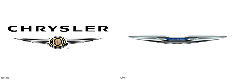
Chrysler seen from a different perspective (Source: Oliver Francois, Chrysler)
The new logo was leaked earlier in the week after its U.S. trademark application (originally submitted in July) was spotted online. Clearing up media speculation in the presentation, the new logo will be featured on all Chrysler-branded vehicles, but not replace the logo of the corporate logo of the parent company (which will retain the Pentastar logo). Chrysler also announced its intention to do a ‘complete overhaul’ of its Dodge brand by mid-2010.
The new logo appears to be a heavily streamlined take on the previous winged logo, which has adorned Chrysler vehicles since the late 1990s. While I’m sure it’s the intention of a company billions of dollars in debt to look ‘streamlined,’ it goes too far, creating a strangely wide shape (which almost feels like its been run over by a car). The odd size also renders the tiny wordmark featured in the center of the logo illegible. Although, judging from the proposed website design (below), it looks like the Chrysler wordmark will be repeated again below the logo in some cases (another issue).
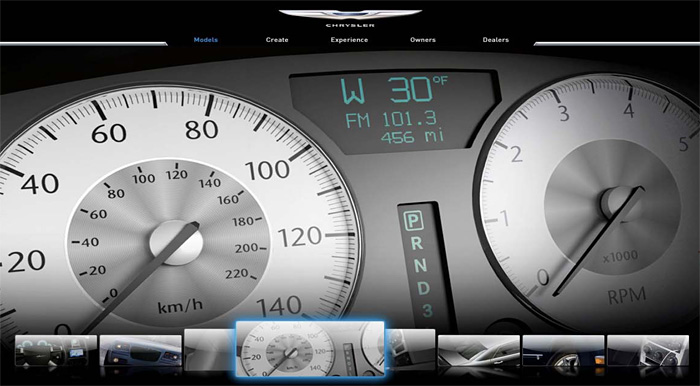
Proposed marketing vision for the new Chrysler website in 2010 (Source: Oliver Francois, Chrysler)
Chrysler branding, a brief history
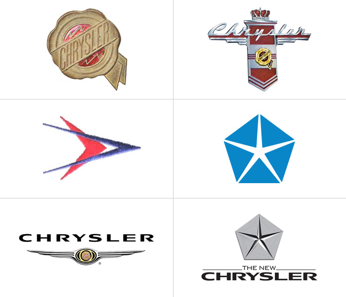
Top: Medallion (1925) and variations (1947); Middle: Forward Look (1955), Pentastar (1962); Bottom: Winged medallion (1998), Pentastar revival (2007)
Chrysler has seen their fair share of logo redesigns since the company's inception, beginning in 1925 with their classic medallion logo. Variations of the logo followed until 1955 when Virgil Exner’s “Forward Look” redesign took Chrysler into the future, dropping the medallion in favor of space age arrows. By 1962, the company adopted the Pentastar which soon became their most recognizable mark. The original medallion logo was later revived in 1996 and sprouted a pair of silver wings after the Dailmer-Benz merger two years later. The winged logo can be seen on Chrysler vehicles made from 1998-2009, while the a new metallic Pentastar was revived in 2007 to become company’s corporate logo.
With recent reports of Ford making a profit, perhaps Chrysler has a chance to turn things around—but it’s going to take a lot more than this new logo.
Filed under: branding
Comments