Ritz and Oreo go retro
Comments: +
June 5 2009
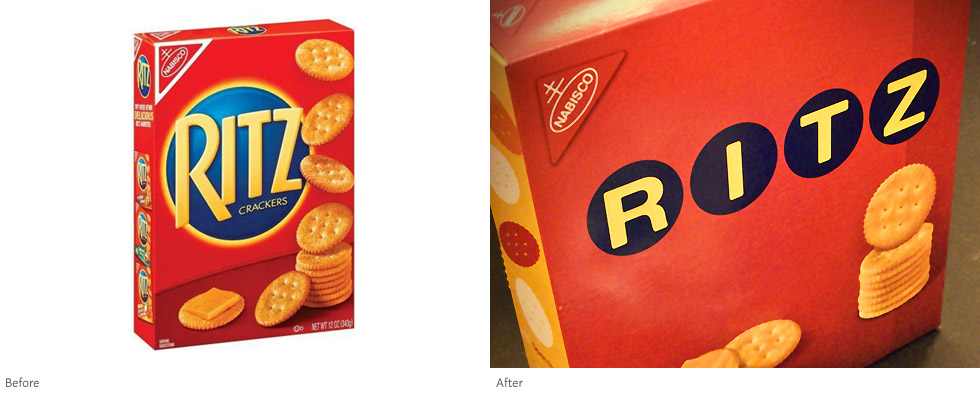
2009 is turning out to be the year of retro food packaging. We've already seen Pepsi and General Mills try it out, now Nabisco is following suit with vintage renditions of Ritz crackers and Oreo cookies.
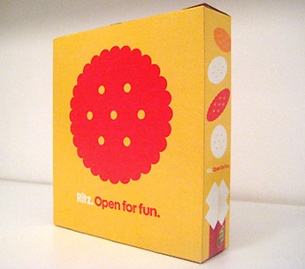
The vintage-inspired packaging, from Kraft-owned Nabisco, focuses on a clean minimal aesthetic—gone are the countless gradients, glows, and warped type. While simple, it is a breath of fresh air on supermarket shelves typically stuffed with over-designed products. A nice way to reinvent a couple of otherwise boring products.
The before (seriously, how many outlines can you put on a logo?) and after Oreo packages:
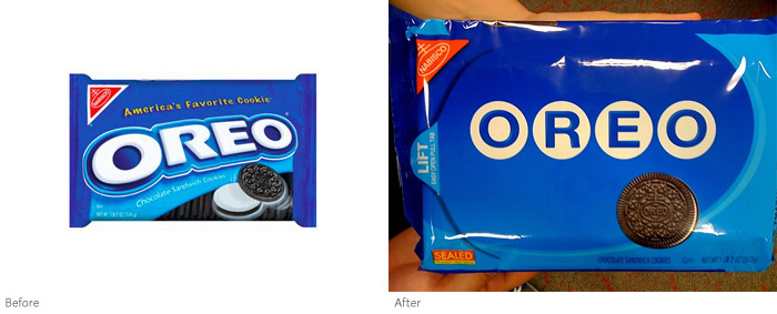
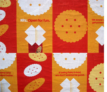
Both Ritz and Oreo are sporting a simple new logo (4 letters placed inside circles), echoing the round shape of the product. The Ritz package seems to build on the design sensibility of the acclaimed (and unexpected) 'Open for Fun' campaign seen last year from advertising agency EuroRSCG:
Currently, the new packaging is being tried out at Target stores, there is no word on whether the look will spread elsewhere or stick around. Here they are on the shelves spotted by Luke Dupont on Twitter:
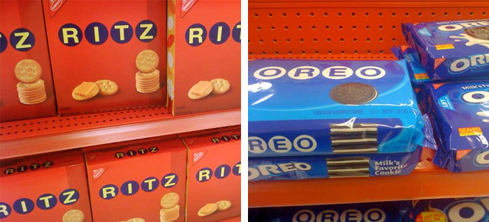
UPDATE: The new packages were designed by Baker. Exclusive to Target, the retro look will only be around for the summer. (June 12, 2009)
Filed under: branding
Comments