Kayak flips its identity
Comments: +
September 4 2009

The popular travel site has launched a new logo and promises more to come.
Launched in 2004, Kayak.com is a travel search-engine that compares other travel sites in an attempt to find the best possible deal. Making money from advertising and click-throughs, rather than making deals with airlines or travel providers, Kayak aims to become the ‘Google’ of travel.
The bottom line for consumers is that we don't sell you anything. We just give you objective, comprehensive travel information to use as you want. Then, you select the travel products you want to buy and you decide where to buy them.
-From Kayak.com
The old logo consisted of an abstract kayak shape (although some have argued it looked more like an eye). I don’t think anyone can question the need to rebrand this logo—based simply on aesthetic reasons—but with the launch of Bing (who infamously copied Kayak), the need for a distinct identity seems even more crucial.
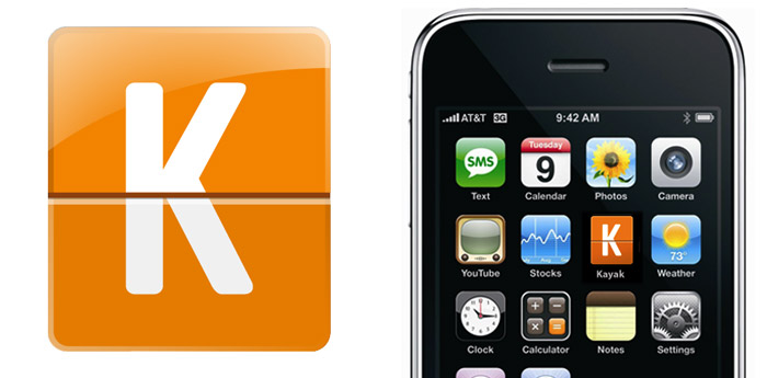
The new logo, which launched yesterday, is just one part of a larger brand update and site upgrade (or “new hidden features” as Kayak calls them) being introduced over the next two months. idsgn contacted Plaid, the New York branding agency responsible for the update:
The upcoming rollout of the brand is designed to emphasize Kayak’s technology that makes them the one travel site that searches them all.
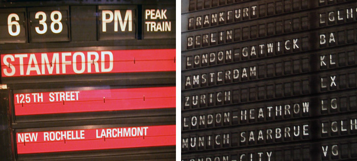
The new logo was inspired by airport and wayfinding aesthetics—specifically analog split-flap display boards, like the one famously used at Grand Central Terminal. This seems to fit with the function of the site—which searches for relevant information and leaves you to find your way (wherever you need to go to make the purchase).
Kayak has hinted at the changes via Twitter, but so far not much has changed on the Kayak.com website (besides the logo).
Before
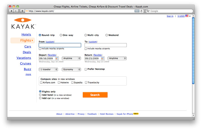
After
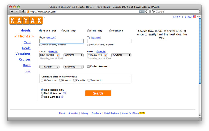
Below is some exploratory concept work for the larger rebrand, which shows a definite shift in the right direction:
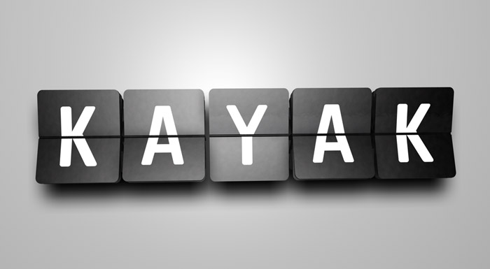
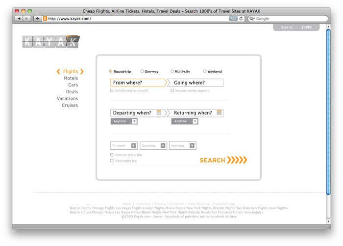
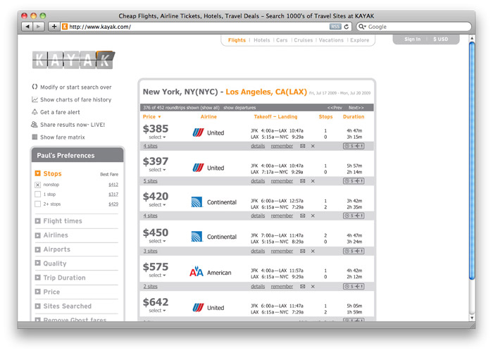
Although Kayak.com has been praised for its ease of use (something other companies have not quite figured out), I think most users would be excited to see some user interface improvements to better suit the new branding. Hopefully some of this gets rolled out soon, because the lonely logo is not communicating the bigger picture just yet.
UPDATE: Kayak aired their first national TV spot during Sunday’s NFL game. Working with the the ad team at Goodby, Silverstein & Partners, Kayak has expanded on the "flippy" identity created by Plaid and incorporated visual cues from their early motion-explorations. (Nov 2, 2009):
We found out that supposedly, ‘according to research,’ 68% of people who use online travel have never even heard of us. So we decided maybe we should look into some of that marketing stuff.
Filed under: branding
Comments