Why American Airlines' user experience fails
Comments: +
May 22 2009
Earlier this week, Dustin Curtis (a user interface designer) wrote an open letter to American Airlines addressing the poor user experience at its website, aa.com.
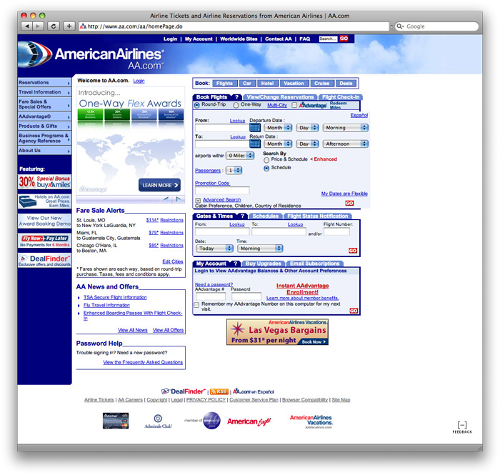
Pictured above is how aa.com looks right now, it's pretty much a user experience nightmare.
...I travel sometimes. Recently, I had the horrific displeasure of booking a flight on your website, aa.com. The experience was so bad that I vowed never to fly your airline again...
If I was running a company with the distinction and history of American Airlines, I would be embarrassed -- no ashamed -- to have a website with a customer experience as terrible as the one you have now. How does your CEO, Gerard J. Arpey, justify treating customers this way? Why does your board of directors approve of this? Your website is abusive to your customers, it is limiting your revenue possibilities, and it is permanently destroying the brand and image of your company in the mind of every visitor.From Curtis' Letter, "Dear American Airlines"
While Curtis criticizes the website, he provides the airline with a solution—spending a couple hours redesigning the front page of aa.com. Here is his take on the site:
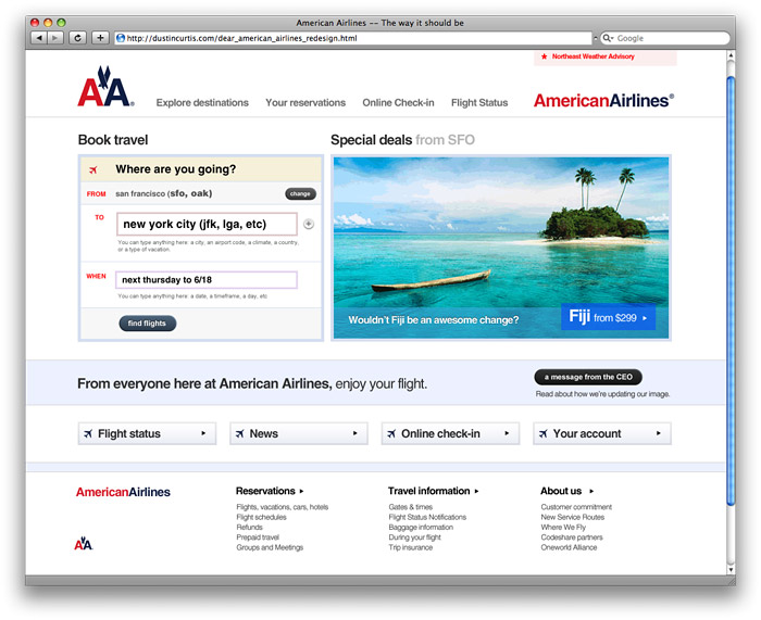
The distinction between the two sites is clear. Buying airline tickets online has never been an overly pleasant task—too often the process is plagued with horrible navigation, annoying calendar pop-ups, useless options, and the list goes on. A redesign along the lines of Curtis' minimalist redesign would be a welcomed change.
So, why the bad user experience?
In Curtis' letter, he had criticized the designers at American Airlines. Today, a response was posted by a designer at American Airlines, pointing the blame to the size of the organization.
I like to think I’m decent at what I do, and I know the others I work with here are all pretty good. The problem with the design of AA.com, however, lies less in our competency (or lack thereof, as you pointed out in your post) and more with the culture and processes employed here at American Airlines.
Let me explain. The group running AA.com consists of at least 200 people spread out amongst many different groups, including, for example, QA, product planning, business analysis, code development, site operations, project planning, and user experience. We have a lot of people touching the site, and a lot more with their own vested interests in how the site presents its content and functionality...
It only takes a few hours to put together a really good-looking one, as you demonstrated in your post. But doing the design isn’t the hard part, and I think that’s what a lot of outsiders don’t really get, probably because many of them actually do belong to small, just-get-it-done organizations. But those of us who work in enterprise-level situations realize the momentum even a simple redesign must overcome...
I can understand the time and frustration it takes to make small changes in a large organization, but something needs to happen. To read more, check out the full response on Curtis' website.
Filed under: design
Comments