No two snowflakes alike?
Comments: +
December 22 2009
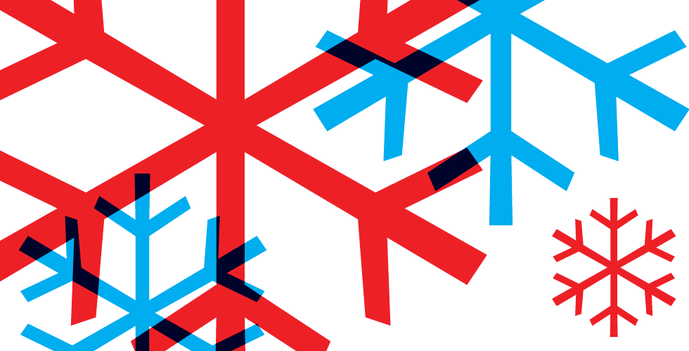
Scientists say no two snowflakes are alike. Apparently, designers have their own opinion.
From holiday storefronts to ski chalet logos, it seems this six-sided shape can be seen everywhere this time of year. Even spotted on the back of my cancelled airline ticket (thanks the weekend snowstorm in New York), this flake sure gets around. But why? If Wilson Alwyn Bentley was able to capture over 5,000 unique “tiny miracles of beauty” at the turn of the 20th century—is there any reason designers favor this particular snowflake?
The most popular snowflake in the world
The simplified snowflake can be traced back to German typographer Hermann Zapf. Working with the International Typeface Corporation (ITC) in 1977, Zapf designed a collection of useful symbols, ornaments, and typographic elements, well known today as ITC Zapf Dingbats.
Spreading like frost in a blizzard, Zapf Dingbats became the de facto dingbat typeface over the following decades, giving typesetters access to commonly used symbols like arrows, pointing fingers, telephone icons, and (of course) snowflakes.
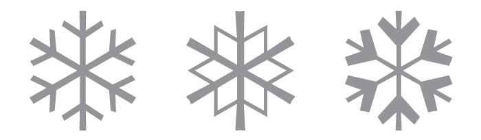
Zapf’s snowflake along with the lesson known ‘tight trifoliate snowflake’ and ‘heavy chevron snowflake,’ released 1978.
It has been noted over one thousand sketches were originally created for Zapf Dingbats, although only 360 made ITC’s final cut. Three snowflakes made the cut, and it’s clear which one became the favorite.
Recently, Linotype released an expanded and updated collection based on Zapf’s work called Zapf Essentials.
The Arial of snowflakes
In 1990 the snowflake was born again in Microsoft’s Wingdings typeface, with a nearly identical glyph to the one made popular in Zapf Dingbats.
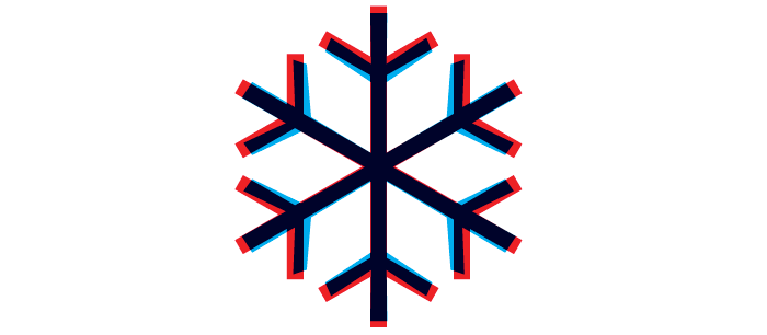
Windings (1990) shown in red and Zapf Dingbats (1978) overlaid in blue.
Included with Windows since version 3.1, Wingdings was pieced together using three symbol typefaces originally designed by Charles Bigelow and Kris Holmes for the Lucida family: Lucida Icons, Arrows, and Stars. The three Lucida fonts were purchased by Microsoft who did little more than remap the keyboard layouts (with controversy) and change its name.
Microsoft’s Wingdings symbol font is not a part of the Lucida family, though it was designed by Bigelow & Holmes to harmonize with the Lucida alphabetic fonts. From the traditional pen and pencil to computer mice (including the Microsoft Mouse and Ballpoint), and from pointing hands to computer disks and tapes, Wingdings offers a large set of icons, pictograms, and symbols for a wide range of functional and decorative uses…
—Bigelow & Holmes, Lucida Family Overview
Due to its inclusion on Windows (and even Mac OS X since 10.5), Wingdings remains one of the most popular modern dingbat fonts.
Snowflakes in Unicode
A selection of classic Zapf Dingbats have also been immortalized in Unicode, an international character set which makes it possible to use glyphs from any language. As the world moves to Unicode, snowflakes (❄) can now be found in several Unicode fonts.
Although many type designers replicate Zapf’s iconic snowflake, it’s a nice to surprise to see some occasional variation.
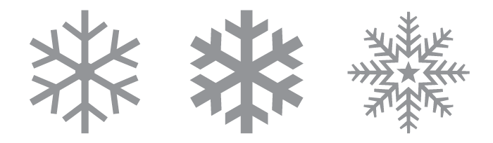
Arial Unicode MS, 1998.
It’s snowing everywhere
Variations of Zapf’s icon can be seen everywhere. Sometimes bold or rounded, it always stands out:
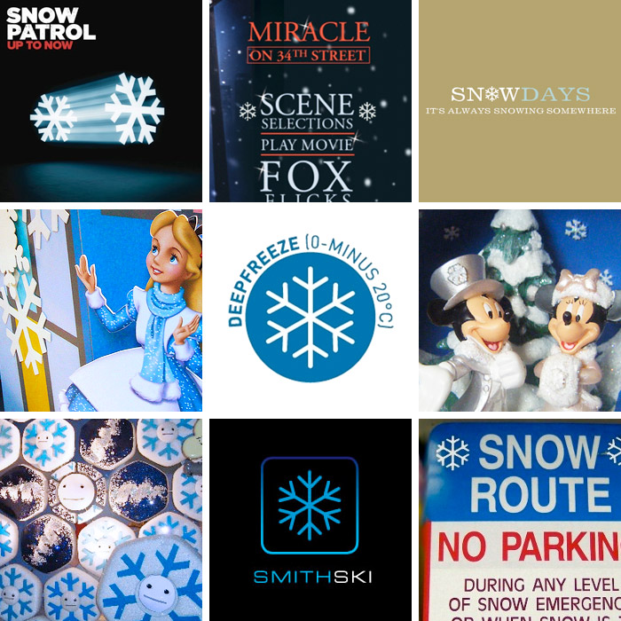
Above: Snow Patrol’s Up to Now, Miracle on 34th Street DVD menu, Snowdays logo, Alice in Wonderland storefront display, Deepfreeze logo for The European Van Company, Mickey Mouse Christmas ornament, holiday display at Saks Fifth Avenue, Smith Ski logo, Snow Route sign in Ohio.
By now, the icon has become so recognizable, it feels more like The Helvetica Man than a graphical element—making it perfectly suitable for a ‘Snow Route’ sign but rather strange on Saks Fifth Avenue storefront.
Sure, it’s easy to use Zapf’s icon for everything… but with infinite possibilities, is it always the best choice?
Filed under: typography
Comments