Know your type: DIN
Comments: +
April 8 2009
")
This is the first post in the ‘Know your type’ series, where we will take a look into the origins of some of the most commonly used typefaces in design today. The first typeface to get the treatment is DIN.
Born from the German railway system
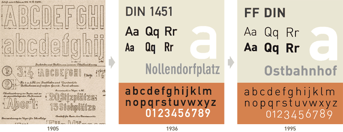
 The history of the realist sans-serif known today as DIN goes back to 1905. At the time, the Prussian railway created a set of lettering with the purpose of unifying the descriptions on their freight cars. Following a merger of all German state railways in 1920, the master drawings of the Prussian railway became the reference for most railway lettering. Based on the master drawings, the D. Stempel AG foundry released the earliest version of a DIN face in 1923.
A country-wide standard
The typeface was adopted by Germany in 1936 as a standard known as DIN 1451 (DIN is an acronym for Deutsches Institut für Normung—in English, the German Institute for Standardization). The typeface became a standard for traffic signs, street signs, house numbers and license plates. Over the next decades the typeface also found use on various household goods and products, making it synonymous with German design.
Picked up by graphic designers
DIN...is the magic word for everything that can be measured in Germany, including the official German typeface, appropriately...called DIN-Schrift. Since it is available in digital form, this typeface has been picked up by many graphic designers who like it for its lean, geometric lines
-German typographer/designer Erik Spiekermann from Stop Stealing Sheep
DIN 1451 comes in two flavors: DIN 1451 Mittelschrift (the main typeface) and DIN 1451 Engschrift (condensed, which should only be used when there is not enough space to use Mittelschrift).
Redesigned in the 90's
In 1995, type designer Albert-Jan Pool expanded DIN 1451 into a more polished form acceptable for graphic design and publishing, known as FF DIN. Today, FF DIN has been widely adopted for use in magazines, advertisements, the web, and corporate logos.
Usage
")
Variants
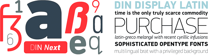
With renewed interest among graphic designers in the 2000's, several modern variants of DIN 1451 have been surfacing. Notably, DIN Next (desgined by Akira Kobayashi of Linotype) and PF Din Display/Text (designed by Parachute), each with their own unique take on the classic German typface.
For more on the history of DIN, check out the 5 part series by Albert-Jan Pool published in the online magazine Encore:
Part 1, 2, 3, 4, 5.
Filed under: typography
Comments