Know your type: Clarendon
Comments: +
August 21 2009
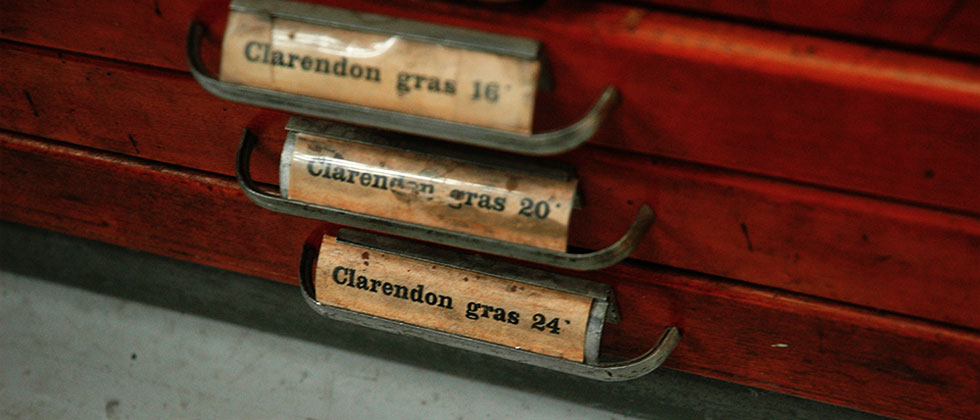
For the fifth installment in our ‘Know your type’ series we look to Clarendon—an influential typeface that helped tame the Wild West, and the first to ever be patented.
A significant change
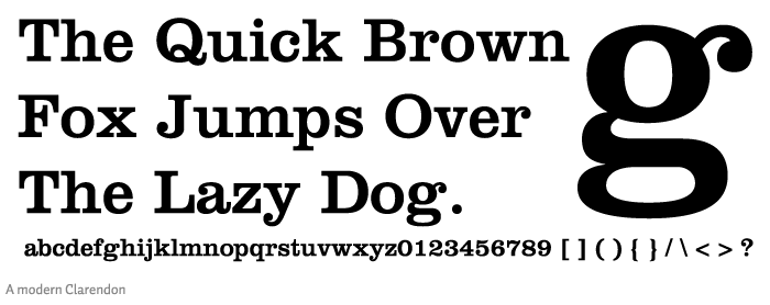
Named after Oxford’s Clarendon Press, the popular slab-serif was created in 1845 by Robert Besley for the Fann Street Foundry. Notable as one of the last new developments in nineteenth century typography, the letterforms represented a significant change from the slab-serif Antiques and Egyptians that were so popular in that time.
The most useful founts that a printer can have in his office are the Clarendons: they make a striking word or line either in a hand bill or title page, and do not overwhelm the other lines. They have been made with great care, so that while they are distinct and striking, they possess a very graceful outline, avoiding on one hand the clumsy inelegance of the Antique or Egyptian character, hitherto in use among printers, and on the other, the appearance of an ordinary Roman letter thickened by long use under the machine.
-Printed in Fann Street Foundry's 1873 Type Specimen Book
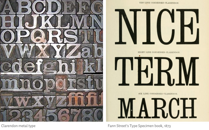
The original Clarendon is considered a condensed face today, visible in typefaces such as Besley Clarendon by HiH Retrofonts (a foundry that specialized in digitizing historical fonts).
Wanted (dead or alive)
Clarendon became hugely popular, leading Besley to register the design under Britain's Ornamental Designs Act of 1842. Unfortunately, the patent expired three years later, with many competing foundries quickly copying its design once the hold was released. Using his own typeface, this is how Besley reacted:
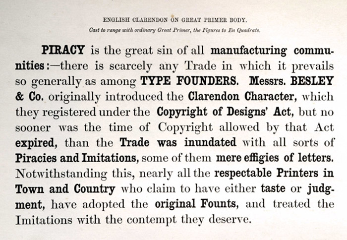
Clarendon is considered the first to design a ‘related bold’ for emphasizing text (as seen above).
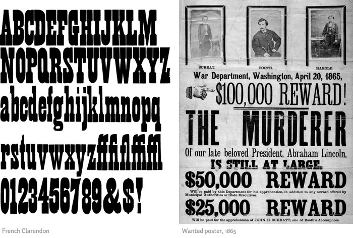
Many variations of the typeface, including the popular French Clarendon, appeared in the second half of the nineteenth century. “The reason it was so widely copied is simple: it was extremely useful. It provided the attention-getting boldness to highlight a word or phrase, yet at the same time was compact and easier to read than the fat faces and antiques of the period,” says HiH Retrofonts.
Becoming a popular wood type, Clarendon is also notable as a common choice on ‘WANTED’ signs of the old west.
Unrelated to type design, Robert Besely later went on to become the Lord Mayor of London in 1869.
Clarendon today
The typeface was released by Monotype in 1935, and reworked into its modern incarnation in 1953 by Hermann Eidenbenz. It was also marketed by the Stephenson Blake foundry as Consort in the 1950s. Remaining a popular choice for over a century, many of today’s most recognized logotypes are based on the Clarendon style.

Clarendon was also used in the United States on National Park traffic signs, until being recently replaced by NPS Rawlinson Roadway.
Today most major foundries have their own digital version of Clarendon with dozens (if not hundreds) of other fonts influenced by the Clarendon style: Red Rooster’s Consort, PSY/OPS’ Oxtail, Adobe’s Rosewood, URW++’s Volta, Canada Type’s Clarendon Text, Parkinson’s Sutro, Font Bureau’s Belizio and Giza, to name a few.
Besley’s orginal matrices and punches can now be found at London’s Type Museum.
Usage

Also see:
Filed under: typography
Comments