Know your type: Baskerville
Comments: +
October 26 2010
")
Designed by a perfectionist and self-taught printer, Baskerville is the eighth font to be explored in our ‘Know your type’ series.
Baskerville, designed in 1754, is most known for its crisp edges, high contrast and generous proportions. The typeface was heavily influenced by the processes of the Birmingham-bred John Baskerville, a master type-founder and printer, who owed much of his career to his beginnings. As a servant in a clergyman’s house, it was his employer that discovered his penmanship talents and sent him to learn writing. Baskerville was illiterate but became very interested in calligraphy, and practised handwriting and inscription that was later echoed in strokes and embellishments in his printed typeface.
; Virgil Aeneid with expansive margins and fine alignment, 1757 (Source: Typefaces for Books)")
; Close-up of letterforms in Baskerville’s preface to Milton, 1758 (Source: Typefaces for Books)")
Baskerville is categorized as a transitional typeface in-between classical typefaces and the high contrast modern faces. At the time that John Baskerville decided to switch from owning a japanning business to a type foundry, Phillipe Grandjean’s exclusive Romain du Roi for Louis XIV had circulated and been copied in Europe. The mathematically-drawn characters felt cold, and prompted Baskerville to create a softer typeface with rounded bracketed serifs and a vertical axis.
Having been an early admirer of the beauty of letters, I became insensibly desirous of contributing to the perfection of them. I formed to myself ideas of greater accuracy than had yet appeared, and had endeavoured to produce a set of types according to what I conceived to be their true proportion.
—John Baskerville, preface to Milton, 1758 (Anatomy of a Typeface)
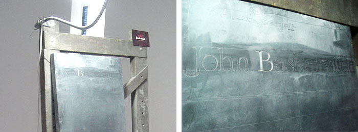
Hand-carving Baskerville on a headstone for John Baskerville by Gabriel Hummerston (Source: cmykern.com)
Achieving crisp perfection
It is difficult to appreciate the qualities of Baskerville without first understanding the process of its creation. Baskerville grew out of an ongoing experimentation with printing technology. John Baskerville developed his own method of working, resulting in beautifully bright woven paper and darker inks. He created an intense black ink color through the tedious process of boiling fine linseed oil to a certain thickness, dissolving rosin, allowing months for it to subside and finally grinding it before use. As printers would not willingly reveal the methods within their print shops, Baskerville followed other printers closely and made the same purchases as them in hopes of setting up the same press. This routine resulted in the development of higher standards for presses altogether.
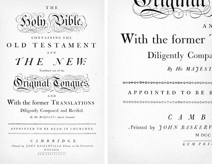
Folio Bible patented by the Cambridge University Press in 1763, Baskerville brought his own press to the university to complete his printing (Source: Typefaces for Books)
Existing printing presses did not capture the subtleties of his type, so Baskerville redesigned the press replacing the wooden platen with a brass one in order to allow the planes to meet more evenly. The wooden platens were usually covered with thick tympanum which helped to absorb pressure and reduce type depth, however, Baskerville’s press used thin tympanum around the metal and the platens were even heated before using them. It was the combination of the contrasting cut in his letterforms, the process of printing, the gloss of his paper and the intensity of his inks that made each print so refined.
Influence in Britain and beyond
While it found little success during the lifetime of John Baskerville, the typeface made a huge influence in Europe after the printer’s widow sold the Baskerville punches and matrixes to France, where it circulated among foundries.
Isaac Moore from Bristol’s Fry Foundry created its own Baskerville in 1766, along with Bell and Scotch Roman which all reflected the sharpness of the Baskerville roman. Admiration for the English typeface in France and Italy spread, and Baskerville’s high contrast letterforms evolved into an emergence of modern faces such as Didot and Bodoni.
American typographer, Bruce Rogers, discovered a Baskerville type specimen in a Cambridge bookstore in 1917, and once he became printing adviser to Harvard University Press, he recommended that the type be casted from the original Baskerville matrixes, causing a revival to the typeface in the 20th century.
 and Zuzana Licko’s Mrs. Eaves (right)")
In 1996, Zuzana Licko designed a contemporary Baskerville revival, Mrs. Eaves, which was named after the printer’s mistress. To recreate the same open and light feeling that Baskerville had, Licko used a small x-height in relation to the cap-height and high contrast within the strokes. Baskerville was popular for its calligraphy influence and swashes, and Licko incorporated a lot of ligatures into Mrs. Eaves to mimic this style. In an interview in 2002, Licko expressed that the revival of classical typefaces such as Baskerville required scrutiny that later influenced her ideas for letterforms in fonts such as Tarzana and Solex.
Baskerville is an elegant book face, and as proven by John Baskerville’s own treatment, it can excel in purely typographic compositions. Today it remains one of the most popular and classic typefaces for print, for its legibility and refined beauty.
Usage
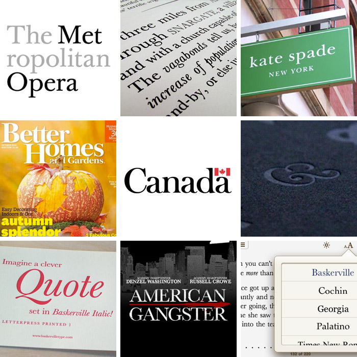
Baskerville in use: The Metropolitan Opera logo by Pentagram, poster by Bradley Hoston, Kate Spade New York logo, Better Homes and Gardens magazine, Canada wordmark, Baskerville ampersand from The Ampersand letterpress poster, Baskerville Type greeting card, American Gangster 2007 film poster, Baskerville on iPhone
Cheryl Yau is a graphic designer with working experience in Hong Kong and Toronto. She is currently a graduate student in Design Criticism at the School of Visual Arts in New York. Visit cherylyau.com and her blog for more work.
Also see:
- Know your type: Cheltenham
- Know your type: Gill Sans
- Know your type: Clarendon
- Know your type: Gotham
- Know your type: Futura
- Know your type: Verlag
- Know your type: Din
Filed under: typography
Comments