Quaker loves life with Archer
Comments: +
May 25 2010
Quaker Oats quietly introduces a new logo as the company focuses on “wholesome” products.
The Quaker Oats Company has a rich history dating back over 130 years in the United States. Founding mill owners Henry Seymour and William Heston originally chose the name after reading about The Religious Society of Friends (better known as Quakers) who were known for quality and honest value. Although they had no ties to the religious group themselves, the name stuck. In 1877, the iconic Quaker Man (a fictitious character dressed in traditional Quaker garments) became America’s first registered breakfast cereal trademark. Parents have been grossing kids out with steaming bowls of mushy oats ever since.
Over the years, the now global company has grown to include other brands (including Chewy granola bars, Cap'n Crunch and Life breakfast cereal, Aunt Jemima pancake syrup, Rice-A-Roni, and Gatorade) and was purchased by PepsiCo for $14 billion in 2001.
The company’s new True Delights brand, a line of health-conscious snack bars and breakfast cereals, was first to receive the new branding.
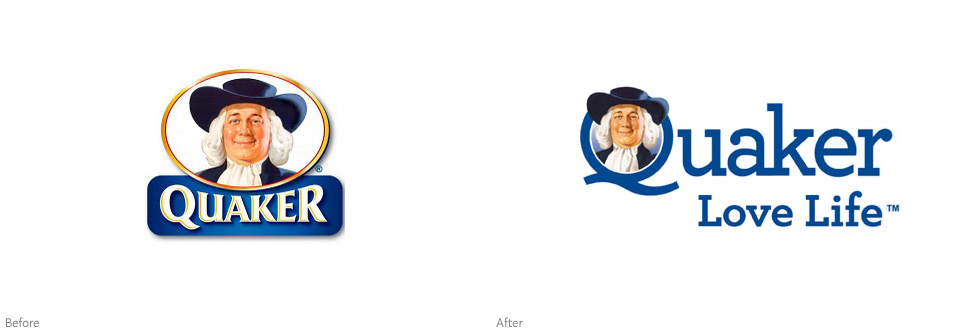
At the forefront is a new logo set in Hoefler & Frere-Jones’ popular Archer typeface. As for Mr. Quaker, he finds a new home inside the letter Q—grinning as you chomp down on a “wholesome” Dark-Chocolate-Mocha-Hazelnut-Café-Square granola bar. Perhaps it’s a result of the new, lighter design (hooray for losing the multiple gradients, shadows, and gold embossing), but the chubby Quaker Man looks out of place here.

: Before, 2009 (left); After, 2010 (right)")
The DuPuis Group, responsible for the packaging design, calls True Delights: “A strategic initiative from Quaker to reposition a declining light snack category from unappetizing diet food into a new healthy and craveable platform for today’s woman.” The logo itself is the work of brand consultancy Wallace Church.
Along with the new look, Quaker is also introducing a new tagline: “Love Life.” While it was trademarked back in January, it is not clear how soon the new branding will be rolled out to other products. A visit to the company’s U.S. website currently shows the old branding, however the new look can already be spotted internationally.
The new, lighter branding appears to contrast with last year’s energetic “Go Humans Go” campaign, which likened oatmeal to Red Bull—giving you wings, or in Quaker’s case, Oatmeal jet packs.
A brief visual history
; Quaker Oats packaging circa 1905 (right)")
Trademarked in 1877, the Quaker Man first appeared holding a scroll which read: ‘Pure.’ The full-length illustration was seen in packaging and advertising for decades to come.
: Jim Nash, 1946; Haddon Sundblom, 1957; Saul Bass, 1972; Sundblom’s design revisited, 2007")
In 1946 graphic designer Jim Nash created a black and white headshot of the Quaker Man, creating a familiar look that would go mostly unchanged even today. A full-color version was painted in 1957 by artist Haddon Sundblom (who was best known for his Santa Claus illustrations for Coca-Cola).
The brand saw its biggest change in 1972 when it introduced a stylized, monochromatic interpretation of the Quaker Man designed by Saul Bass. Known for creating some of the most classic and memorable logos in North America (including AT&T, United Airlines, and many others), Bass’ logo remained in use until recent years when the company decided to switch back to a version of Sundblom’s design.
Archer to the rescue?
With the new logo, Quaker joins an ever-growing list of American companies who have latched on to the popular Archer typeface in recent years—including Wells Fargo, Newsweek, and even the United States Government.
Originally designed by Hoefler & Frere-Jones for Martha Stewart Living magazine in 2001, the soft slab serif typeface is instantly recognized by its unique ball terminals. Designed to be “personable, straightforward, and credible… pretty, hard-working, and frank,” the typeface very quickly become a designer favorite when it was publicly released in 2008.
As a result of its success, the typeface has been increasingly subject to criticism for it overuse—there are at least two blogs dedicated to pointing out Archer ‘sightings.’
In a recent AIGA Voice article, designer Lauren Adams suggests why the typeface is so alluring in the current economy:
With unemployment continuing to soar and businesses declaring bankruptcy, with newspapers and magazines folding and personal savings accounts shrinking, Americans, more than ever, crave trust, comfort, friendliness and other fuzzy feelings. Companies are responding, and Archer may be part of the solution.
These fuzzy feelings go back to Mr. Quaker and his ‘Pure’ scroll, so it’s no doubt why the company decided to choose Archer. But can the trendy typeface stand the test of time?
UPDATE: The new logo was designed by New York-based brand consultancy Wallace Church. Thanks Rob. (June 3, 2010)
Filed under: branding
Comments