Nice tomatoes, sweet pea
Comments: +
May 13 2010

Seed packages—designs headed for the realm of the forgettable—make better use of photography and illustration as they circle back to their former visual glory.
Confession: I am a plant murderer. One of my dearest friends, a woman with the ability to coax even the stubbornest patch of bare earth into bloom, used to give me those adorable peat pots with seedlings peeking their baby heads just a few inches above the soil. I watered. I added Miracle-Gro. I put them in direct sun. And… they always turned black and died! A wise gardener, my friend doesn’t even offer them anymore. Nevertheless, I still fantasize about my own lush fields of blossoms and vegetables when brightly colored packs of seeds start popping up on store shelves everywhere at the end of winter, each envelope a tiny poster advertising an abundant future that can be had for just a couple of dollars and some dirt.
Until the mid-20th century, seed packets were lavishly illustrated with chromolithographs or engravings, after which photography became the preferred medium. Along the way a good deal of fantasy appeal was lost, artfulness sacrificed in favor of the “real” images provided by photographs. Early photographic compositions stripped the packages of visual charm, replacing it with a straightforward, pedestrian image, often accompanied by bland typography.
Now that organic gardeners and locavore foodies are taking renewed interest in heirloom fruits and vegetables, package designers are using photography more artfully and returning to illustration as well, re-invigorating the rich visual history of seed packages. And as the economic recession creates increased demand for home vegetable gardening, seed sales are skyrocketing.
“People's home grocery budget got absolutely shredded and now we've seen just this dramatic increase in the demand for our vegetable seeds. We're selling out,” says George Ball, CEO of Burpee Seeds, the largest mail-order seed company in the U.S. “I've never seen anything like it.”
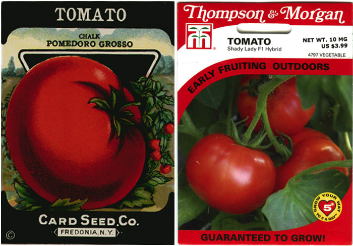
The image above (left), from a Card Seed Company package, dates to sometime in the 1920s. That monolithic tomato—a fat, perfect prizewinner—seems ready to rule the world. Master of the peaceful fields in the distance, it is a noteworthy specimen. It has gravitas.
Next to it, the perfectly nice but bland photo on the contemporary Thompson & Morgan package is descriptive, but omits any sort of potential narrative, fantasy or otherwise. This is not the tomato of your dreams, it’s just a salad waiting to happen.
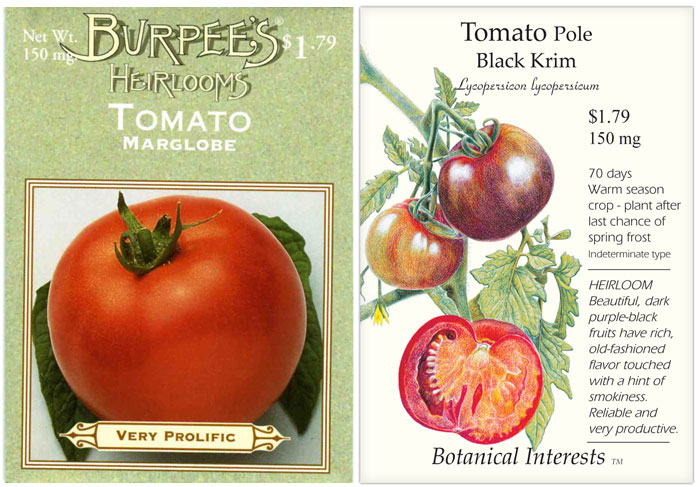
Burpee’s heirloom seed pack (above left) combines the approaches, using photography instead of illustration to bring back the monolithic center-stage tomato, pairing it with an earth-friendly green background and retro typography in a clear nod to the past.
The Botanical Interests package takes a different tack, avoiding photography altogether. Its lyrical but realistic illustration evokes the handcrafted, non-mechanical world of an earlier era, a moment of modern nostalgia.
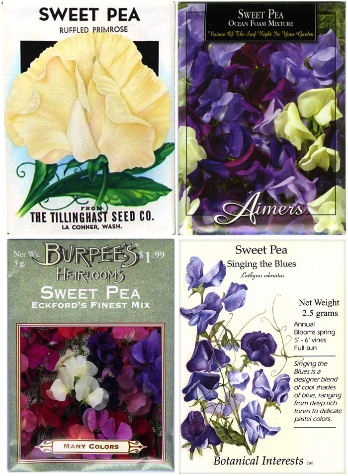
Above (top left) is a 1940s stock seed package that was sold preprinted with images and identifying information for the contents, then imprinted with the local retailer’s name at bottom. The single dramatic sweet pea flower is rendered as lovingly as a portrait; the hint of tendrils and greenery conjures up romantic visions of a bouquet bursting with curling shoots.
In contrast, both the Aimers package and the Burpee heirloom seeds use tightly-cropped photos of blooms that omit the wisps of the vines, as much a part of the beauty of sweet peas as the blossoms themselves. In the process, any hope for romantic associations becomes squashed: the mass of flowers lacks mystery or any hint of back story.
The Botanical Interests artwork brings some of the flowers’ visual exuberance back, demonstrating that the narrative and evocative qualities of illustration can prove far more eloquent than the literalness of a photograph.
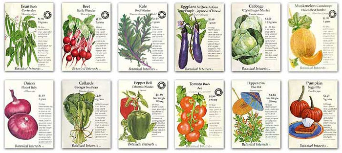
Which begs the question: Would a photo work within this last design (or any of the other illustrated examples)? Absolutely, if it were as carefully composed and styled as the drawing. On any of these packages, the designer’s intent can be expressed either photographically or illustratively. Even on a 3.25" x 4.5" canvas, I still want to see something that inspires the imagination more. Especially when it encloses something so basic as seeds, humble bearers of so much hopeful promise.
Angela Riechers is a writer and graphic designer, and a graduate of the new Design Criticism MFA program at the School of Visual Arts. Previously, she was Art Director of Home Magazine and taught undergraduate graphic design at SVA and The City College of New York. You can find her design work at www.angelariechers.com, and blog posts at NounVerbDesign.
Filed under: design
Comments