Starbucks reveals new logo, drops wordmark
Comments: +
January 6 2011

The world’s largest coffee chain reveals an updated logo, removing its ‘Starbucks Coffee’ wordmark.
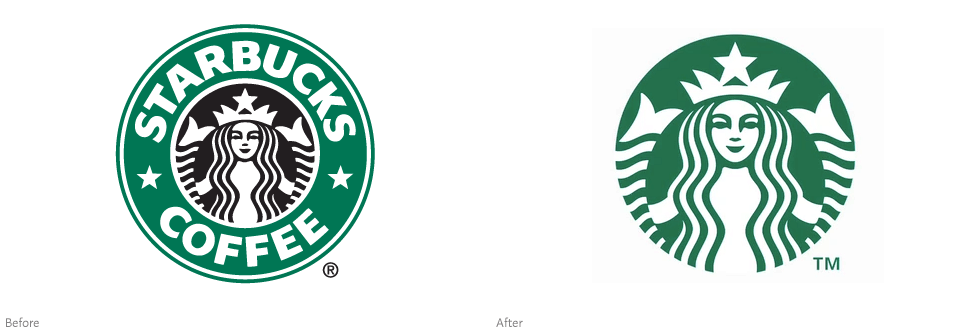
The new logo, which was introduced January 5th on the company’s website, retains the memorable “siren” that has served as Starbucks’ icon since the company’s formation in 1971. Dropping the ‘Starbucks Coffee’ wordmark, the company attempts to position itself to market other (read: non-coffee) products—over the past few years Starbucks has dabbled in music, ice cream, and even booze.
“Even though we have been, and always will be, a coffee company and retailer, it's possible we'll have other products with our name on it and no coffee in it,” says CEO Howard Schultz.
Since its first location opened nearly forty years ago in Seattle, Starbucks has grown to become the largest coffee shop chain in the world with nearly 17,000 stores in 55 countries. Although the company has experimented with alternate logos (including the vintage logo at its flagship Pike Place Market location, or no logo at all), this update marks the first official logo change since the company went public in 1992.
Mike P., a senior creative manager at Starbucks explains how the new logo came to be:
When we first heard about the possibility of modifying the Starbucks brand identity, our minds went wild with the possibilities…we broke down the four main parts of the mark—color, shape, typeface and the Siren. After hundreds of explorations, we found the answer in simplicity. Removing the words from the mark, bringing in the green, and taking the Siren out of her ring. For forty years she’s represented coffee, and now she is the star.
Starbucks now joins the ranks of Nike, McDonald’s, Apple, and Target—a select few global brands that are recognizable enough to get away without a wordmark.

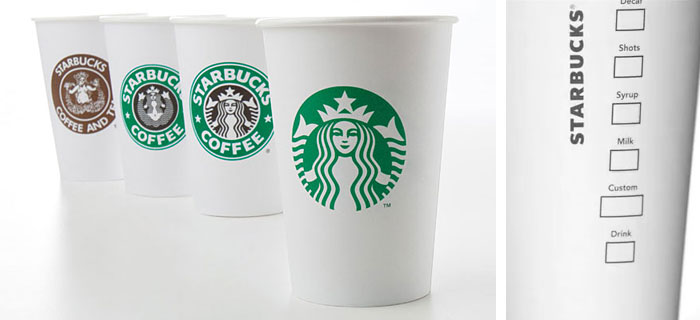
As a company that prints its logo on 3 billion paper cups each year for North America alone, it’s a pretty safe bet that consumers will get it—eventually. Although that’s not stopping certain Starbucks die-hards from freaking out right now:
Who's the bonehead in your marketing department that removed the world-famous name of Starbucks Coffee from your new logo? This gold card user isn't impressed!
—comment posted by ‘MimiKatz’ on Starbucks’ blog
CNNMoney goes as far as comparing the reaction to the recent Gap-incident. This was clearly a concern of Starbucks, whose public relations firm reportedly reached out to the members of the design community for comment.
Personally, I think Starbucks should be applauded for this. Isn’t the goal of every logo to be recognizable? If your logo can be recognized around with world without explanation, you've done your job. Not to mention, the same logo can now be used and understood in every language and country the company operates in.

It’s worth noting that although the name ‘Starbucks’ does not appear in the new logo itself, a separate wordmark does appear on the backside of the newly-designed paper cup.
Behind the Starbucks siren
So what is this “siren”?
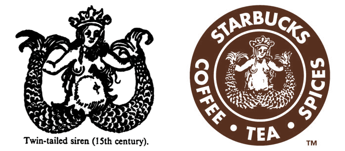
In a 2005 blog post, Michael Krakovskiy points to the book A Dictionary of Symbols which contains an illustration very closely resembling Starbucks’ original 1971 logo.
The book (which can be read on Google Books) describes sirens as a mythological figure similar to mermaids (or Melusine), its seductively-spread twin tail representing women’s legs. The siren was said to entice sailors with beautiful song—only to devour them.

“The graphic designer removed the belly button, the unattractive shading around the bulging tummy of the 15th century siren and merged the tail-legs to remove the suggestion of naughty bits… Other than that it's clear that this is exactly the image that he or she was using,” notes Krakovskiy.
Starbucks senior writer Steve M. provides some background on why this image was chosen:
In a search for a way to capture the seafaring history of coffee and Seattle’s strong seaport roots, there was a lot of poring over old marine books going on. Suddenly, there she was: a 16th century Norse woodcut of a twin-tailed mermaid, or Siren. There was something about her—a seductive mystery mixed with a nautical theme that was exactly what the founders were looking for.
The original bare-breasted, legs-spread siren sparked some controversy in 2008 when it was reinstated for an anniversary promotion—even prompting a religious group to boycott the company.
Obviously, the siren was too risqué for a publicly-traded multinational corporation—which explains why she was restyled and cleverly cropped in 1992.

However, when Starbucks entered the Saudi Arabian market in 2002, the company feared even the stylized siren was too much—creating a special censored version for the country, using only the woman’s crown. The company later reverted to the standard logo in Saudi Arabia.
The new siren
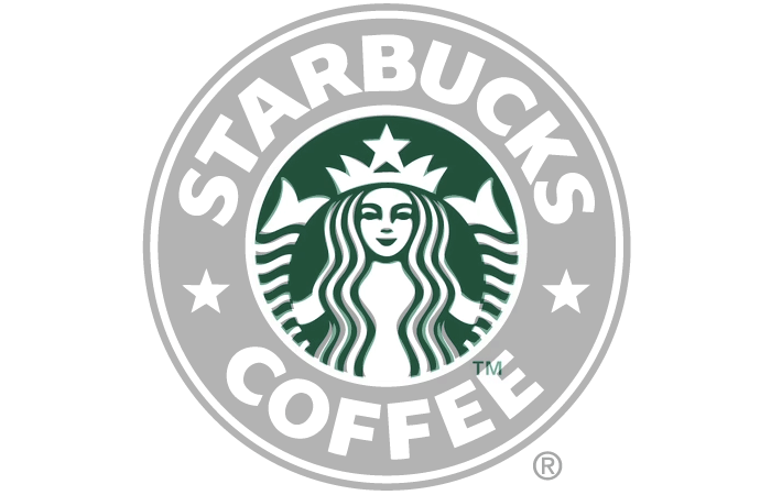
The 2011 siren is almost identical to its 1992 counterpart, but it’s not just a scaled-up version of the old logo. There are a few subtle differences: a thinner face, a rounder smile, a new nose, and a more voluptuous body.

New logo (green) overlaid with old logo (grey) to show differences
“The 20-year old logo was built in the early days of AutoTrace and it showed—points everywhere. We improved composition, brought in more sophisticated stroke width and spacing and a smoother line flow. When it came to her—the Siren—we enhanced her form in subtle ways, smoothing her hair, refining her facial features, weighting the scales on her tail to bring the focus to her face,” says Mike P.
The logo, which was designed in-house and refined by branding firm Lippincott, will first begin appearing on paper goods like cups and napkins starting in March.
If nothing else, a one-color logo will save the company money on printing costs.
In related news, Starbucks also recently announced a new logo and packaging for its Seattle’s Best Coffee subsidiary.
Filed under: branding
Comments