Picturing a new AOL
Comments: +
November 23 2009

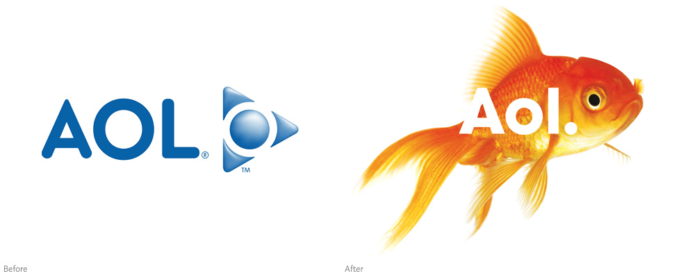
The company that bombarded us with billions of unsolicited America Online disks moves on, sans-triangle.
Suffering from significant drops in subscriptions (seriously, does anyone still use AOL?), the company announced yesterday in a press release it will adopt a new brand identity. Created by Wolff Olins, the full makeover will be unveiled on December 10th when AOL is spun off from parent company Time Warner.
Historically brand identity has been monolithic and controlling, little more than stamping a company name on a product. AOL is a 21st century media company, with an ambitious vision for the future and new focus on creativity and expression, this required the new brand identity to be open and generous, to invite conversation and collaboration, and to feel credible, but also aspirational.
—Karl Heiselman, CEO of Wolff Olins

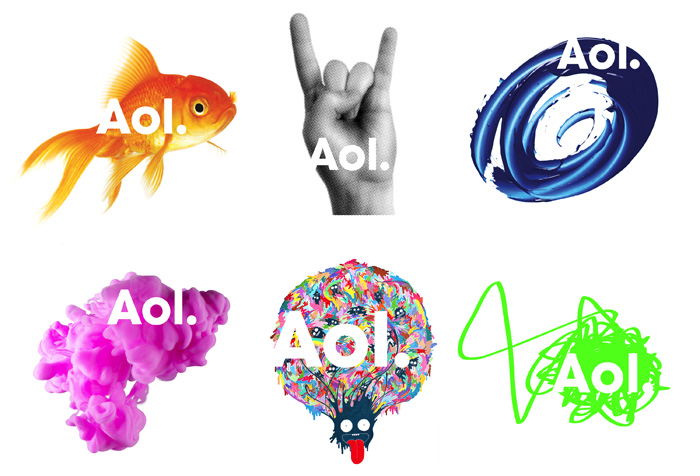
Shown above, the new identity features an infinitely changeable background.
Already highly mocked on the web, the new logo is rendered with a lowercase “-ol” and topped off with a period. “Perhaps that is what became of the period missing all these years from the logo of S.O.S soap pads,” joked Stuart Elliott in the New York Times.
Taking a cue from the classic Nickelodeon identity, the new logotype appears on an infinitely changeable background featuring everything from goldfish to skateboards—not the first time we’ve seen the interchangeable image trick from Wolff Olins. “It’s a mix of do-it-yourself and high production values, crazy stuff and elegant stuff, simple and engaging and bizarre—all the things the Internet is,” describes Wolff Olins creative director Jordan Crane.
Once the world’s largest Internet service provider, AOL hopes the new logo will help it transition to an independent, advertising-based digital media company. The news comes a week after the company announced a mass employee cut, laying off one third of its staff.
Video
Thanks to Joshua Jones and Samuel Ritter for the tip.
Filed under: branding
Comments