Olimpia Zagnoli, coming to America
Comments: +
November 8 2010

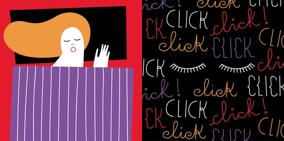
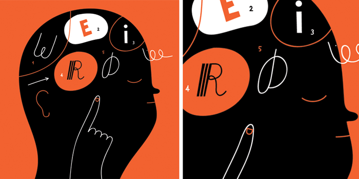
Olimpia Zagnoli is an Italian illustrator whose distinctive, character-driven work is marked by an iconic simplicity following in the tradition of Paul Rand, Bruno Munari and Charley Harper—resulting in images that are uniquely simple, fun, captivating and sometimes sad.
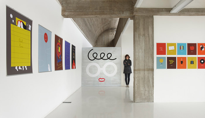
Zagnoli’s work has been exhibited in magazines, newspapers, book covers, posters and galleries around Europe and the US. Her clients include The New York Times, The New Yorker, The Guardian, Adidas Originals, The Rolling Stone, Il Corriere della Sera and many others. Born in a small town in northern Italy, Olimpia now lives in Milan and drives a yellow Fiat. When she gets old she wants to be a rockstar. She is giving her first United States lecture on November 10th in New York for AIGA/NY.
CHRIS RUBINO: I just found out yesterday that there was an Italian illustrator working in the first half of the 20th century named Antonio Rubino, how did I not know this? Is he a relative of mine? He seems like he had his place in the long history of Italian illustration; I think you are the most recently relevant in this lineage. I can see the past in your work as well as your personal touch on the future. Can you talk about your influences and/or what brought you to your current style?
OLIMPIA ZAGNOLI: Antonio Rubino used to work for my favorite vintage magazine for kids called Il Corriere dei Piccoli. I really hope he’s a relative of yours! I do have creative relatives too and they’re called mom and dad. My mom is a collage artist and my dad is a photographer. They really influenced me over the years and they gave me the possibility to develop a personal view of what art is. Living in a place like Europe i got the chance to visit the most amazing museums, churches, galleries in the world and this is definitely a good starting point if you want to make art or just feel inspired.

I see the difference between fine art and illustration. But I love my work. I love the fact it can be totally bi-dimensional and be happy between the pages of a magazine but I also like the fact it can come out and become a t-shirt, stand on a wall, become a sculpture or a flag and more.
I think your work looks very European (compliment), even Italian, I love that you use simple shapes, colors, icons to communicate in a universal visual language but I’m curious to know how you decided to incorporate so much of the English language in your work verses your native Italian?
We Italians are really xenophiles. Do you use this word? Well, we have a word which is “esterofilia” which mean that we are in love with everything that comes from outside our country. Especially when it comes from America. Our culture was really influenced by American icons in the past and still is. Like why should I be crazy in love with paper cups, radio flyers wagons or wood grain storage boxes? Because they’re American! Also, I’ve been really influenced by music and the bands and artists I love most come from England or the U.S. I always listen to music while I draw and sometimes some of their lyrics magically appear in my illustrations.
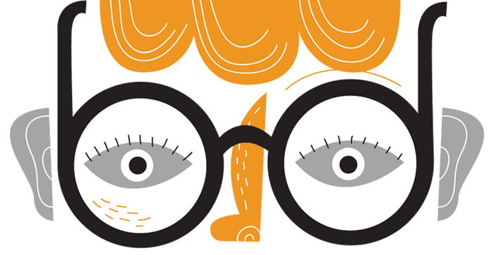
Do you really like eyeballs?
[Laughs] You caught me! Even though my boyfriend keeps saying “please no more eyeballs,” I think they’re easy to draw and give a sense of humanity even if the illustration is all about objects.

…my boyfriend keeps saying ‘please no more eyeballs,’ I think they’re easy to draw and give a sense of humanity even if the illustration is all about objects.
There are a lot of tears and rain in your work, I think these are symbols of cleansing, no? It’s so nice seeing emotion in commercial work, I think its really what makes your work stand out, do you feel like you invest a lot personally into your illustrations verses just aspiring to match a brief?
I just like lines and curves and simple small things that come from nature like flies, tears, teeth, drops, rocks. And it’s good to “sew” personal little elements inside an illustration like the initials of the people I love, my face, a heart or something like that.
I first saw your work through the Adidas Originals exhibit at Vice Gallery, is exhibition something you are pursuing more? Is it inevitable that designers and illustrators, working outside the confines of tradition, will move more and more into the fine arts? Do you have specific feeling towards working commercially verses not?
I see the difference between fine art and illustration. But I love my work. I love the fact it can be totally bi-dimensional and be happy between the pages of a magazine but I also like the fact it can come out and become a t-shirt, stand on a wall, become a sculpture or a flag and more. That’s why I really don’t see limits when it comes to where it wants to go. If it’s a gallery, a museum or a fanzine, it doesn’t really change for me.

I couldn’t agree more, Thank you so much for your time and contributing such a beautiful body of work to the world. Any final words?
Thank you! Final words? We don’t eat spaghetti with meatballs! It’s a lie!
Visit olimpiazagnoli.com to see more of Olimpia Zagnoli’s work. Tickets for her first U.S. lecture (November 10th in New York City) are available from AIGA/NY.
Chris Rubino is a New York City-based artist/designer whose work has been exhibited in Europe, Japan, Hong Kong and the U.S. He likes to spend his vacations in the desert and has been in a number of motorcycle accidents. He would very much like to meet Lawrence Weiner one day. Visit his work at www.chrisrubino.com.
Filed under: design
Comments