Monthly review, Vol. I
Comments: +
March 2 2010
A study from the University of California suggests that an average American consumes 34 gigabytes of data each day. That’s a lot to sift through. Fortunately, the idsgn Monthly Review highlights the most important happenings over the past month so you don’t miss a thing…
-
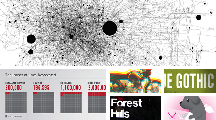
Mouse movements into modern art
Made by Moscow-based designer Anatoly Zenkov, IOGraph (formerly known as MousePath) tracks your cursor’s every move and turns it into art.
-
Designers help Haiti
Designers lend a hand following the recent disaster in Haiti using ampersands, infographics, posters, and more posters (call for entry).
-
AIGA Design Archives
AIGA launches a highly anticipated (much-needed) redesign.
-
Oscars of type
Ellen Lupton introduces typography to the red carpet.
-
Design discussions
Paul Shaw uncovers the truth behind Helvetica & NYC’s subway.
-
Valentine’s Day redesigned
Our friends at Under Consideration transform cupid.
-
Web FontFonts
Finally, real fonts on the web! Courtesy of FontFont.
-
A new look for Tonight
Jay Leno returns, but his Tonight Show logo does not.
-
Olympic pictograms through the ages
Designer Steven Heller traces the evolution of the tiny symbols for each Olympic sport since their appearance in 1936.
-
Making bananas (even more) fun
Design Related interviews DJ Neff, the art director behind Chiquita’s playful new brand refresh. Neff injects a series of playful illustrations into the brand’s iconic blue stickers.
-
Know your type
Designed by an architect, and known today as the face of The New York Times, Cheltenham is the latest in our ‘Know your type’ series.
-
Super Bowl XLIV
We’ll admit it, we watch the Super Bowl mostly for the ads (one of our favorites came from Google). Related: new logo standards.
-
Jamie wins the TED Prize
Jamie Oliver wins with his wish to teach every child about food.
-
MTV loses the music
MTV drops “Music Television” from their logo.
-
Sign out
Joe Schulz’s photograph series strips down highway signs.
-
State of the Internet
Focus explains the Internet in one gigantic infographic.
-
Overcoming creative block
ISO50 asks Erik Spiekermann, Nicolas Felton, and others how to beat creative block.
-
Transforming print
Wired attempts to transform the magazine experience with their tablet/iPad concept.
-
A city without billboards
São Paulo, Brazil bans all outdoor advertising in an effort to rid the city of what the mayor calls “visual pollution.”
-
Classic Esquire
Designer George Lois tells the stories behind his twelve favorite classic Esquire covers.
-
10 worst name changes
Xfinity (formerly Comcast) tops TIME’s worst name change list.
-
Grammy-winning covers
The album covers behind this year’s Grammy winners.
-
Flaunt
A new book on designing creative portfolios.
-
The Brand Quiz
How strongly do you associate colour and imagery with brands?
-
From Curlz to Gotham
Designer Jessica Hische illustrates how her taste in type has evolved.
-
And then there was salsa
Tositos take over Vimeo, in an ad by Goodby, Silverstein & Partners.
-
BBC redesign
BBC goes behind the scenes on their new “global visual language.”
-
Willy Wonka’s color palette
Sean Adams explains what Oompa Loompas can teach us about color.
-
Layer Tennis, a new season
For the first time in Layer Tennis history, a typeface was designed live in fifteen minute increments.
Filed under: design
Comments