iPad first impressions
Comments: +
April 5 2010

Abracadabra, Apple’s ‘magical’ device appears at half a million homes this weekend.
Here at idsgn, we’ve been fielding mixed reactions to Apple’s newest major product launch: the iPad. On first glance, we reacted to the user interface that seemed to regurgitate the iPhone’s functionality without much consideration for the iPad’s larger size. We questioned if the iPad will deliver a ‘shake-up’ to traditional publishing and user interface design industries, as many have speculated. But, for the most part, decided to reserve judgement until we could actually see the device in ‘real life.’ After a weekend of intense (sometimes obsessive use), our impressions remain, well, mixed.
None can debate the iPad’s impressive physical design: the slick, cool device easily puts the Kindle and any other competitors to shame. The smooth aluminum case feels extremely solid (read: kinda heavy) and the glass touchscreen is very responsive and already feels more intuitive than a mouse in many applications. The one drawback that all of our testers immediately noticed was the extreme glossiness of the display. This gives the colors a great, richness in the right lighting, but can be a challenge in many daylight situations and also puts unavoidable finger smudges on proud display.

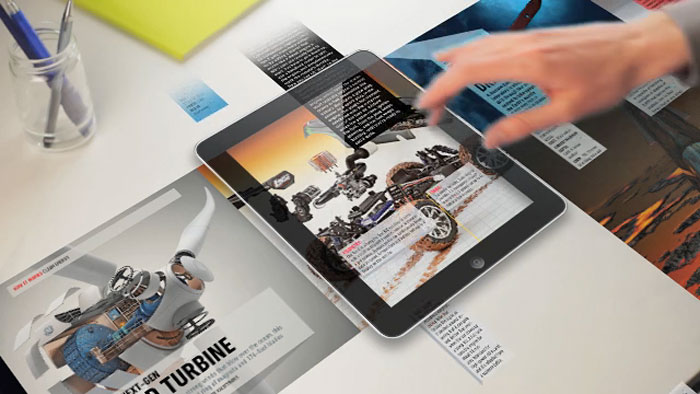
Many (all) new iPad apps were still extremely buggy at launch, but it was somewhat to be expected with most developers working blind, without an actual product to test on. Though the number of apps are limited, many were immediately impressive, intuitive and had an appeal not available on other platforms. ABC Player and Netflix both streamed and displayed video with surprising clarity and ease. The predictions of the iPad as the ‘magazine killer’ were hinted at in apps like the Marvel Comics reader, with guided, zooming navigation that creates an interesting new way to read comics. Popular Science+ also adds a new spin on reading, using unusual, multi-directional (sometimes unintuitive) page-navigation. Disney’s Toy Story app allows children to independently read a narrated storybook with added features like a parents ability to record their own voice as the storyteller.
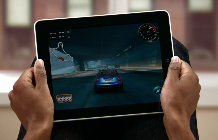
There’s no Wired magazine app yet, despite a preview earlier this month and much of the New York Times functionality we saw at the Apple Keynote was not present at launch (such as the ability to see video and ‘pinch’ zoom in and out). NPR has a very functional app that is unlike any page navigation I’ve seen before but works brilliantly on the ipad and has some great added features, such as audio overlays, that I couldn’t see using on other devices. We were quickly addicted to the game Harbor Master which seemed perfectly suited to the iPad, although I don’t think I would have given more than two minutes to it on another platform. The recipe app Epicurious made a lot of sense, and all of our testers agreed that the added functionality (sorting, searching, etc) could easily signal the death of traditional cookbooks.

No review would be complete without some criticism and moaning. I found the device awkward to hold, wishing the case (with an attached stand) were not on backorder. I was constantly propping it up on things and wished I could use both hands more often to take advantage of the touch screen (especially when typing). The familiar home button is now at perfect ‘thumb height’ when viewing horizontally which made for some annoying, accidental exiting of programs. The device seemed too heavy to easily hold in one hand. That and the glass display made me wonder if I could legitimately foresee holding this on my morning commute (sometimes with one hand) as I’ve seen others do with the Kindle.
By and large there were no huge surprises or disappointments. The device performed as promised, though maybe not quite at ‘magical’ just yet. There were small hints that it could be a game changer in many arenas as every speculator has speculated, especially with competitors preparing to launch their own products in this category soon. Touch screen interactivity provides some exciting design and UI possibilities and seems like a big step in the right direction. Hopefully this excitement and change will provide great opportunity for new design challenges and solutions in the coming months.
Filed under: interaction
Comments