Inspiration from print design
Comments: +
April 16 2009
Last night was the most recent installment of SVA's DOT DOT DOT lecture series in New York City. The topic this month was "The Influencers" and I had the opportunity to hear from web designer Jason Santa Maria on being influenced by print design.
I started out in school as a print designer and I only came to web design afterwards. But, print design and all the stuff that I learned when I was at school had a gigantic influence on me. Especially things like traditional typography and especially editorial design, book design, newspaper design... And when I came to the web, I didn't really see any of that really happening.
Print design vs. web design
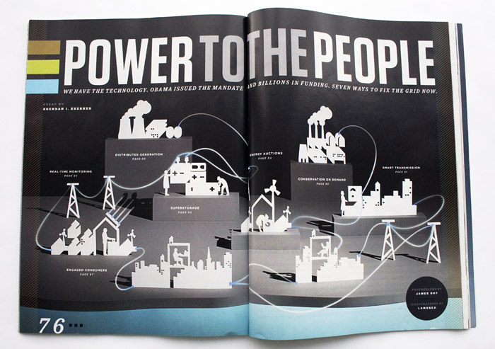
Jason showed some great examples using Wired magazine, comparing their print edition to their online edition. He pointed out how the visual design in the print edition gave the articles a tone and feeling, just from glancing at it. The web edition, being mostly a dump of text, lacked this. While these examples were from several years ago, not much has changed since then. Here is an example I pulled from the most recent issue of Wired Magazine (April 2009):
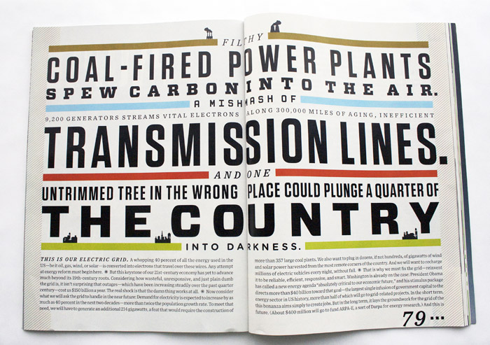
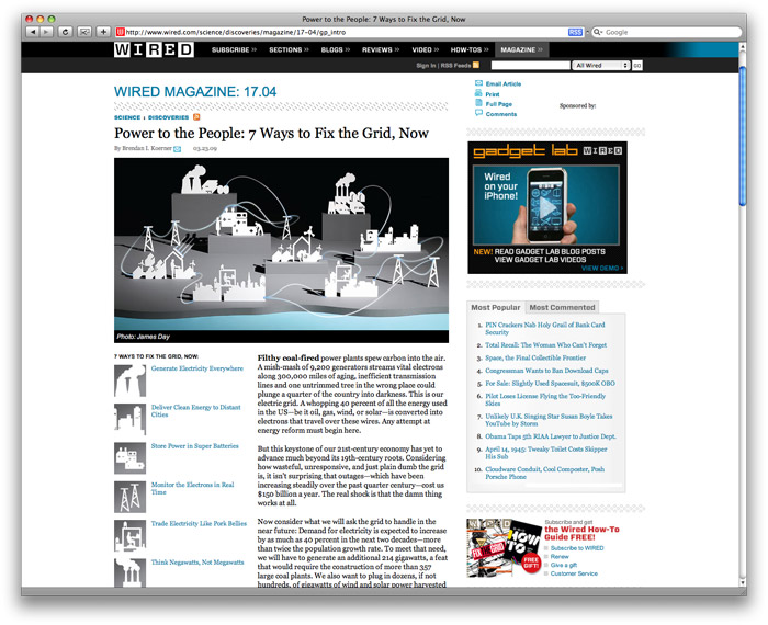
The article ("Power to the People") is full of color, imagery, and great typography. Now let's take a look at the same article online:
There really is no comparison. On the web, we see a shrunken down graphic, followed by a standard dump of scrollable text—that's it.
Can we can take print design online?
The web has only existed only for a tiny amount of time in comparison to print, so it really hasn't had time to mature like print has. Plus there are many stumbling blocks that we face on the web, such as technology, differences in screen sizes, browsers, even different devices like cellphones. But does that mean we can't try? Jason takes a unique approach:
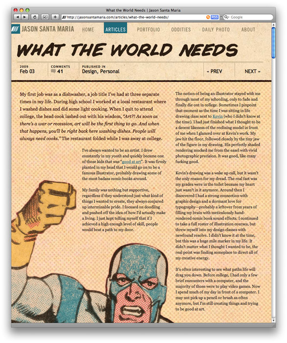
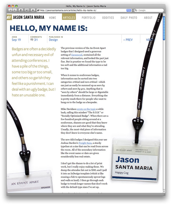
Something that I've been trying on my site is bringing that influence of print design online, heavily inspired by a magazine...Where I might have a very simple system for layout, some very common page elements—things like the date, the title and the navigation. And that can stay intact. But when the story calls for it...the visual design can adapt around that. Things can change.
As you can see, his website almost comes off looking more like magazine articles than a website:
We tend to separate what makes a good website based on what we know about web design, we do not really compare it to other media very often, so its very interesting to hear Jason's perspective. For more on Jason Santa Maria check out his website, full of inspiring articles and design.
So, what other media can you draw inspiration from?
UPDATE: Jason's talk from DOT DOT DOT has been posted at Vimeo (April 29, 2009)
Filed under: design
Comments