Flaunt: Armin Vit on creative portfolio design
Comments: +
February 22 2010

Creating a design portfolio can be a daunting task. What is the best way to put it all together? What do companies look for? Where to begin?
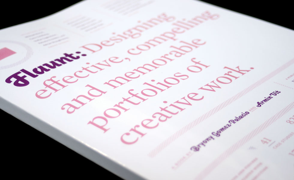
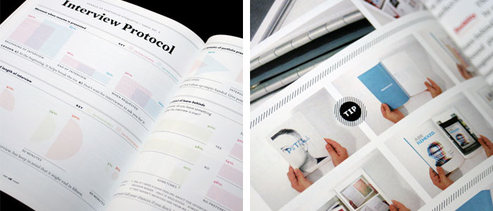
Thankfully, the folks at Under Consideration have published Flaunt: Designing Effective, Compelling and Memorable Portfolios of Creative Work, a new book which aims to ease the anxiety around putting together and presenting your creative work. Written by Bryony Gomez-Palacio and Armin Vit, Flaunt provides an inspiring showcase of portfolios from many up-and-coming designers—but it’s more than just pretty pictures. The authors turn to industry leaders like Michael Bierut, Carin Goldberg, and Stefan Sagmeister to offer their best advice and share common mistakes.
No strangers to the task, Gomez-Palacio and Vit even show us the evolution of their own porfolios over the years. From graduation, to the work that landed them jobs at Addison and Pentagram in New York, the authors deliver a candid look at the blood, sweat, and tears (literally, judging from an image of Gomez-Palacio’s fingers after a Japanese 4-hole binding process) that go into a successful portfolio.

We had a chance to catch up with Vit and ask him about the new book, the world of self-publishing, and whether we’ll be seeing design portfolios on the iPad anytime soon.
IDSGN: There is a great quote at the beginning of the book by Adrian Shaughnessy which says, “You should never consider your portfolio finished, and you should always be dissatisfied with it.” I think this is how a lot of designers feel when attempting the daunting task of putting together their portfolio. What do you hope to accomplish with Flaunt?
ARMIN VIT: Our main goal is to give designers a sense of what is possible, and rather than have each reader try to find the right case study to follow, we hope that they can get a few useful techniques from each portfolio shown and empower them to make their own to fit their work and personality. Additionally we just want to demystify this very scary project that we all tackle numerous times in our career. And finally, it was very important to bring in the voice of those designers that review portfolios, simply to expose how varied their opinions on what is wrong or right can be.
The book is full of inspiring portfolio examples. Is there one in particular that made you say, “Wow, this is what a portfolio should be”?
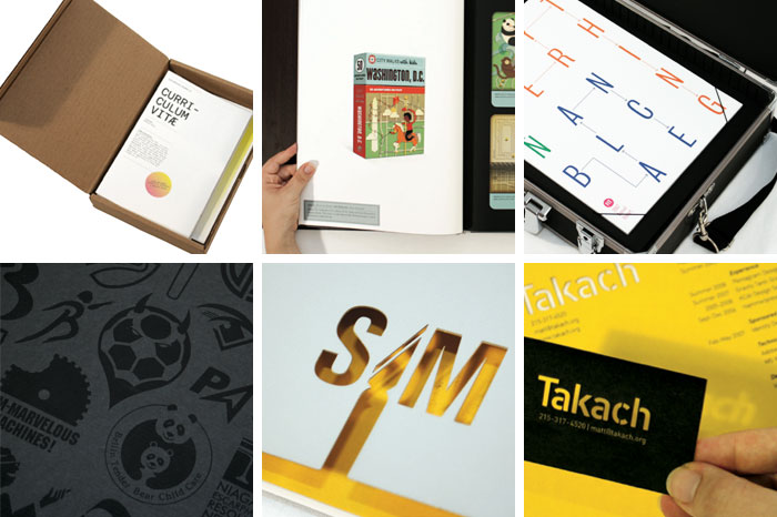
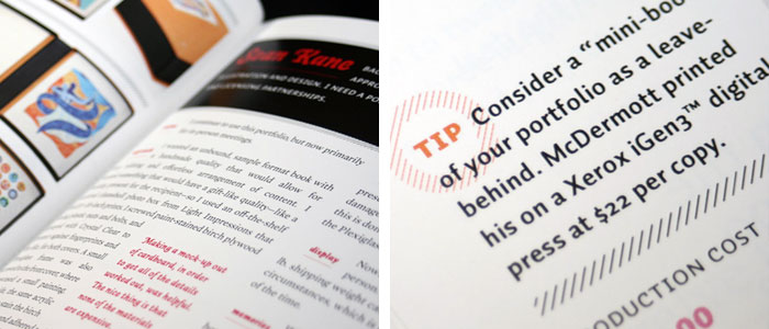
There were quite a few, and each of them had their own wow-factor. For example Abi Huynh who puts dozens of laser-printed, saddle-stitched mini-booklets together and ships them in a rudimentary cardboard box; and it doesn’t matter if the portfolio makes it back or not, he just creates a new one every time; it’s expandable and modular, even if it takes a bit of production time. Jessica Hische’s portfolio is a great example of a simple, sophisticated portfolio, no bells and whistles, just ample spaces for the work to shine. And then there were little details that we just loved, like Josh Berta’s boards with loops to hold actual samples in place, or Daniel Green’s using a standard black laser printer to print on black paper achieving a lovely varnish effect, or Sam Becker’s and Matthew Takach’s laser-cut covers.

In the book, you share the evolution of your own portfolio over the course of your career. I don’t know many designers who would be so willing to showcase their early work, especially work which you admit as being “alarmingly weird.” The uncensored showcase is one of the most refreshing moments of the book. Did you have trouble deciding to bare all?
Oh no, not at all. It’s very important to acknowledge that we can all only get better with practice and as time goes on. I’m proud of how crappy that first portfolio was, and if you look at the answers of the experienced professionals (p. 128) where we ask them about their first portfolio, they all have a similar story, of an ill-conceived portfolio. Even in some of the lectures I give, I start with my student work and first freelance and professional projects, they always get a good laugh.
There is something special about looking at a nicely put together portfolio with your hands, yet we live in an era where online portfolios can be made at the push of a button for little to no cost. Are Internet portfolios killing the whole idea of a physical portfolio?
That's one prevalent thought, that a well done print portfolio isn’t necessary anymore, since everything can be put online. And to a certain degree, yes. But there is a ritual when a designer comes in for an interview, of sitting down and going through a portfolio—not clicking through a web site—that simply hasn’t gone away. So the portfolio is about being able to make an impact at that moment, when you are sitting face to face with someone. And usually a good online portfolio is followed by a strong printed portfolio, so they go hand in hand.
Beyond the examples, you also took the time to speak with some leaders in the industry—the very people we might be looking to in order to land a job. What is one of the most important things people need to know about portfolio etiquette?
Consideration for the interviewer’s time. Don’t assume they will have all morning to look at your work or patiently listen to every single thing about your work. Be concise, be smart, and make a good first impression. And not being sloppy, in either the presentation, the resume or the way you dress.

Flaunt is Under Consideration’s 4th book and this time around you’ve decided to self-publish. What made you decide to go that route, and how did the overall experience differ?
It was something we wanted to try since we went on our own back in 2007. In fact, the interviews we conducted with the experienced professionals were done then. In the past year we have pitched three or four good book ideas to publishers that have been rejected; perhaps they were bad ideas, but since we have a good track record with books we just felt the design book industry has gotten very conservative in the last 2 or 3 years and understandably so. Anyway, we really wanted to just do it on our own, figure out the production and distribution, assume all expenses and, conversely, if all goes well, reap all the benefits. The experience wasn’t that much different from working with a publisher, mainly because we’ve been lucky to work with publishers that have allowed us to work through the whole book but I have to admit that it’s refreshing to not have important decisions like the title or the cover of the book be decided by the sales group. The flip side is that you do miss two or three pair of eyes looking at the product, and so many things can go unnoticed that we felt really nervous in saying, “Okay, we are done, ship it.”
You are also selling the book in digital PDF format. Reading the PDF myself, I enjoyed not having to wait for the postal service—and being able to instantly search through the entire book definitely beats an index—yet I still feel like I’d rather have an old fashioned physical copy to keep on my bookshelf. I suppose that goes back to the same reason why people love physical portfolios. As an author, how do you feel about this shift, especially now with the popularity of the Kindle and the upcoming iPad?
The idea of the PDF came from seeing the success that 37signals had with their Getting Real book, we just thought it was ingenious to produce something that could be absorbed as a PDF. Not all topics can be PDF’d but we felt this one fit the mold. But as you mention, there is still a very gut instinct to have a physical embodiment of that experience, and we couldn’t resist the urge to print the book. For design books in particular, the Kindle doesn’t stand a chance, with its lo-res screen and one-color reproduction, and I don’t think the iPad is accessible enough at however many hundreds of dollars it will cost to buy and run monthly in contrast to getting a real book at a tenth or fifth of the price; design books simply benefit too much from existing in real life to be constrained to the screen.
What about portfolios? Do you think we’ll see the next generation of designers scrap their physical portfolio and ‘flaunt’ it on their iPad?
Never. At least not for print, packaging and identity designers. Web and motion designers, surely, it’s perfect for them. But for someone trying to show a book, a CD cover, a box, a letterhead, there is nothing like seeing and feeling the actual object or at the very least seeing it at real size. Having said that, Flaunt probably looks amazing on an iPad!
Flaunt is now available from Under Consideration, shipping today in book form ($24.99 USD) and also in PDF edition ($15).
Bryony Gomez-Palacio and Armin Vit are also the authors of Graphic Design, Referenced (Rockport Publishers, 2009), Women of Design (HOW Books, 2008), and The Word It Book (HOW Books 2007), as well as the publishers behind the popular design blogs Brand New and FPO: For Print Only.
Win a free copy
Does your portfolio need work?
Under Consideration has graciously offered to give away two copies of their book (one printed, one PDF) to a pair of designers who need some help with their portfolio.
To enter: Send a photo of your printed portfolio along your name and mailing address to contest@idsgn.org. Two winners will be chosen by the editor, one international contestant receive a PDF edition and one U.S. contestant will receive a printed edition. Contest deadline is 12:00 PM (noon) EST on Friday March 5, 2010. Good luck!
UPDATE: Thanks to everybody who entered the contest. Our winners are Nic Sanchez in Riverside, California and Justin Hallström in London, UK, congratulations!
Filed under: design
Comments