Design discussions: AIGA Fellow Lanny Sommese
Comments: +
May 7 2010

Lanny Sommese is a world renowned poster designer and educator. For the past 40 years, he has been a professor and practitioner at the Pennsylvania State University.
His designs and posters have been consistently recognized by design publications and included in numerous permanent collections. He gained notoriety recently when designer, author, and former student Chip Kidd combined Sommese and another professor to create Kidd’s psychotic, viciously critical, design professor Winter Sorbek for his novel The Cheese Monkeys. Sommese’s teaching style and critiques are well known by many of his current and former students.
This June, Lanny Sommese will be awarded the AIGA Philadelphia Fellow Award—the most prestigious honor that an AIGA chapter can give.
idsgn recently got a chance to sit down with Sommese to discuss the award, his views on design education, and if there’s any truth behind Winter Sorbek.
TOM WILDER: First off, How do you feel about receiving AIGA Philadelphia’s top honor?
LANNY SOMMESE: Awed, honored, gratified, flattered, proud… tickled pink!
Your teaching style is highlighted in Chip Kidd’s The Cheese Monkeys as the character Winter Sorbek. Is there some truth to how Chip portrays you and your teaching style? Are you happy about the way Chip portrayed you in the book?
My birth name was Sohrbeck. However, my mom remarried and I took his name, Sommese. I presume that’s where Chip got the name. However, the “Winter Sorbek” character was actually a combination of myself and another of Chip’s design faculty at the time, Bill Kinser. Bill was one of my teachers in grad school at the University of Illinois. A few years after I took over the program at PSU I talked him into joining me. We both had our share of curious eccentric, idiosyncratic, psychotic approaches to pedagogy. Those were interesting, different times.
The ‘Winter Sorbek’ character was actually a combination of myself and another of Chip’s design faculty at the time… We both had our share of curious eccentric, idiosyncratic, psychotic approaches…
You’re most well known for your posters. What is so powerful about the message a poster delivers in comparison to other mediums?
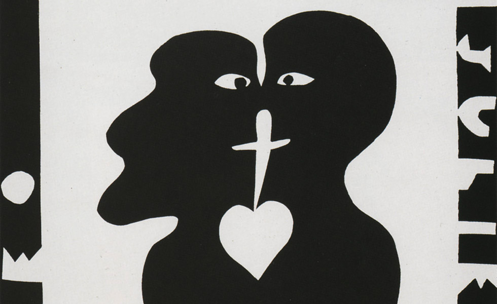
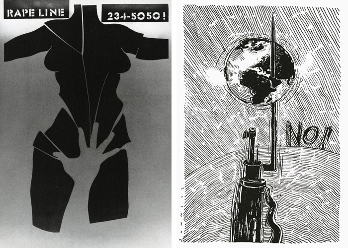
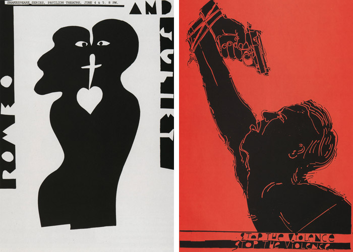
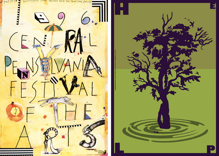
I have always worked across a variety of design venues. However, as my career has progressed I have gravitated toward poster design probably because of the large format and creative freedom that it provides. The advantage of the poster over other media is that a poster is more visceral. Because of its size it is immediate and confrontational—communicating on an emotional as well as intellectual level. This is especially true when the audience is on foot.

Did you always know you were going to be a designer or an educator? Or was there another passion that you thought you would pursue earlier in life?
Hmm, let’s see. I think it was November of 1961…maybe December? Anyway, it was my first semester as a freshman at the University of Florida. Like many college fledglings I was uncertain about what subject I should study. Going into music and learning to play the trumpet was out of the question, my mom said it was too noisy. Law? Medicine? No. Wait, didn’t Mrs. Philpott, my high school art teacher, indicate that I had nominal artistic skills?Maybe that was it? I could be an artist. Maybe not! The thought of becoming a beatnik and growing a goatee didn’t really appeal to me, but the art-talent-thing was worth investigating further.
The thought of becoming a beatnik and growing a goatee didn’t really appeal to me, but the art-talent-thing was worth investigating further.
That’s why I was in the art library two days later. As I wandered through the endless rows of bookshelves a colorful publication caught my eye. It was oddly titled, with a peculiar looking foreign word on the cover. G-E-B-R-A-U-C-H-S-G-R-A-P-H-I-K, my god, it was a tongue twister. Nearby, scattered on the floor, were some copies of The Push Pin Graphic. I quickly flipped through the pages of the two publications. The work knocked me out. Do this kind of stuff and get paid for it? Wow! No struggling artist stuff for me. I was going to be a graphic designer.
I decided to be an educator when, as a grad student at the University of Illinois, I taught a sophomore design class. I loved it!
What makes a good professor as opposed to a good designer? Surely there must be a difference. Not all designers can be good teachers and visa versa, what makes you able to balance the two?
For me making graphic design and graphic designers has always been joined together, one feeding off the other. I do my work at school as much as at home and I encourage the faculty to do the same. In fact I see the graphic design program as one big design office with art/creative directors (faculty) and a gaggle of junior and senior-level designers/image makers.

What do you think makes a good design student?
They need to be smart, committed, and gregarious with a big-time work ethic. A sense of humor would be nice, but leave that big ego at the door.
What is the design process that you teach at Penn State?
Our belief is that at the heart of each project should be an idea that is fueled by the unique aspects of the problem at hand. The first step in the process is to find out as much as I can about the subject to assure that an idea has specificity. The audience and budget are also considered, as are the functional aspects, such as readability etc. Once a relevant concept is in place it drives the rest of the creative process. In this way the concept, to a large extent, dictates the visual approach… Once a style has been selected, its inherent potentials and characteristics “kick-in” and temper the realization of the final product.
Language is crucial as well, because of the context the words provide for the visuals. Ideally, the viewer will use the language to grasp the meaning of the image (sometimes the other way around) and entice the audience to interact emotionally and intellectually with the imagery.
Ideally each project is the product of a perfectly relevant idea manifested by appropriate imagery. It’s restrained—all that is non-essential is eliminated and form appears to flow effortlessly from content. It communicates—targeting an audience that is “tuned-in” to the nuances of meaning surrounding the visual and verbal aspects of the image. The message is, at once, literal and metaphoric and understandable.

Ideally each project is the product of a perfectly relevant idea manifested by appropriate imagery. It’s restrained… It communicates… The message is, at once, literal and metaphoric and understandable.
Why has your teaching method had such an impact on design students?
For many years it’s been my opinion that traditional fine arts degree programs are at odds with the needs of the graphic designer. Rather than a narrow art focus, a university-based design curriculum should take full advantage of the school’s vast resources by integrating the designer’s preparation with the myriad of complementary studies available to its students. With this in mind we moved the design program out from under the art umbrella and created our own degree, a Bachelor of Design in Graphic Design. The degree has formalized what we had been doing for many years—emphasize head skills over hand skills. Our program is impactful because it produces smart designers who are more than problem solvers, they’re problem definers.
What do you believe other schools should focus more on?
One thing that we are very proud of is that our students are not only be able to art direct and design but do everything else as well. They personally create all photography and illustration in their portfolios—no stock photography or clip art or images lifted off the Web.
Finally, what is your current favorite piece of graphic design?
It changes day to day. My choice on this day is a funny, sassy poster I just saw in the catalogue of the III Bienal Internacional del Cartel, Bolivia, entitled That Obscure Object of Desire. It’s the work of two talented friends of mine, Lance Rutter and Yann Legendre.
Sommese will recieve the 2010 AIGA Philadelphia Fellow Award on June 10, 2010 at 7:00 PM at the World Café Live in Philadelphia, Pennsylvania (tickets are still available).
For more work from Sommese, visit the AIGA Design Archives.
Thomas Wilder is a New York City based designer who currently works for Plaid Creative. He’s worked with clients such as Kayak.com, Tiger Woods, and NYEHAUS. He graduated from Penn State University with a Bachelor of Design in Graphic Design. You can read more from him at Plaid Speaks.
Also see:
- Design discussions: Paul Shaw and the NYC Subway
- Design discussions: April Greiman on technology (Part 1) & trans-media (Part 2)
Filed under: design
Comments