CS5: An evolution of the designer’s toolbox
Comments: +
April 14 2010
![]()
After months of hinting and speculation, Adobe has unveiled the latest version of its popular design toolbox, Creative Suite 5. Beneath a mountain of new features, the suite also received a comprehensive brand refresh. We talked with Adobe’s brand design team to find out more.
Since its humble, grayscale beginnings on the Macintosh Plus, Adobe Photoshop—and more recently, the Adobe Creative Suite—has become a vital component in nearly every designer’s toolbox, forever changing the way we work.
This year, Photoshop is celebrating its landmark 20th anniversary. As a longtime user, since at least version 4.0 (CS5 marks the release of version 12.0), I’m always curious to see what the next generation will bring. Typically, it comes as a mixed blessing—new features to improve speed and workflow are always welcome, as long as you take the time to learn them and (of course) fork over the upgrade fee.
So what’s new?
A launch video posted by Adobe on Monday unveiled many of the new features and improvements we can expect to see in Creative Suite 5. Watching with great anticipation, the Adobe ‘Evangelists’ guide us through a Tim Burton-esque Land of Oz filled with Photoshop-branded flowers, Wolverine chops, and fancy new 64-bit native software.
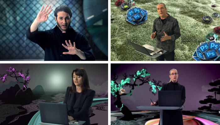
Features like Photoshop CS5’s new Mixer Brush, Content-Aware Fill, and Puppet Warp gave everyone that initial ‘wow’ feeling. “I’m salivating,” says Greg Geisler of Texas design studio Raytracer who took part in the launch video. Although, if Photoshop CS5’s Content-Aware Fill performs anything like CS4’s Content-Aware Scale, I wouldn’t set my hopes too high. Photoshop’s HDR imaging demonstration also seemed to produce gimmicky results at best.
Beautiful Strokes, Perspective Drawing, and the Shape Builder tool are a nice addition to the new version of Illustrator. Meanwhile, interactivity is being touted as the hot new feature for InDesign CS5, giving the traditionally print-focused software the ability to export animated Flash content for web and on-screen presentations. Along with Flash CS5’s ability to now export iPhone applications (or not), this is clearly one of the most unexpected and controversial features announced.
“I don’t want Flash in InDesign. I want a fast, working InDesign,” complains UK graphic designer Craig Burgess on Twitter. Likely aimed as a way to easily create future iPad-like content (such as the Adobe-powered Wired Magazine concept), it comes at a time when Flash is struggling to stay relevant among popularity of devices that do not support Flash—namely the iPad.
One thing I’m excited about is Adobe’s BrowserLab, an easy way for web designers to quickly preview webpages on a variety of browsers and platforms through a web interface. Surely that beats booting up a copy of Windows.
For many of us, however, it was the suite’s new look that really stole the show. Eagle-eyed viewers were quick to pick apart the new branding. “What the hell are these CS5 icons supposed to look like?” questioned one designer. I admit, my first thoughts were not too far off—“Is it supposed to be a book?” So, we asked Adobe’s desktop brand team to shed some light on the matter.
Evolution of a desktop brand
Since launching in the late 1980s, Adobe’s flagship desktop brands—Photoshop and Illustrator—lived for years without much change. Version after version, we all knew Illustrator for its digital interpretation of Botticelli’s Venus and Photoshop for its iconic framed eyeball (briefly turning to starfish and feathers, respectively, for CS and CS2).
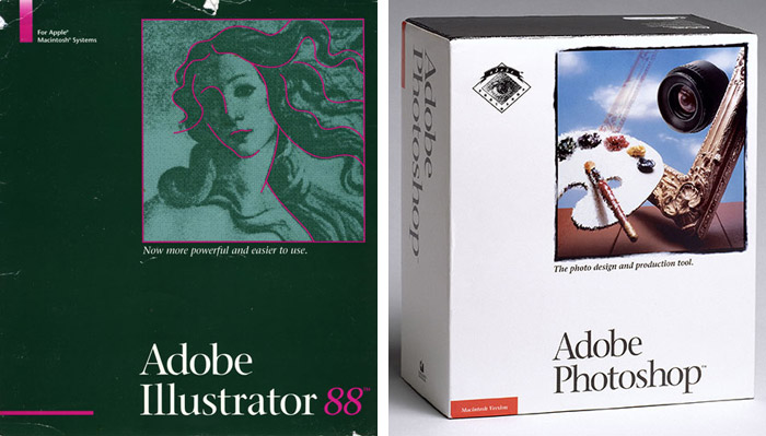
This all changed in 2005, however, when Adobe and Macromedia merged into one giant multimedia empire. Adobe’s brand team was faced with a challenge: How do you merge dozens of product offerings from two different companies into one cohesive system? How can Macromedia Flash become Adobe Flash? The Adobe Creative Suite/Macromedia Studio mashup solution couldn’t work forever.

Under the lead of in-house designer Ryan Hicks, a new system was born with the release of Creative Suite 3. Using color as a primary reference point, the Adobe brand team adopted a minimalistic two-letter mnemonic to create a consistent look across its newly expanded family of products. With the introduction of the new icons, Flash could finally feel at home sitting next to Photoshop in the dock.
Not everyone was happy when the new look was revealed in 2007, however. Initial reaction among users was, to put it kindly, mixed.
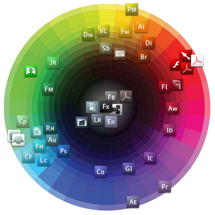
idsgn spoke with Shawn Cheris, lead designer of Adobe’s desktop brand team, who recalls: “When Adobe launched the new branding system with CS3, people hated it. I hated it. But once they had them on their desktop and realized how much more functional they were, people went 100% the other way. Now you can buy CS pillows and the like.”
Despite the initial reaction, the icons lived on with the release of CS4—swapping the white lettering for translucent black. With the introduction of CS5, Adobe wanted to present a distinct shift. Cheris explains in Adobe’s XD blog:
When we began thinking about what we wanted to do for CS5, the one thing we all agreed on was that we wanted to bring back a sense of joy to the brand work. Our goal was to move beyond the monolithic expression of of the CS3 and CS4 systems and create a more dynamic language. We wanted to bring back inspirational and aspirational artistic qualities to the identity system while leveraging the successful patterns we’ve established with CS3 and CS4. Everyone missed the more whimsical imagery that was such a big part of Adobe’s heritage and wanted to surprise and inspire our users and give them something new.
Creating a splash
Looking at other large-scale design problems, Adobe’s CS5 brand team found particular inspiration in Otl Aicher’s systematic approach to iconography for the 1972 Munich Olympics. Built on an isometric grid system, Aicher’s icons were individually unique while maintaining consistency across the entire set. An ideal solution for a company that sells an ever-growing number of applications.
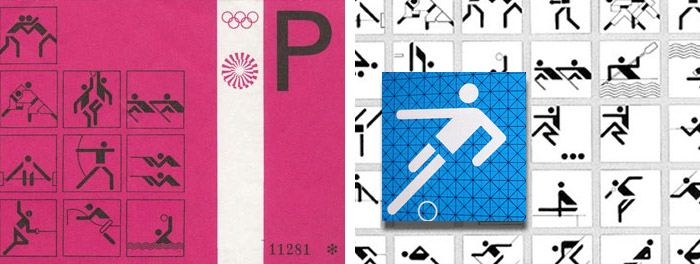
An isometric grid similar to Aicher’s became the foundation of our new visual system. If nothing else, it guaranteed that we weren’t going to be working with rectilinear elements anymore. Using the grid, we started to form shapes that could be used as a template for creating more complex forms. These shapes became the basis for our new system—our kit of parts.


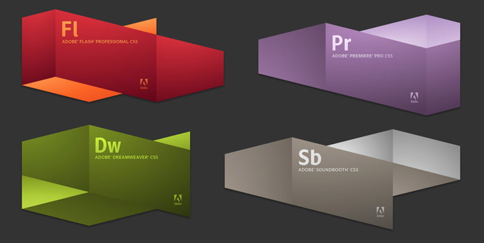
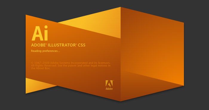
From the grid, the brand team developed a set of building blocks used to create splash screens for the suite. Blocks were pieced together in sets of five to create a unique shape for each product. “After a lot of experimentation, we discovered that five pieces would give the shapes exactly the right amount of complexity. That this was also the fifth CS release was merely a happy coincidence,” explains Cheris in a follow-up blog post.
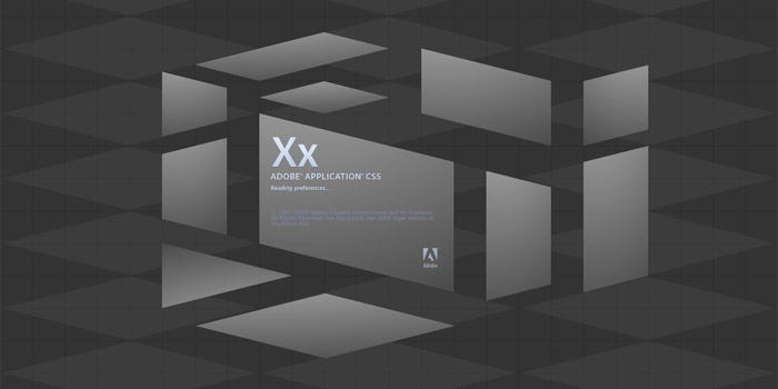
The final splash screen design returns to the color system we’ve grown to love since the CS3 redesign, with a small twist. To help increase visual differentiation between product lines in CS5, a subtle two-color design has been introduced.
Updating the icon system
![]()
The icons’ folded ‘book-like’ planes were inspired by the visual language created in the splash screens, using the same metallic sheen and translucency. We asked Cheris what he thought about the mixed reaction which, in particular, surrounded the icons:
I’ve been monitoring the mixed reaction with some amusement. The reaction to the splash screens had been overwhelming and positive, but people aren’t sure what to make of the icons, which isn’t atypical… We’ve had them on our desktop for the better part of a year and most of the designers around here have come to appreciate them. They’ve got a slight bit of translucency, and when they’re all lined up in the dock they look great. Plus, without the splash screens, they seem a bit odd. Why 3D? Is that a book? I think when people see the whole system and live with it, they might think differently.
Seeing how it all fits together, I have to agree it does make more sense. Not revolutionary, or even much of a jump from previous versions, it is a safe and subtle improvement.
![]()
As with CS3 and CS4, the new icons use the proprietary typeface ‘Clean,’ designed by Robert Slimbach. Interestingly, while the typeface first saw usage on the Creative Suite icons, Adobe announced last year it has adopted Clean as its new corporate typeface. Clean replaces the popular Minion and Myriad typefaces, which were also designed by Slimbach for Adobe (Myriad co-designed with Carol Twombly). Adobe has no plans to make Clean available for licensing, unlike Myriad which is now the face for countless other companies, from Apple to Walmart.

“What he produced is as classic as all his other designs, but with an uncharacteristic blend of contemporary touches for on-screen rendering and a more "progressive" feel… Most sans-serif families aren’t really designed for use in extended text, but Robert is a master at text and tuned the face to shine in these conditions. Text families require a subtle balance of harmony, rhythm and individuality, and Adobe Clean handles these remarkably well.”
—David Lemon, Senior Manager, Type Development at Adobe
Wrapping it up
Adobe turned to San Francisco branding agency Tolleson Design to create the packaging for CS5. The company was also responsible for the CS4 packaging, although side-by-side, I never would have guessed:
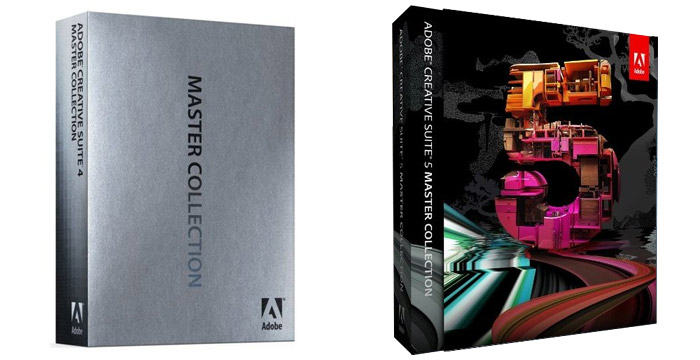
If anything requires a “What the hell?” this is it. Tolleson had a knock-out with its minimalist CS4 packaging (left), and even with every other CS5 box (below). But why does the Master Collection (Adobe’s crème de la crème, valued at $2,600 USD) receive the most juvenile design in the bunch? We are back in Oz here, with a number 5 made out of… pink doll houses? It’s probably best we just move on to the individual titles.
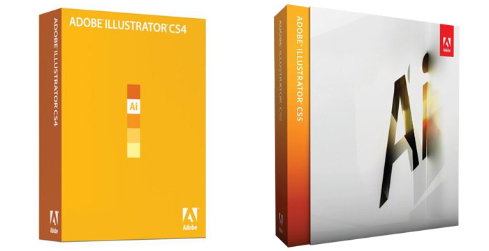

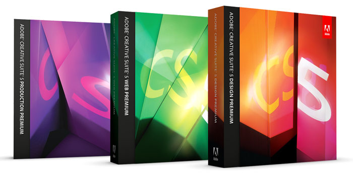
Much like the isometric splash screens created by Cheris and the brand team at Adobe, the individual titles (above) and Premium suites (below) fit together like family, while still being unique enough to each hold their own. In fact, he explains Tolleson used the splash screens as inspiration for their design:
We met with them [Tolleson Design] early on and throughout the process, and shared with them what we were doing, particularly with the splash screens. They took that as a point of inspiration and did some amazing work. I really love their take on the folding planes/angular language of the splash screens. We’re planning more collaboration for CS6 and will be starting to spitball on that in the next few months.
The branding work for CS5 was conceived and executed by Ryan Hicks (lead), Shawn Cheris, and Dave Nelson at Adobe. I’d like to personally thank the team for taking the time to share their thoughts and imagery. For more, watch Tolleson Design and the Adobe team talk about the CS5 Experience on Adobe’s XD blog INSPIRE, and don’t miss Cheris’ blog posts for a deeper look.
Adobe Creative Suite 5 will be released mid-May, and I’ll happily replace my dock icons when the time comes.
Filed under: branding
Comments