Apple switches to Verdana
Comments: +
April 1 2010

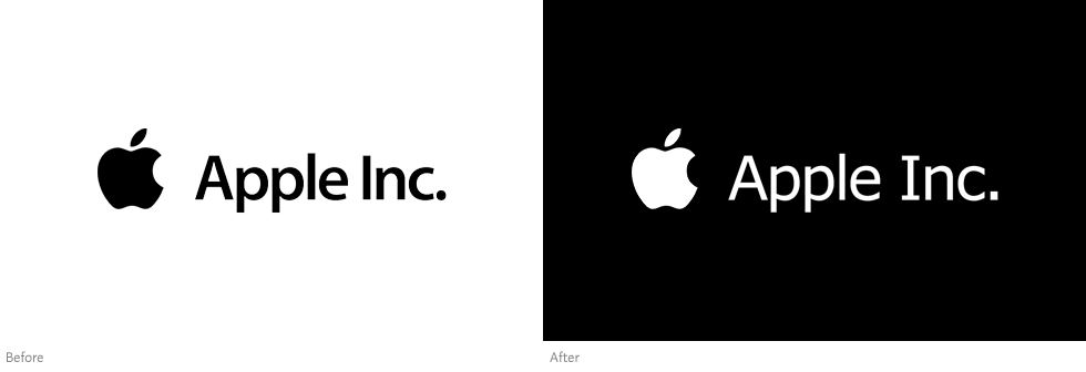
Following IKEA’s lead, Apple Inc. has changed its corporate typeface to Verdana.
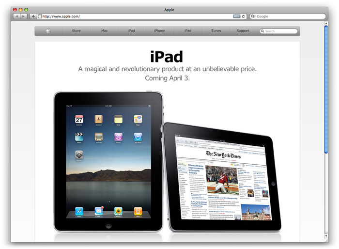
The California-based computer and electronics company, best known for its Macintosh computers and iPods, announced today the company will be adopting Verdana as its corporate typeface. The typographic change, Apple’s first since 2001, was spotted on several of the company’s international websites Thursday morning, and will soon be visible on all new packaging and marketing materials.
The news comes only months after Swedish furniture giant IKEA similarly adopted the Verdana typeface. “Verdana is a simple, cost-effective font which works well in all media and languages,” praised IKEA spokeswoman Camilla Meiby. After IKEA’s change, designers and IKEA fans alike were initally shocked to see the company drop Futura (its corporate typeface for 50 years) for the screen optimized Verdana. However, as time passed, people began to embrace the typeface in ways like never before.
One of the biggest reasons for Verdana’s resurgence is its wide multilingual support, which is increasingly becoming important as global companies like Apple enter foreign markets. Apple’s recently announced iPad will soon be available for order in Australia, Canada, France, Germany, Italy, Japan, Spain, Switzerland. “This is largely due to Verdana,” said CEO Steve Jobs.

Verdana was designed by Matthew Carter for Microsoft in the mid-90s, specifically to improve on-screen readability. The font first shipped with Microsoft Internet Explorer 3 in 1996. Being one of the ‘Core fonts for the web’—a set of fonts which also includes Arial, Comic Sans, and Times New Roman—Verdana has become one of the most widely used fonts on the web.
In 2010, it appears Verdana may also become one of the most widely used fonts offline as well. “It’s true,” says Apple’s Senior VP of Industrial Design, Jonathan Ive, “when something [like Verdana] exceeds your ability to understand how it works, it sort of becomes magical.”
Bill Davis of Ascender Corporation (the font’s publisher) predicts many more companies will follow the trend, recently announcing some improvements to the typeface. “We are busy working on creating condensed weights, and also extending the family from light to black (with italics). We are also working on small caps, additional figure styles, and programming these additional glyphs as OpenType features…”
Prior to the first Macintosh, Apple used a typeface called Motter Tektura, designed by Othmar Motter of Austria’s Vorarlberger Graphik in 1975. With the introduction of the Macintosh in 1984, Apple adopted a narrow variation of the classic Garamond typeface. The typeface became synonymous with Apple for almost two decades, used memorably in the 1997 “Think different” campaign. In 2001, as the company launched the first iPod, Apple slowly began to implement a variation of Adobe’s Myriad typeface in all new packaging and marketing materials.
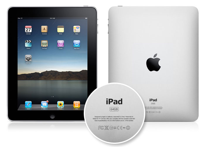
Apple’s most recent product, the highly anticipated iPad, is one of the company’s first products to use the new corporate typeface. Coincidently, the iPad will be released April 3rd, only days after this announcement.

UPDATE: In case it wasn’t clear, the above article was posted on April Fools’ Day. Thanks for sharing a laugh with us (April 2, 2010).
Filed under: branding
Comments