The end of movable type in China
Comments: +
June 30 2010
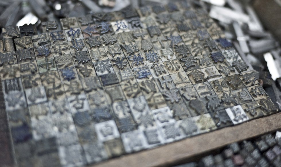
While Western letterpress printing has made a recent revival, what was once considered one of the Four Great Inventions of Ancient China is no longer a sustainable practice in its country of origin.
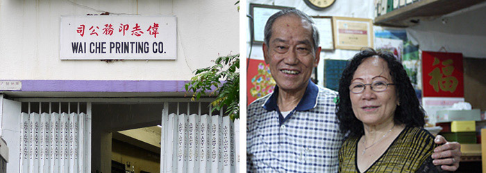
Wai Che Printing Company, preserved by its 81-year-old owner Lee Chak Yu, has operated on Wing Lee Street with its bilingual lead type collection and original Heidelberg Cylinder machine for over 50 years. Curious to learn more, I visited Wai Che—one of the last remaining letterpress shops in Hong Kong—to understand how Chinese movable type differed and why this trade has become obsolete.
Movable type, made influential by Johannes Gutenberg around 1440, was one of the greatest technological advances defining typography as we know it today. Invented in China by Bi Sheng 400 years earlier during the Song Dynasty, movable type was created as a system to print lengthy Buddhist scripture. As Chinese characters were mostly square, characters of uniform size and shape were easily interchangeable for printing. Kerning was not an issue; the letterforms had a balanced visual appearance by nature.
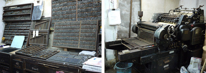
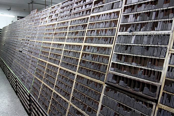
When entering the Chinese letterpress shop, an instant observation was the vast amount of characters in each set of type. Characters of the Latin alphabet were often organized either by uppercase and lowercase (so named because of the separate cases to differentiate between majuscule and minuscule letterforms) or more recently in a California Job Case. Instead of using a type drawer, Chinese characters were typically stored in cube shelving with the type stacked into a square or column, facing outward for easy identification. Using a pair of tweezers, printers carefully picked characters out of a wall of tiled type and placed them onto a composing stick before setting up the chase.
Using Chinese Type
With an overwhelming Chinese character set, there was no standardized way to categorize type. Newspaper publishers had a dozen of each character and therefore organized the type by complexity of the strokes. Small commercial printers were usually more limited in their collections and had the type purchased as they needed them. In the 1950s, it was common for a Chinese printer to constantly have characters casted by a typographer based what they needed for a job. Larger sized characters would be custom cut out of wood instead. It usually took a day to cast a new character, and this method saved money, valuable storage space and avoided redundancy.
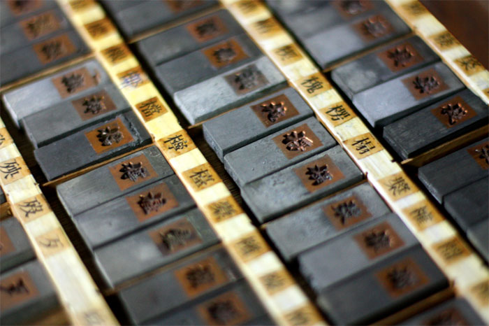
Letterforms were cast in the popular type styles, Song or Ming, named after the dynasty in which the regular script was developed. Chinese type specimen books, organized by radical or meaning of the characters, acted more as a display of legibility and letter availability rather than style since typefaces did not come in many cuts, italic or weight variations.
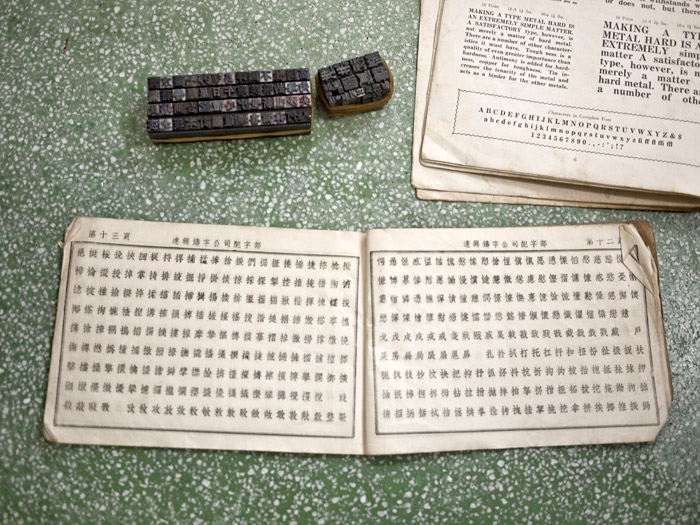
Due to the amount of characters, Chinese lead type came in fewer sizes and measured on a scale of their own. Unlike the popularized point system, when measuring Chinese characters, the larger the size number, the smaller the type. On a 7-size scale that ranged from ‘initial’ to 6—6 was the smallest type size available and legible in Chinese letterpress printing. When printing bilingually in both English and Chinese, printers matched the type in both languages optically with skill. Generally, a size 2 Chinese character was considered equivalent to 24-point Roman type.
An Obsolete Practice
The invention of movable type in China developed with Gutenberg's mechanical press and hot type-metal, proved to have widespread and lasting success in Europe. But in practice, it was not suitable for Chinese—a language with over 45,000 unique characters. Typesetting in Chinese took “minding p’s and q’s” to a whole new level, and accuracy was challenging when characters were essentially compounds of many radicals and ideograms. Running a Chinese letterpress shop required an enormous storage space and basic literacy of at least 4,000 commonly used characters. In the 80's, Chinese matrix type foundries quickly went out of business as it became expensive to install government-regulated chimneys to release the toxic metal fumes. Unable to source new characters when needed, this affected the businesses of over 200 print shops alone in Hong Kong.
Words printed with lead type are much lovelier because they are able to preserve the beauty of Chinese calligraphy and the grace of its individual brush strokes. Right now that is something you can't find in computer fonts.
—Chang Chiehkuan, Taipei Times, 2009
The use of movable type in China is now a rare business and found only in the rural village of Dongyuan for printing pedigrees. Although this traditional method has been replaced by offset and digital printing, there are single print shops in Hong Kong and Taiwan that still keep extensive collections of their lead type and press machines. Lately, there has been discussion about collecting these existing artifacts and setting up printing museums or digitalizing the complete fonts. Hopefully these projects will come to life soon, sharing and preserving Chinese cultural heritage.
Cheryl Yau is a graphic designer with working experience in Hong Kong and Toronto. In Fall 2010, Cheryl will begin her MFA in Design Criticism at the School of Visual Arts in New York. Visit cherylyau.com and her blog for more work.
Filed under: typography
Comments