idsgn (a design blog)

Now and then: How film titles have evolved

Comments: +

August 28 2009

Image

Before the cinematic title sequences of today’s films, pioneered by the likes of Saul Bass and (more recently) Kyle Cooper, film titles were once a motionless work of art. In this ‘Now and then,’ we are pressing pause and exploring the art behind the film title.

Since the early days of cinema, artists have carefully designed film titles to captivate audiences and set the film’s mood. To bring attention to this often overlooked art form, Dutch graphic designer (and movie lover) Christian Annyas has put together The Movie Title Stills Collection. The website collects and neatly organizes film titles by decade, from the 1920’s to present. To illustrate how film titles have evolved over the years, we've chosen some of our favorites from the collection.

1920’s

Image

1930’s

Image

1940’s

Image

1950’s

Image

1960’s

Image

1970’s

Image

1980’s

Image

1990’s

Image

2000’s

Image

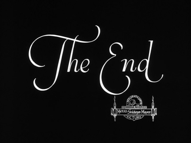
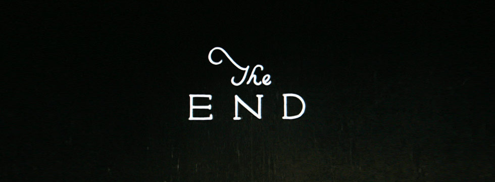
The End

Image

Also featured in Annyas’ collection is the now retired ‘End’ title, with an explanation for its departure:

In the early days of cinema almost every film had it’s own ‘The End’ title. The reason for this was that the credits were shown at the beginning of a film. This changed in the sixties when only the most important people like actors and directors were mentioned in the opening credits, the rest of the cast and crew would be mentioned during the (now often minutes-long) closing credits.

More titles

For hundreds more, check out The Movie Title Stills Collection. And if you can’t get enough there are a few other film title collections out there and a couple great ‘End’ sets on Flickr. For the motion side of things, check out The Art of the Title and Forget the Film, Watch the Titles.
Filed under: film

By Skylar Challand

Comments

ADS by FUSION