Redesigning Craigslist
Comments: +
August 27 2009
")
Launched in 1995, Craigslist remains one of the world’s most popular websites… but why does it still feel like the ’90s?
Craigslist has built a cult-like following, changing the way people find jobs, apartments, and romance. But unlike most websites, its design has gone mostly unchanged over the years. In a recent article called “Why Craigslist Is Such a Mess”, Wired magazine exposes why (and tries to help).
Besides offering nearly all of its features for free, it scorns advertising, refuses investment, ignores design, and does not innovate. Ordinarily, a company that showed such complete disdain for the normal rules of business would be vulnerable to competition, but craigslist has no serious rivals. The glory of the site is its size and its price. But seen from another angle, craigslist is one of the strangest monopolies in history, where customers are locked in by fees set at zero…
- Gary Wolf, Wired Magazine
Despite Craigslist’s lack of interest in change, Wired asked some leading interface designers to give the site an extreme makeover—with some hopeful results.
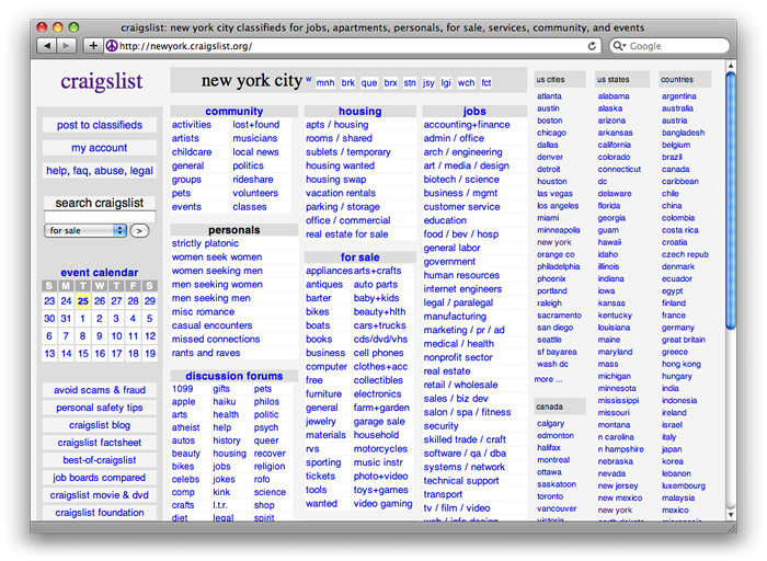
Before
The current site, while familiar to existing users, is a mess of confusing hyperlinks with very little consideration for user experience:
After, by Khoi Vinh/NYTimes.com
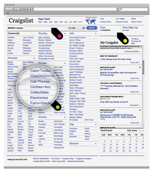
The NYTimes.com team retained Craigslist's basic look and feel while making the site work more like an app. Since search is the most important feature, design director Khoi Vinh and his colleagues gave this function more real estate and placed it at the top of the page.
After, by SimpleScott
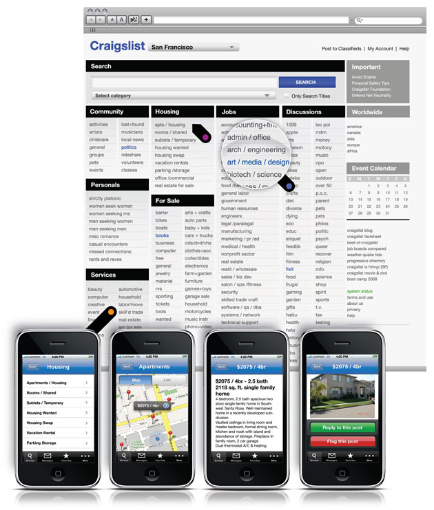
‘Craigslist is working,’ says SimpleScott, former design director of BarackObama.com—why fix what isn't broken? Instead, he focused on making the site easier on the eyes.
After, by Studio8
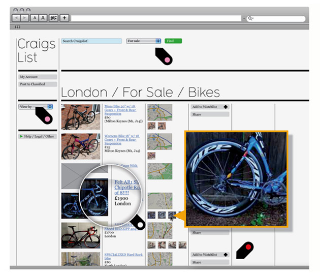
‘Craigslist is frustrating and claustrophobic,’ Matt Willey says. His layout has a contemporary look, a Web 2.0 feel, and plenty of breathing room.
Personally, I like the direction of Vinh’s design. It’s not too drastic of a change—echoing the minimalist approach of the original site—but the clear typography and clean interface go a long way in improving readability. Best of all, it saves my head from exploding. How could Craigslist go wrong with that?
For more designs (including an interesting one by Pentagram), check out the article at Wired and even submit your own makeover.
Filed under: design
Comments