Nickelodeon cleans up
Comments: +
August 2 2009

Nickelodeon wipes away the slime as the popular kids’ network celebrates its 30th anniversary.
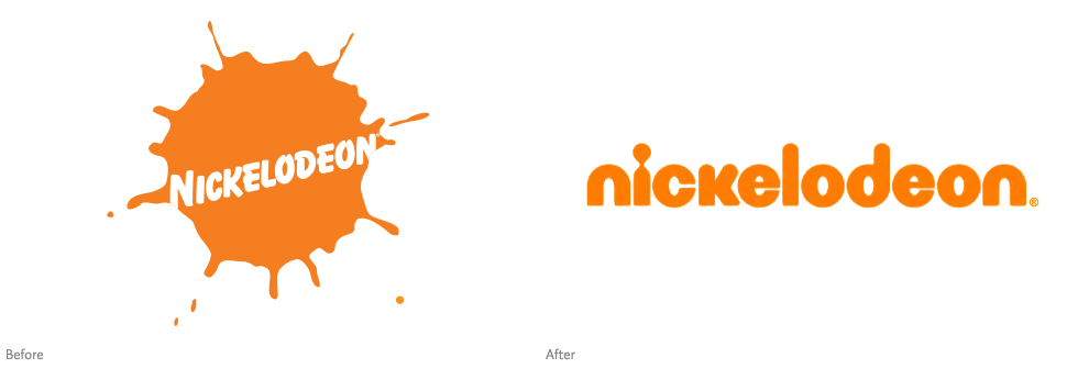
The MTV-owned cable channel has announced a new identity which will debut this fall. Representing its biggest change in 25 years, the new logo marks a departure from the familiar ‘splat’ in favor of a more standardized look. While the new logo has not officially aired, it can already be seen on material for the upcoming Nickelodeon Animation Festival and new merchandise like DVD box sets.


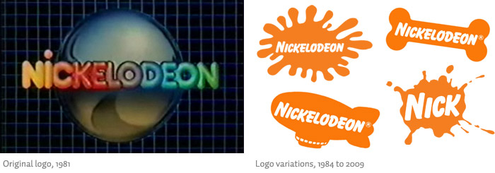
Set in rounded lowercase type, the focal point of the new logo is a stylized dot on the lowercase ‘i’—somewhat resembling the outline of a child (or perhaps one last little splat for old time’s sake). I can't help but feel nostalgic for the much-loved ‘splat’, designed in 1984 by Scott Nash and Tom Corey for Fred/Alan (the company behind the famous MTV logo). The ‘splat’ was notable as one of the first to break away from traditional logo restrictions, morphing into hundreds of variations (as seen in this branding guide). The designers behind the new logo have yet to be identified.

The network, which originally debuted in 1977 under the name Pinwheel, primarily felt the need to develop the new identity in order to unify itself with its four sister channels: Nick at Nite, Nicktoons, Noggin, and The N. Along with the new logo, The N will be rebranded as TeenNick and Noggin as Nick Jr., bringing the word “Nick” into all of its channels for the first time. “The decision to streamline the network identities came after they started putting all of the channels' logos on the same business card—and decided that it looked like a mess,” reports Variety.
The network's soon-to-be-rebranded sister identities:

We wanted to clean it up and allow Nick to be the stamp on all of these channels… In asking ourselves if everything could live under the splat, we decided that the splat was dated. It just couldn't be done in a streamlined way.
-Cyma Zarghami, president
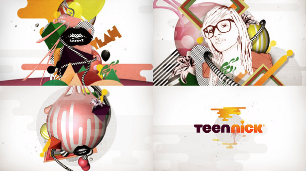
A glimpse of the new TeenNick logo has been spotted in stills from an upcoming ident produced by Lifelong Friendship Society, giving an idea of how these sister networks will be streamlined into the new brand:

UPDATE: Some opinions from kids and a slightly larger version of the TeenNick logo (Aug 3, 2009). Story is picked up with some interesting comments by Fast Company, Entertainment Weekly, Perez Hilton, Examiner (again), Movieline, etc (Aug 5, 2009).
Nickelodeon officially launched its new branding today on-air and online. The ‘splat’ is gone, but the slime is here to stay (Sep 28, 2009):
The new identities of Nick's sister networks have also been released (Sep 28, 2009):

Filed under: branding

Comments