The good and evil of infographics
Comments: +
July 19 2011

There has been an explosion of interest in infographics. Lowly excel-charts have been overshadowed by the unexpected visualizations being circulated lately. Though information design has a rich history, magazines like GOOD, Wired, and Popular Science have helped to repopularize data visualization in recent years and created a cultural interest in the data behind the headlines.
Designer Nicholas Felton elevated infographics to a personal art-form with his immaculate annual reports. Felton himself was recently hired by Facebook, implying the social media giant has more than a passing interest in data visualization too. Other designers and agencies have taken note of the trend. From Scott Stowell to Pentagram’s former partner Lisa Strausfeld (who left the firm this past March to focus more time on data visualization), designers have done stunning work that helps educate people in new ways.
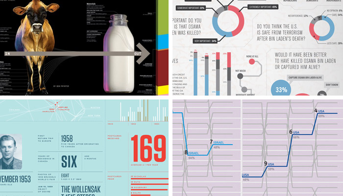
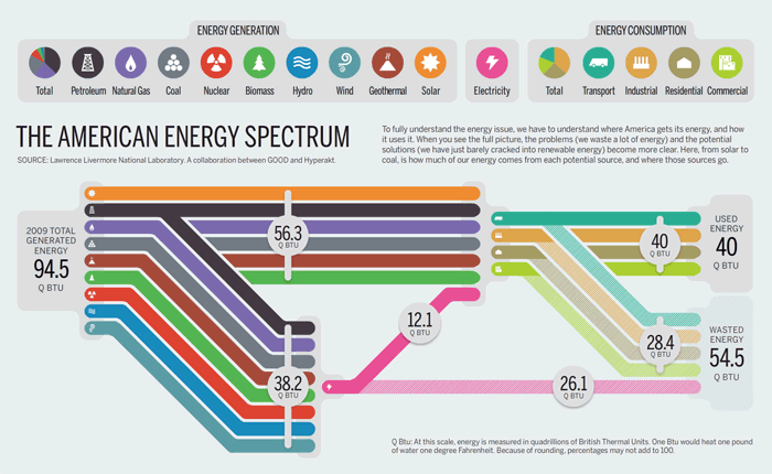
One studio heavily involved in information design is the Brooklyn design firm, Hyperakt. Aside from their mission to focus their work on social issues, Hyperakt has become known for their data rich designs for GOOD, Popular Science, Thompson Reuters and other clients. This was one of the reasons I was so drawn to their work a few years ago and just one of the many factors that led to my joining the company this past winter.
Now, after working on several infographics projects, I’m beginning to see just how much the information is shaped by the designer. The countless ways information can be represented visually allow for a great flexibility in the overall message you can send the reader. A change in scale or proportion can make the same data look extremely dramatic or very minimal. This slightly worried me as I had come to trust data visualizations as a valuable source of information. After all, I am seeing the raw data with my own eyes. Plus, these visualizations are coming to me from trusted sources like GOOD magazine and others. Could they be misleading me?
Beyond the ability to skew perception, there are other potential problems with data visualizations. In an article written for the Huffington Post, Paula Scher points out that charts, graphs, diagrams, and maps have been around for a long time and that recent infographics can overcomplicate data or lead viewers to skip out on reading articles, missing the context.
Regardless of its pitfalls, I think the spin-machine that operates in our current media makes data visualization especially important. The way pundits and news organizations distort facts and reshape the dialogue, it is comforting to see the data with your own eyes. Not to mention some of the stunning design work happening in this realm. But, I also see that there is a healthy skepticism to be had for this medium, too. What you see is not always the whole story. Visualized or not, there is always another side to the information.
To explore this topic further, I spoke to someone who has been designing information for a long time: one of the principals of Hyperakt, Deroy Peraza.
JOSH SMITH: At Hyperakt you have a mission to ‘do good’ for the world, usually working for nonprofits or art institutions. How does this relates to infographics? Do you think data visualizations are always ‘doing good’?
DEROY PERAZA: I think infographics are incredible education tools. They make information (and the larger concepts that arise from that information) easier to digest-at least they should-if they are successful infographics. They are another avenue for learning, which I think is absolutely great for society.
It’s no doubt they inform.
The more a person knows, the more empowered they are in every way. But, like any medium, data visualization is a medium that can be perverted. The core traits of a great infographic are is honesty, logic, and beauty. when any of those are taken out of the equation, the result can do more harm than good.
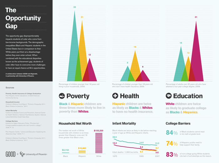
I think people believe what they see. Add to that, infographics (at least lately) are coming from well trusted sources like GOOD magazine. This makes them very influential at the moment. But I’ve seen how they can mislead if the designer is not careful…
Absolutely. Part of our role in creating infographics is to be discerning readers of the information, to make sure we are showing well balanced data from respected sources. We make judgement calls and have a great deal of responsibility there.
What about the viewer? Is there something a viewer should look for or question?
I think viewers should question everything.
Touché. But I wonder if it’s easier for viewers to question other media? Certain buzzwords in news articles and spin on TV are recognizable now. Infographics are newer to many people, is there a smart way to read and evaluate them as a reader?
Well, as a reader, when I look at infographics the first question I ask myself after having digested all the information presented is: What’s missing? What’s the other side? Because there’s always another side, another argument to be made.
Do you ever hear from the other side of those arguments?
One of the most exciting things about infographics is how much conversation they generate. When you crystalize a point of view there are always those that will agree and those that won’t, regardless of the issue or of the thoroughness of the data represented. I love that a reader has the power to add in their opinion. And they always do.
You mean because of internet? And comments?
Exactly. These pieces are never done. They’re conversation starters and they continue to be ‘modified’ in a sense by user comments.
Have you ever adjusted an infographic based on that feedback?
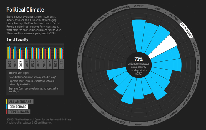
Generally speaking, when we create an infographic for a client like GOOD, once it’s out in the world, there’s no taking it back. We don’t modify it, but we participate in the conversation when its appropriate. I have worked on personal projects like the World Cup Radial Bracket piece, that was modified over the course of the tournament and incorporated a lot of edits based on user feedback. That was a lot of fun, although I would guess that process would be much more contentious when dealing with more serious issues than a soccer tournament. The feedback there was more about mechanical edits to the piece that would make the information easier to read. When the feedback is grounded readers’ opinion on an issue, it’s a trickier matter.
I wanted to show you something I found. It is a Wall Street Journal chart which was (allegedly) skewed to mislead the viewer into thinking that the majority of wealth in the USA is concentrated in the middle class.
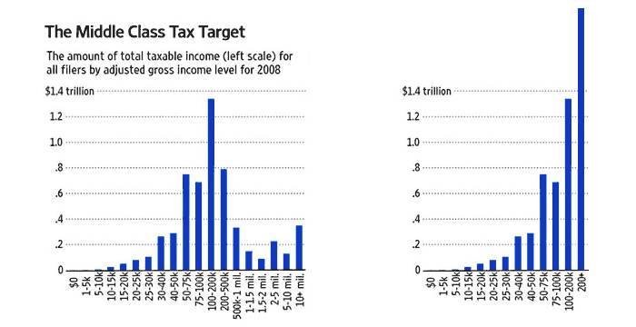
Actually, the wealth is concentrated more on the very wealthy, but the chart separated the wealthy into many columns to prove a point (that Obama was unnecessarily taxing the wealthy).
That’s a fairly common trick, it’s something we’ve had to deal with.
So you’ve been asked to purposely mislead?
Not necessarily. I think clients optimistically read data through from their own lens. Sometimes they think this can be captured in a visualization, which in short is misleading.
Do you continue with a project when that happens?
In the past, we spotted a trend that looked very positive for the client when looked at in isolation, but when put in context it ended up being not so significant. By overemphasizing a truth, you can create a lie.
By overemphasizing a truth, you can create a lie.
Was it a hard position to be in?
I actually don’t think it’s hard at all to be in that position. If you spot something that is stretching the data to the breaking point and can articulate it and clearly tell the client that it would be disingenuous to skew the reader’s perspective, a responsible client will take a second look. One of my favorite tactics…is to remind them that if we, your humble designers, can see holes in the data… Surely other people will and they won’t be afraid to publicly call you out.
This sounds like a good tip for client relations in general.
One of my favorite things about the public nature of the internet is accountability. Clients think twice about what they put into the world because they know anyone can put dents in their reputation now. If a client is ignorant (arrogant) enough to want to proceed, they are probably not clients you want to be associated with, because those dents are transferable to us.
It sounds like you are embracing move to digital platforms and not nostalgic for printed infographics?
I think infographics are, as my mom would say, “in their sauce” when they are online. As much as I love print for its tactile qualities, the web is a much greater vehicle for infographics. In fact, the web is the reason for the recent explosion in visualization. It’s a medium that has always been powerful but it was missing a few ingredients:
1. Readily available, high quality data in vast quantities
2. Sharability
3. A platform for debate
On a global scale if you add all that stuff together its a no-brainer why they are so popular now.
So what does the future infographic look like? How might it evolve, especially online?
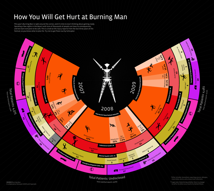
I think we’re actually in pretty primitive stages really. For the most part we’ve just taken an artifact from the print world and inserted it in the digital world. Not to say there hasn’t been many attempts at going beyond that, dynamically visualizing data in real time.
Things like Daytum or Mint?
Exactly. There was also a great MoMA exhibition a few years ago called Design and the Elastic Mind which was pretty mind blowing. Also, there’s lots of stuff made on Processing and there are sites like Last.fm, which show you real time stats on your listening habits. There are a lot of Twitter-centric analytics products like Klout that attempt to make deductions about users based on interaction patterns. I find this stuff really exciting, taming data as it’s coming in and learning from it immediately, there’s so much power in that.
Taming data?
We all have devices now that put so much at our fingertips, but there’s still too much manual work involved. Data will become more powerful as more natural, simple processes are invented to interact with it. It goes back to this idea of information as a layer on top of life. It should just be there. We shouldn’t have to think about it. That of course is no small task.
One final question: does it ever bug you that as I type the word ‘infographic’ there is a little red line below it, reminding me that it is not in the dictionary*?
Yeah, it actually really does.
*Correction: In June 2011, The Oxford Dictionary added the word ‘infographic’ to its dictionary (along with the words ‘ZOMG’ and ‘Twittersphere’), appearing to be the first and only dictionary to do so. Meanwhile, our computers remains convinced it is not a word.
Josh Smith is a graphic designer and co-founder of idsgn. He lives and works in NYC. You can follow him at @joshsmithnyc
Filed under: infographics
Comments