Design discussions: April Greiman on trans-media
Comments: +
September 11 2009

This article completes a two-part discussion with the prolific trans-media artist, April Greiman.
In part one April discussed how she acquired the newly released Macintosh computer in 1984 and introduced it to a reluctant design community. She shed light on the limitations of this early technology and the continuing transition within our industry.
During the course of this discussion, April pointed out a limitation that lingers today. That is the idea that our design tools (including software like Photoshop) are sometimes created by technical professionals who can be far removed from the everyday needs, challenges and process of designers.
In part two, the discussion shifts to more topical information on the design field at large. She provides valuable advice and a glimpse into the methodology of someone who continues to push back conventional limitations.

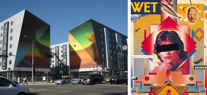
Greiman's large-scale mural at the Wilshire-Vermont LA subway terminal (left), Cover of WET magazine, 1979 with Jayme Odgers (right)
JOSH SMITH: You seem to avoid working for typical corporate clients. I mean, it seems like you've managed to avoid the…
APRIL GREIMAN: …Dumb clients? Yeah I would say people find me. Over the last few years I've just had some pretty great opportunities so that I don't have to. But I would say during the early part of my career I did turn down some clients if I didn't identify with the content or their morals. I would never work for a tobacco company, for example. I also got invited to do an annual report for Northrop and I turned it down because I wouldn't have anything to do with weaponry. I've just really just been inching along with the clients who somehow find out about me through something they've heard or seen. I still think that's the best way, although right now it's not my favorite economy to be working in.
I don't think you're alone there.
It's good that I'm a closet Buddhist, because I'm used to just taking it one day at a time.
People say ‘Oh April Greimen…she's a graphic designer,’ but I haven't called myself a graphic designer since 1984, when I got the Macintosh.
Is there anything that gets overlooked when people talk about your work?
I'm sort of tagged 'New Wave/Postmodern' and I think that the vast majority of work that came after is probably the most important work, with a bigger scope. Definitely the work we've been doing in the last five years is much more complex. I've sort-of coined the phrase ‘trans-media' for that. I really think that's what our strength is and what I've been interested in. It's kind of being a specialized generalist.
What project are you working on at the moment?
Recently we're working on a twenty eight hundred acre mixed-use complex and park in Irvine California. Over the last half a year, we've completed some of the concept design. Now we are concentrating on fourteen hundred acres with the landscape architect Ken Smith, who's in New York. The architecture firm is also in New York, so we're the local firm here, but we started off being the colorist for the park and it evolved.
What does it mean to be a colorist for a park?
Picking the color for the whole park, coming up with a concept and a palette that is really enduring and can apply to everything from the architecture materials to plants and specifically for signage, print and a graphic design program.
You mentioned that New Wave and Postmodern are labels that you get stuck with…
Yeah, people say “Oh April Greimen, yeah sure, she's a graphic designer,” but I haven't called myself a graphic designer since 1984, when I got the Macintosh.
That label ‘Graphic Design' was something you fought when you were directing the CalArts design program…
Well, it's so broad; I mean what is it even? Fine art is visual communication as well. But at that time I was really frustrated because I was bringing video and computer into graphic design and meeting a lot of resistance, so I thought you really can't call it graphic design. That term is really indicative of a technology (print) that isn't the only medium anymore.
Some people prefer applied arts…
Yeah… yeah, or commercial art.

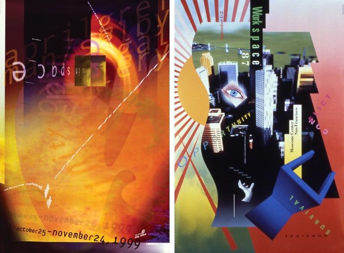
Poster for 'Objects in Space' at Selby Gallery, 1999 (left), Workspace poster, Moscone Center, 1987 (right)
I notice your work ‘breaks a lot of rules' especially in typography. As a young designer you're always told to stick to a grid and keep things the same size.
That's fine when you first start out, but Wolfgang Weingart taught me differently. We didn't start out with baby steps. He'd just throw us out into space and say ‘start'. So my M.O. became about trying stuff and not worrying about the grid or the structure until I have a feeling for what I'm doing. Then you tidy it up after. If you start off tidy, it's really hard to get messy after.
If you start off tidy, it's really hard to get messy after… Leap into the void and just start with what you're interested in.
Seems like good advice for those of us who might cling to a typographic grid too much.
Yes, just jump in. Leap into the void and just start with what you're interested in. You can always apply ordering systems and production needs after, but you can’t start with a tidy grid, pour text in with one size type and one weight and expect too much to happen.
It takes some skill to move past those rules and still produce legible, beautiful type treatments.
I really think that people who do fine typography are fine artists.
Do you think there's a difference between fine art and design?
I don't. People, particularly in America, are really stuck on labels. It's hard to get out from under your label, where in Europe and Asia we're all artists. Except in America. You know, everybody is hung up on whether you're a fine artist or a designer. I think the best of art is all well designed. And the best of design is all pretty fine art.
What do you think is next in design? Do you follow trends or do you think there's any movements happening right now that are taking things in a new direction?
I actually think that the iPhone is pretty mind-boggling. We're now carrying around a computer that's a little bigger than a credit card...and the power of this thing; you've got your own library, your own global database. It's just amazing.
With access to all this information, I wonder if we're all going to be so smart in a few years or just…
…totally dumb!

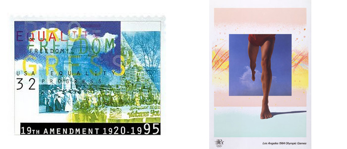
Greiman's U.S. Postage stamp celebrating the 19th amendment (left), Poster for Los Angeles 1984 Olympic Games, designed with Jayme Odgers (right)
How does it feel to see your work or your name unexpectedly? I mean did you ever get a letter with your stamp on it, or come across your name while reading?
Yeah it's kind of a hoot. I mean you always pinch yourself and say ‘why are they choosing me' or ‘why are they enamored with something I've done'. It always comes as a pleasant surprise. I know students are given assignments to do something ‘in-the-style-of.' So there's a zillion of those and I've seen people do such bad things with my work, trying to imitate a style (that I really don't have). But there is something there-an aura or something about the work that people could say ‘it's one of these certain people who made this.'
I think the best of art is all well designed.
And the best of design is all pretty fine art.
I would say people identify the spatial relationships in your work to being an ‘April Greiman thing.'
Hard to take credit for creating space, but I'm willing to do it after a couple glasses of wine or something!
I guess you didn't invent space.
I was made in space that's for sure.
Do you have any advice for young designers?
Just make sure you love what you do…
or this would be a pretty crappy way to spend your life!

Miracle Manor, Desert Hot Springs, California with Roto Architects
April Greiman continues her work from her Los Angeles studio Made in Space. Her spa and retreat, Miracle Manor, is located in Desert Hot Springs, California. She makes a concerted effort to give back to the industry she loves by leading workshops for young designers and lecturing around the world. She also teaches a class at Southern California Institute of Architecture entitled Seeing is a Way of Thinking. idsgn would like to thank her for taking the time to share her insight with our readers and we look forward to her future contributions to our community.
Filed under: design
Comments