Design discussions: April Greiman on technology
Comments: +
September 10 2009

idsgn is proud to present an in-depth, exclusive interview with the prolific trans-media artist, April Greiman.
April Greiman is regarded as one of the most influential designers of the digital age. She has been called a pioneer in this regard, making it acceptable for a graphic designer to explore their craft using a computer. In 1984, computers were seen by much of the public as science fiction props, specialized industry tools, or subverted novelties. The design community regarded them as an embarrassment to the long history and craft of an art form.
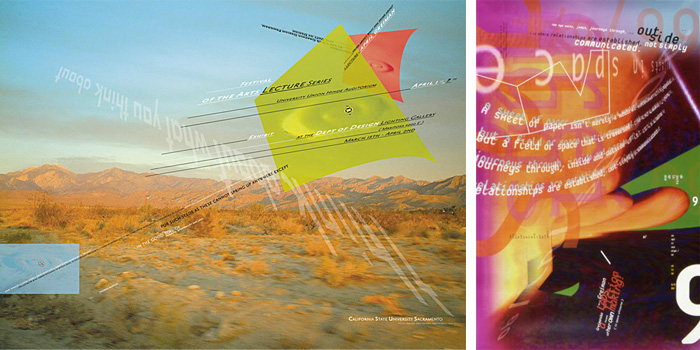
A native New Yorker, April is a graduate of the legendary Basel School of Design in Switzerland. Already making waves in America's design community, in 1986 she accepted the role as guest designer for issue #133 of the influential Design Quarterly magazine. Not only did she shake up the magazine’s format by creating an issue that unfolded into a 3' x 6' poster, she produced the work solely on the blasphemous computer, which she began working with two years prior.
The issue, entitled “Does It Make Sense?,” contained a life size, nude self-portrait, layered with symbols and typography (above) became an instant industry-benchmark and forced the design world to sit up and take notice of the contributions computers could provide.
Though sometimes overshadowed by this great feat in guiding an industry to change, April's career continued to push boundaries in ways that are still felt. Schooled by the famous New Wave master Wolfgang Weingart, April is also credited with introducing America to New Wave, postmodern design.
By experimenting with typography and image placement, in direct contrast to the rigid swiss grids of the past, New Wave postmodernists challenged the notion of modernist ordering systems and asked designers to experiment with the artistic possibilities that lay beyond the grid.

April's work in particular is often identified for its 3D, spatial qualities that provide a unique experience to the viewer. Challenging every convention in the industry, even the term ‘graphic design,’ which she feels is too limiting, April prefers to be called a ‘trans-media artist.’
We caught up with April in her Los Angeles office, Made in Space, where she's spent the last few years working on large architectural and environmental projects, creating her own hotel/spa retreat (Miracle Manor) and continuing to challenge the way design affects, interacts and communicates with those around it.
This interview is presented in two parts:
Part 1: April Greiman on technology
Part 2: April Greiman on trans-media
JOSH SMITH: You were one of the first designers to touch a computer, first Mac in 1984, but I wondered how that happened. At the time computers were expensive and relatively underground. How did you get your hands on one? What made you decide to invest in something like that?
 APRIL GREIMAN: I went to the first TED conference in 1984 with one of the founders of TED, Harry Marks. I don't think Steven Jobs was there at the time, but Alan Kay, who's one of the inventors of the Mac, was speaking there. He was working for Xerox Learning Park, where they did research and were designing a notebook or laptop type of computer. After the conference, Harry Marks said, ‘we are going to Macy's department store. I want you to see this little computer.’ I said ‘no way.’ I'd tried an Amiga prior to the Mac and it was fun, but a little too dopey for me. But Harry was a bit of a mentor to me. He basically invented the technology and software that launched motion graphics. We used to go out on photo shoots together just driving around, shooting things we were interested in. Anyway, he dragged me to Macy's and the next thing I knew, there was a line around the block, waiting behind me to try the Mac! I was immediately hooked, so I bought one.

128K! How could you do anything with that?
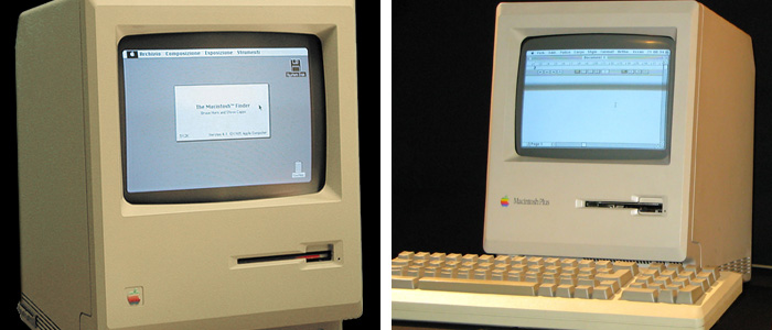
Well, exactly! If you look at the some of the work done in the early to mid-eighties you can see the limitation. We finally got a 512k machine, the Mac Plus, which is how Design Quarterly was done. We used MacVision, which was a little beige box that hooked up to a video camera and ported right into the Mac. You could scan over an image and it was tiled out. We kept moving the camera, scanning and repeating.
Totally different process, using computers today…
Totally, yes.
A lot of experienced designers disapprove of students learning with computers rather than the hands-on methods they learned in school. Do you think young designers are missing out?
I tend to pretty much exclusively work with digital tools. If I'm doing color palettes for buildings and architects I have a huge library of color chips and different systems, so testing colors is still a hands-on thing. That's the only ‘analog’ work for us, really.
And your photography?
I don't touch film, it's all digital. All of our printing is digital. I haven't touched a piece of film for 20 years. I really haven't.


Have your design views changed in light of new technologies or trends?
Not really, I mean the body of ideas is ever expanding, but there are some core things that remain. I see everything as an object in space and have always been interested, since the Basel school days, in creating visual and spatial hierarchies. So for me when web design came into the realm of possibilities, I loved it because I didn't look at it as a page. I was already looking at it as spatial media that you would journey through space to access information from. What a great thing.
I see everything as an object in space…when web design came into the realm of possibilities…I was already looking at it as spatial media
Do you feel like websites have a long way to go to embrace that kind of spatial quality? Sometimes when I look at a website, I feel like they've just borrowed from other websites, or copied what's been done in printed work.
Well that's the thing about HTML, you can just copy all that code and paste it into your desktop and then just add your own images, it all looks very templative. There are very few, I think, inventive and unique websites.
It seems like such a new medium, it has so much further to go and there's a lot to explore.
Part of it is you know you can make websites in Photoshop or in Illustrator, so everybody is doing that. But, to a certain extent, they are primitive technologies; in terms of the potential of what can be done. It's just repeating tasks and cut-and-paste and not really thinking. We are sort of subscribing then, to what engineers of the software have thought about this medium of communication. Because, keep in mind, designers like us are not designing the software. We're not writing code. We're just using the code.
That's an interesting point. Some of the technology that guides us may also be holding us back…
It's always been a problem that people who actually invented, produced or designed creative tools come from more of a technical background. Let's say you were a student, learning Photoshop or After Effects. You go take a class to learn it and they would show you 95% of the things you'll never use in that program. It's because the people who are designing it are not the ones designing with it. They are not solving the kinds of problems we are. So you kind of have to wade through and get stuck in somebody else's quicksand of engineering and technology.
Keep in mind, designers like us are not designing the software. We're not writing code. We're just using the code.
Continue reading part two: April Greiman on trans-media—reflections on a long and influential career in our industry. Included is advice for young designers, the state of things today and the shape of things to come.
Filed under: design
Comments