Sonoran: The next Helvetica
Comments: +
April 1 2011
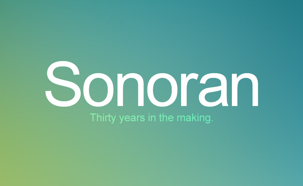
Introducing Sonoran, 2011’s most anticipated typeface release.
Nearly thirty years in the making, the highly anticipated Sonoran is finally here.
Typeface designers Robin Nicholas and Patricia Saunders first began work on Sonoran in the early 1980s, drawing inspiration from the classic Swiss typeface Helvetica. “Helvetica is a great font, people really love it. But it does have its flaws,” says Nicholas. “With Sonoran, our main goal was to fix Helvetica’s mistakes.”
Designed in 1957 by Max Miedinger, Helvetica is one of the most commonly used typefaces today. Itself based on Akzidenz-Grotesk, Helvetica was designed as a neutral typeface that could serve a variety of uses. Over the years, the typeface has turned into an modern icon of sorts, becoming the first font acquired for the Museum of Modern Art’s permanent collection. Its legacy was documented in the 2007 film Helvetica, directed by Gary Hustwit.
Despite Helvetica’s success, graphic designers have struggled for years with its quirks.
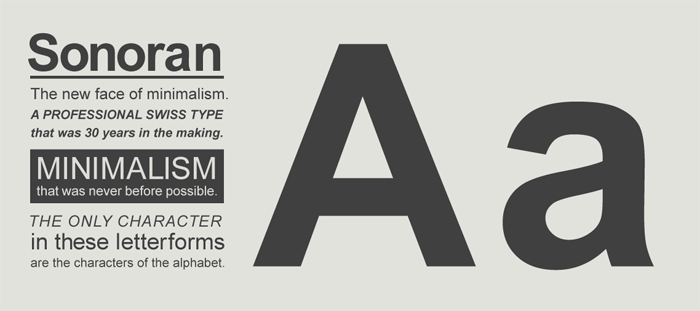
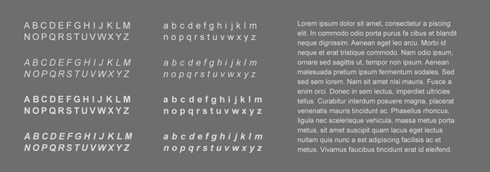
With Sonoran, attempts have been made to solve these problems. Sonoran’s improvements are subtle, yet important, remaining metrically equivalent to Helvetica. When we inspect individual letters, you can really see how the typeface was improved:
 compared with Sonoran (bottom)")
“Helvetica is [almost] our ultimate typeface: objective, powerful, and delicate according to weight,” says respected designer Massimo Vignelli, a known Helvetica proponent. “If only its capital G didn’t have that annoying spur,” adds Vignelli, who once hired an intern for the sole purpose of de-spurring Helvetica. “Sonoran is a godsend.”
It’s not everyday we hear such high regards for a new typeface—it’s already been called the world’s first perfect typeface.
Reacting to the news, it seems some type foundries have taken down their websites today, perhaps to brace for the fallout—or as a sign of giving up.
“We’ve solved typography,” notes Saunders, one of the typeface’s designers.
Part of Sonoran’s success can be attributed to its robust multilingual character support (covering Arabic, Cyrillic, Greek, Hebrew, Thai, and Turkish, to name a few), which is becoming increasingly important in today’s global marketplace. The typeface is also available in several weights and widths, including Narrow, Light, Black, Rounded, and Monospaced.
Filmmaker Gary Hustwit, who first learned about Sonoran during the filming of Helvetica, has been closely following the development of Sonoran ever since. With the typeface now complete, Hustwit announced a special director’s cut of Helvetica, part of the Design Triliogy boxset. “Sonoran is rewriting history, I had to tell the whole story,” says Hustwit. The special edition box set is due out late 2011 to early 2012.
Microsoft has also announced it will include Sonoron as its default operating system font starting with Windows 7.1, as well as with its latest Zune Phone.
The typeface will be released for public sale Monday, available from Fonts.com.
UPDATE: The truth is out, see Sonoran: The hidden truths (April 4, 2011).
Filed under: typography
Comments