Monthly review, Vol. XXIX
Comments: +
July 10 2012

-
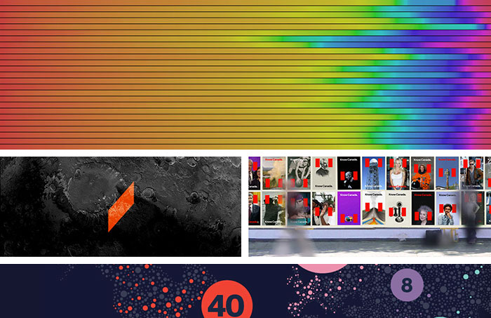
Movie poster colors
Vijay Pandurangan examines color trends in movie posters from 1914 - 2012, visualizing the data in a poster of its own. Shown above: 1914 (top) - 1938.
-
Microsoft re-imagined
Following the announcement of Microsoft’s Surface tablet, design student Andrew Kim re-imagines the brand.
-
Rebranding Canada
Bruce Mau Design re-thinks Canada’s branding for Studio 360. The resulting campaign can be seen at KnowCanada.org.
-
Designing infographics
Our very own Josh Smith gives Co.Design readers 10 pointers on designing amazing infographics.
-
30 new typefaces
The Next Web highlights 30 new typefaces you need to know about, including Idlewild from H&FJ, Pluto Sans, Frontage (shown), and more.
-
Is your font racist?
Tao Jones questions the use of stereotypical typography.
-
Science in Comic Sans
CERN scientists presents their Higgs boson research in Comic Sans.
-
The Nike Logo Project
Nike showcases hundreds of logo variations used in the past 30 years.
-
100 iconic films
Paramount Pictures celebrates 100 years with illustrations by DKNG.
-
Introducing Symbolset
The first truly semantic symbol font, replacing common terms with icons.
-
New Twitter logo
Twitter revamps their bird icon using three sets of overlapping circles.
-
Pantone Queen
Pantone and Leo Burnett team up to create a color guide fit for a queen.
-
The Hinglish Project
India’s Ministry of Tourism teaches phonetic pronunciation via fonts.
-
Jess & Russ
Designers Jessica Hische and Russ Maschmeyer put every engagement site ever made to shame.
Also see:
- Monthly review, Vol. XXVIII
- Monthly review, Vol. XXVII
- Monthly review, Vol. XXVI
- Monthly review, Vol. XXV
- Monthly review, Vol. XXIV
Filed under: design
Comments