iPad, the forgotten details
Comments: +
January 29 2010
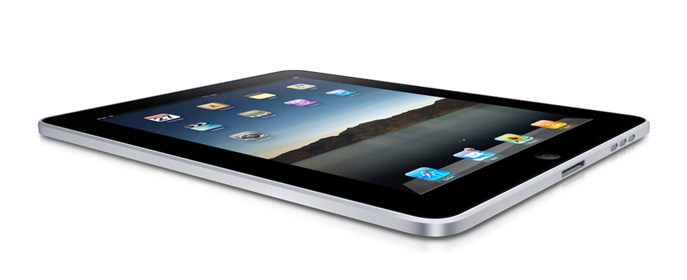
It’s hard to escape the buzz around this week’s Apple iPad announcement. While everyone is making jokes about the name, it’s really the user interface that has me baffled.
Sure, the physical device is sleek—I don’t know about “magical and revolutionary”—but it really feels like Apple missed an opportunity with the design of its new UI.
When the iPhone was first introduced in 2007, it revolutionized the mobile phone. With a screen at 3.5 inches, a smartly designed interface provided access to thousands of applications at your fingertips. So after years of speculation, when Apple finally announced the iPad, it was shocking to see an awkwardly familiar, scaled-up iPhone home screen.
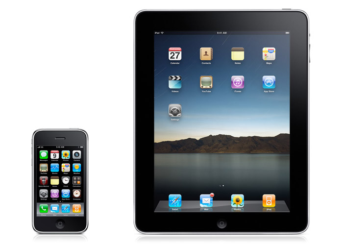
The tiny iPhone icons look clumsy spread across the iPad’s large 9.7 inch Multi-Touch display—enough so, that Apple decided to throw in a photo of some mountains to fill up the empty space. Is this what “revolutionary” looks like?
Perhaps The Onion had it right when they joked before the announcement:
Claiming that he completely forgot about the much-hyped electronic device until the last minute, a frantic Steve Jobs reportedly stayed up all night Tuesday in a desperate effort to design Apple's new tablet computer… Jobs then began work on double-spacing his Keynote presentation and increasing the font size to make it appear longer.
Maybe his Keynote wasn’t double-spaced, but the iPad interface sure is. The lousy attempt to fill up the larger iPad display feels out of place for Apple.
The iPhone-sized unlock slider looks just as awkward on the iPad:
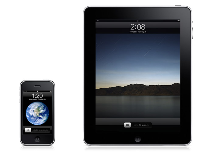
Granted, Apple has put a lot of work into rebuilding some of their applications to work better on the iPad (not to mention, designing the hardware to go around it). But the home screen—something you see every time you need to switch applications—should not have been a mere afterthought. If the iPad was designed before the iPhone, would it really look like this?
The iPad’s faux-wood iBookshelf isn't going to win any “revolutionary” points either, with an interface which looks strangely familiar to any Delicious Library or Classics users.
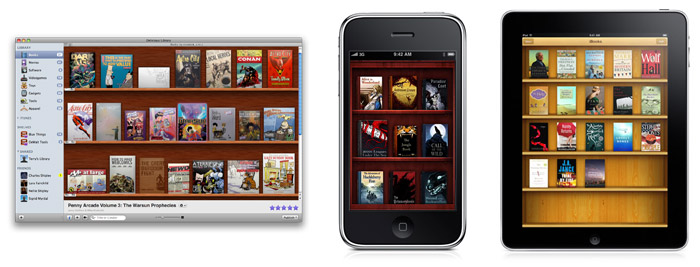
“No, Apple didn’t license iBooks from me. They just copied me,” responded Delicious Library creator Wil Shipley shortly after Apple’s announcement on Wednesday.
A similar interface can be found in the iPhone application Classics (used under permission from Shipley).
“Many of you have been contacting us with questions about Apple’s recently announced iBooks for iPad. We have no involvement, but we are proud to have influenced the future user interface of digital reading,” says Classics’ developers Andrew Kaz and Phill Ryu.
The iPad’s choice of wallpaper leaves much to be desired as well.
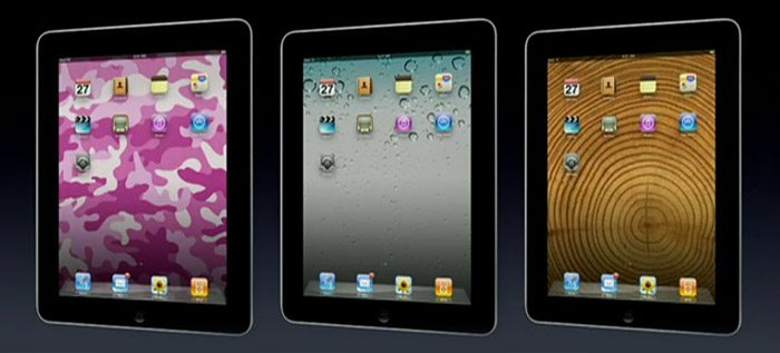
Apple has consistently raised the bar for interface design in the past by focusing on the finer things. Let’s hope the iPad will get there too.
Filed under: interaction
Comments