Hello webfonts
Comments: +
June 28 2011

Webfonts have arrived at idsgn… and it’s about time.
When we launched idsgn over two years ago, @font-face was still just a spec and Typekit did not yet exist. One of the few options web designers had for ‘real fonts’ (read: not Verdana) was sIFR or ‘Scalable Inman Flash Replacement.’
Around fall 2009, the web typography landscape started to change as Typekit and other webfont services started to pop up. We wrote an article on web typography around this time which outlined some of the problems and setbacks at the time (and still serves as a somewhat relevant introduction to fonts on the web).
Flash forward to 2011 and webfonts are everywhere, from The New York Times to Google.
So what’s our excuse?
Quite simply our typeface of choice, Auto, had not been available to license as a webfont.
sIFR, essentially a Flash and Javascript-based hack, allowed us to use Auto for the time being—despite not working on non-Flash devices (ie. iPhone or iPad). We put up with cursed at its quirks for years, but it did its job for the most part.
Sure, we could have switched to something else (some readers wished we did), but we stuck to it out of love. Optimizing fonts properly for the web takes time.
Thankfully, the folks are Underware came to the rescue and graciously offered to provide us with early access to the Auto webfont (served via Typekit) before it becomes publicly available later this year.
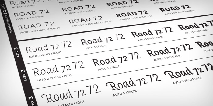
Auto is a friendly sans-serif from Netherlands-based Underware, with the distinction of having 3 different sets of italics (for a total of 72 different fonts). We use 5 of them here on the site: Auto 2 Regular (for the headlines), Auto 2 Light, Auto 2 Light Italic, and Auto 2 Light Italic Small Caps (for the sub-heads), and Auto 2 Bold Italic Small Caps (for labels, navigation, etc).

The idea of creating a triple-italic font family came from solving complex typographic tasks. Designating a quotation within a quotation is one example where two different italics can help you to avoid typographic trouble. Or try identifying a quote within spoken text in a novel, or identifying different speakers in plays and manuscripts. Synergize their forces - get these three italics rolling! Of course you also just use one italic at a time. Pick the one you prefer the most or suits the best.
Perhaps we’re more excited about this than we should be, but there was nothing more satisfying than deleting the obsolete SWF files from our servers today.
So thanks to Underware, and thanks to Typekit, for making this possible.
Filed under: Announcements
Comments