MySpace goes blank
Comments: +
October 11 2010
MySpace has an identity crisis. Can a new logo revive the dying social network?
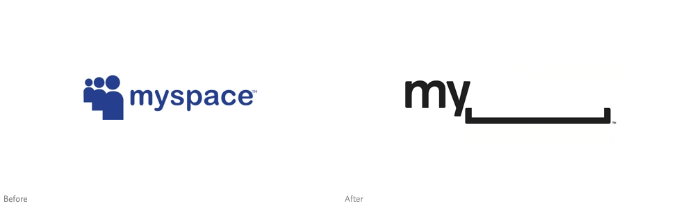
Attendees at Friday’s Warm Gun design conference in San Francisco had a sneak peak at MySpace’s upcoming brand relaunch. Presented by Mike Macadaa, MySpace vice president of user experience and design, the new logo marks the biggest visual change in the MySpace brand since its launch in 2003.
Taking last year’s (relatively minor) strip down to the extreme, the new MySpace logo drops the word ‘—space’ in favor of a blank line. Borrowing from AOL’s recent rebrand, the logo’s blank line can be filled in with random imagery—in this case, user-generated artwork. “MySpace is a platform for people to be whatever they want, so we’ve decided to give them the space to do it.” says Macadaan.
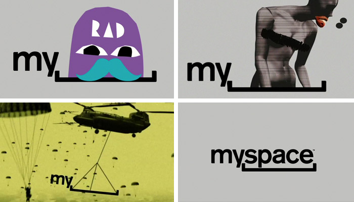
A video from the conference shows a number of different logo configurations:

If we really are getting into a place where you’re going to be able to show off what you’re into—or what it is you’re trying to get famous by—the logo needs to be a vessel, an empty stage. It can’t be a logo that is all about some big company that’s trying to express a whole bunch of their own philosophies.
—Mike Macadaan, MySpace vice president of user experience and design
Originally (mis)identified as Helvetica by TechCrunch, the logo’s remaining type (‘my—’) appears to be set in Calibri, according to typography master Erik Spiekermann.
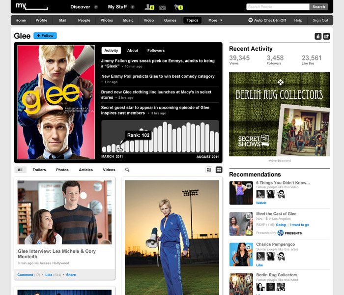
Details (including a proper resolution logo) are scarce, but it is reported the new branding will launch alongside the newly redesigned MySpace website later this year. A beta preview of the new website promises a “cleaner, more simple look” and “easier navigation with all your stuff in one place,” but judging from the provided screenshots (below), it is still a disaster.

If anything, the new logo represents MySpace perfectly. On one hand you, have a blank void (the site’s declining user base); on the other, a random mess of imagery (the average MySpace user profile).
Of course, the logo is already the target of online ridicule, complete with the now-obligatory mock-Twitter account. At least it makes a good bench for MySpace guests:
")
In all seriousness, it’s going to take much more than a logo redesign to bring back MySpace from the dead.
UPDATE: A press release from MySpace revealed some additional, clearer imagery (Oct. 27, 2010):
Filed under: branding
Comments